Especially because it becomes so imprecise.
On YouTube, "1 year ago" can mean anywhere from 365 to 729 days. Anything between 1 and 2 years ago becomes "1 year ago".
So if I see two videos that were both uploaded "a year ago", it's impossible to know which is more recent without actually opening the videos, going to the description, and looking at the date.
I feel like there was a UI designer convention and they had a contest on the best way to hate on users with GUI microagressions and this "N days ago" trend won so now it's everywhere.
I don't want to do date math in my head! Just give me the precise timestamp!
Don't throw away information with nonsense like "1 year ago" when as the parent post says, that could mean anything in a huge range of days.
The current generation of UI / UX people come usually from non tech backgrounds and are people very keen on... Making things pretty. They seem to know very little, however, about usability and other principles that we, developers, used to care about.
Even more fun: everybody rounds differently. “1 year ago” may mean 365 to 729 days ago to YouTube, but another website thinks it means 183 to 548 days ago (nearest whole number of years), and another website 350 to 548 days ago (nearest whole number of months up to 11, then years), and another anywhere from 1-365 to 364-729 days ago (within the last calendar year).
Exactly, and I think we as humans also read it differently. To me "3 years ago" reads "sometime in 2020, who knows?" but it might be "October 2020" to someone else. It's so imprecise as to be rather useless.
Except that saying "1.5 years ago" with a decimal would be 1 year and 6 months ago, and you won't want to do the conversions from a base 10 to base 12 for the month. Just write "October 21, 2020"
Isn’t it nice to see people deduct in real time why many sites use relative timestamps?
For most people, exact time doesn’t even really matter — it’s about estimating a broad chronological context for the most part. I’d just wish the UI would have a universal and easily accessible way to disclose the exact time when I actually need it.
> Isn’t it nice to see people deduct in real time why many sites use relative timestamps?
But that is throwing out the baby with the bath water. The existence of multiple locally used data formats is no reason replace information with this oversimplified nonsense. Browser can and used to provide the locale with every request. That is enough information to format a data such that it is readable to the user.
ISO 8601 is a long document which none of us can read and which specifies A LOT of different formats, including 2023-10-21, +0020231021, 2023-W42, 2023-294, and a lot of others (including duration specifiers).
Citing RFC 3339 is usually a better idea, since in addition to be readable for free, it is limited to the date formats you are thinking about. My 2 cents on your preferred citation, keep preaching though!
Oh, I was going to mention that one. We're in October 2023. A video published in November 2021 should not say "1 year ago" but rather "Almost 2 years ago".
The T makes it hard to visually parse. Whenever I try to read a timestamp using the T I have to scan it very carefully to see the date-time boundary. It'sWasWifWweWusedWaW"W"WtoWdenoteWwordWboundaries. I beg you people, use a space:
I agree on the 'T' being harder to read, but dislike the use of a space as it makes it ill-suited for use in a filename, and would allow word-wrapping to occur between the two sections. I'd much rather they had used an underscore instead of a 'T'.
Windows does not allow the colon (":") in filenames, so you can't use the ISO date-time format in filenames anyway.
RFC 3339 notes:
      NOTE: ISO 8601 defines date and time separated by "T".
      Applications using this syntax may choose, for the sake of
      readability, to specify a full-date and full-time separated by
      (say) a space character.
I tend to use the space whenever possible.
Note also that ISO 8601 doesn't require the "T" to be uppercase. A lowercase "t" might be slightly more readable: 2021-11-21t15:10:35
Best to avoid spaces in file names even if the OS allows it (hell, you can put a new line in file names in Linux and I believe Mac OS but that's a terrible idea) because many programs will exhibit major error states if they end up processing these names due to assumptions about file names.
And thats the reason why we should use more spaces and other special characters in filenames at every public used places. Thats the only way this bugs of lazy and stupid software developers getting fixed finally.
The principled stance is nice (and I agree with it generally) but sometimes you just need to get work done and not have to rely on trying to get some developer to fix something. Fully agreed though that it's lazy programming if an application can't deal with spaces.
Which I've always considered a weird anachronism, because 'space' isn't represented any differently than any other character, U+0020, unless you really want to get into the variety of "whitespace" elements. Same with newlines. It's all bytes.
Mostly because the browser Javascript API for Date is kind of crap for dealing with timezone info. There are some efforts to standardize on a better API, but it's going to take time to migrate.
How do you know what time zone to convert it FROM? Unlike epoch time (Unix time in milliseconds or seconds), "2021-11-21T15:10:35" doesn't automatically mean UTC without a "Z" or "+0" at the end. Without the time offset, that timestamp could be in any of the world's timezones. There's no way to know what moment in time was actually stored/meant.
Even if the user set it in one time zone, if we store it without a proper offset (and preferably a locale), we cannot properly account for the user traveling to another place, daylight savings time, government time adjustments, leap time, etc. These complexities compound off each other and make proper scheduling and debugging time issues really, REALLY hard later on.
In the twenty years or so that I've been doing web dev, datetime is probably the single biggest gotcha I've seen developers (including myself) stumble into. Part of this is because the standard JS datetime handling is atrocious compared to any other language I've worked in. It doesn't really natively handle time zones well, and well carelessly cast them back and forth if you're not careful.
Moment and Luxon can help with this, lighter libs like date-fns can too with the right extensions, but out of the box JS is going to fuck it up. I promise. Another choice is to just use milliseconds to store everything, and convert that to the user's timezone only at the time of display. Every timestamp is stored as an epoch, and every user has their time zone (not just offset, because of daylight savings) recorded with their profile. Doing those two simple things can avoid most of the landmines.
Surely when someone posts content, that date/time that happens is captured by the server in epoch time.
And javascript natively converts epoch time to whatever timezone the client has set. If your user-agent (aka browser) is working on New York time, but you're in Tokyo, well, I'm not sure who else you have to blame but yourself if it shows you New York time when you didn't want that.
How do you determine the viewer's timezone? A lot of apps try to find your timezone and it works fine until you travel abroad to a country with a different timezone.
If your own user-agent or OS is working on the wrong timezone, that's your fault.
A website/app shouldn't have to find your timezone. It should use whatever one you've set. If you've set your timezone to one you didn't want, I'm not sure what you'd expect other software is meant to do about that. Fix your config.
If you're not formatting a numerical date in the user's preferred date format then you're probably not localizing the month name to the user's language either.
I think irrational’s point is that it’s trivial for any viewer, no matter the locality, to identify the date if there is no longer any ambiguity between date and month.
I thought ISO 8601 allowed both unqualified times (e.g. "2023-10-14T19:21:45"), which are assumed to be local times, and qualified times (e.g. "2023-10-14T19:21:45−01:00"). Which one is used is then a choice left up to an individual program.
No: 1) unfortunately ambiguous with also widely used MM/DD/YYYY, 2) cannot be naturally sorted, the order does not go from the most significant to the least significant, especially when appended with HH:MM:SS.
Sorry, can't sort it in a column. I'm totally uninterested in everything that ever happened the first of january. I want to see the mails from last night on top.
The imprecision could be fixed by forbidding the first digit from being 1, switching to a lower unit instead. So up to 120 seconds ago, then up to 120 minutes ago, then up to 48 hours ago, then up to ~61 days ago (ick, months are evil), then up to 24 months ago.
When such relative dates are in a list it's generally tolerable. The failure to update is far more irritating, and limiting to "yesterday" does not fix that.
I found myself using an official YouTube client by accident recently, and it was so jarring to not be able to easily see when the video I was watching was uploaded.
"So if I see two videos that were both uploaded "a year ago", it's impossible to know which is more recent without actually opening the videos, going to the description, and looking at the date."
For better or worse (worse, IMHO), this is how YouTube search works. It takes at least two HTTP requests to get the precise dates. One to retreieve the SERP. Another to retrieve the JSON for each videoID. The JSON contains the upload date, etc.
IMO this sort of inefficient design pattern is faciltated by web developers who rely on Javascript, which is seemingly all of them. Webpages become shells for advertising and Javascript is used to fetch non-advertising, i.e., data. Google wants users to make clicks and track them, i.e., collect behavioural data. Thus it makes sense that a user would be forced to "open" a video to see its actual upload date.
The suite of tiny custom utilties I wrote in C can search YT and retrieve all YT videos, this can be upwards of 900 results. The output is CSV, SQL or simple HTML, including upload date and other data I find useful. This is done using only two TCP connections. No browser is needed. The simple HTML is just a page that looks like CSV, with a hyperlink to the video file. It's "YT redesigned" to look like I want it to look. I do the web development before opening the page in a browser.
The custom "downloader" I wrote is smaller, simpler and faster than yt-dlp. No Python required. But most times I don't download. I just use the simple HTML that looks like CSV. IMHO, this is much better than Google's privacy-invasive page laden with Javascript. I can see the precise dates and other useful data. I can sort by vaious columns. And I can exclude garbage videos that Google ("the algorithm") inserts into results, videos that have nothing to do with the search query string I submitted.
> Google wants users to make clicks and track them, i.e., collect behavioural data. Thus it makes sense that a user would be forced to "open" a video to see its actual upload date.
You don't need malice to explain that --- just A/B testing. Making information, that a user wants or needs, less accessible increases engagement, since the user is clearly clicking more.
Not to mention, it is a lot easier to program a function formatting the text to exact dates than writing a function that estimates how long ago it was.
But of course "lunchtime" is a completely meaningless term for me.
1 - I rarely eat a meal in the middle of my day. In fact I usually only eat once, so is that one meal lunch? or breakfast? or dinner? or what ??
2 - My day not only isn't the same as yours, it isn't even the same from day to day, so even if I agreed to call my one meal lunch instead of dinner, it does not come at the same time as yours does, and does not even come at the same time from day to day, and does not even come at the same time relative to when I am awake let alone the absoluet time.
It's inconsiderate to think this is reasonable for everyone else because it's reasonable for you. It's like how kids and the untravelled and otherwise ignorant presume everyone else's life is exactly the same as theirs.
I could translate of course, because of course I know what it means for probably the majority of everyone else, but why should I have to do that? This whole topic is about convenience and meaning, and this would be inconvenient and of only arbitrary meaning to me. It would be like calling it "triangle time" sure, I could just know that that means around noon. Why should my interface require me to translate from markers that are meaningful to someone else's life but not to mine?
A worse example just to show what's so wrong would be like calling sunday "church day". Or sunday afternoon "right after church". That would be not only inconsiderate but downright offensive. For a lot of people that would be perfectly fine and some of them would even fail to see why that should be a problem for anyone.
And the offense isn't just mentioning a religion, it's the assumption, the turning anyone else into the exception, when they are not an exception, they are equal.
Would you still be upset if I told you it has a hobbit setting where you get times like "second breakfast" and "elevenses". I'm sure you're a cool person and I don't want to denigrate your lifestyle, but the thing I'm talking about is a humorous desktop widget on an eopen-source desktop. You are certainly not obliged to use it, I'm fact you could even send in a patch that represents you - and have "only meal of the day time - ish" or "time to not attend a religious service".
If only I had explained the purpose of the church example was to illustrate with a stronger example that's merely further along the same dimension... If only I had explained anything at all instead of just saying I hate some idea for no unpackable explicable reason...
If the thought of a clock that says "about lunch time" sends you into a seven paragraph manifesto about the evils of the clock.....perhaps you should just not use it.
But this was a timer on a normal phone. It's pretty useless to tell me it's less than one minute left until the eggs are done. Do I have time to do a bit more dishes or will the phone ring in one second? Who knows?
Interesting you say that actually, I have been working on a folder synch implementation across samba with mac & win environments and the last modified times are not a reliable source of truth it seems. This fuzzy method would have been very useful as the exact minute of the modified file isn't critical.
In the end though we just used checksums, but over the wire the larger files take too long. This comment has given me an idea!
Getting off topic but most sync systems do a quick comparison then a full one.
So for example check modified, inode number against the previous version. If they are all a match consider skipping the checksum. This way you can skip almost all checksums on an incremental transfer. You can have false-negatives but this can often be mitigated by occasionally doing a full rescan or similar.
> So for example check modified, inode number against the previous version.
To be honest, I didn't even try this because the destination machine is Windows, I didnt think inode number had an equivalent in windows, but after googling, there might be a way.
Another great suggestion.
As for the full checksum, I went with a chunk size of the first and the last of the file, (the changes are very small, property based) but I don't think its as reliable.
How can I upvote this enough.. Luckily, often the timestamp is visible as a tooltip.
Case in point: When you browse npm versions of packages, it will date them with "version 5.3.27 was released 'about a year ago' craziness. ARE YOU PEOPLE OUT OF YOUR BLOODY MIND?
i am browsing through older packages to figure out the order they were released in, to sketch a pinning of compatible packages to form a build configuration, and 20 sequential packages are reported as 'about a year ago', requiring me to tooltip each one to figure out which ones are too recent to use.. The crayon eating has gotten out of hand.
Brought to you by the same morons who build ORMs that map table names between (irregular) singular and plural. To serve what need..
The people who do this for anything developer-related are criminally incompetent. What amazes me is that not only are they still employed, this idiocy is everywhere. From npm to GitHub to CircleCI to...
I would go even further: I would remove these rounded, relative timestamps altogether.
iOS mail app really irritates me with this: whenever I open it, it tells me "Updated just now". Then I pull to refresh, and suddenly there are unread emails I received 2 hours ago. Just tell me the damn time when you did the update.
Even worse is the stupid timestamps on notifications. If you don’t catch it within an hour it becomes imprecise (1h vs 2h ago). Maybe I really need to know exactly when that notification came in! And there is zero way to tell. Just give me the time! I can tell time.
One benefit with Thunderbird. It's still saying the exact date and time (knock on wood). If it's today, it only says time, anything else you get full date and time.
The dream of a web where the server simply sent data, and the client chose how to display it, is totally dead. Web designers want their websites to look a certain way right down to the pixel, and client-side display control messes that up. To be clear, it's not that you can't still do it, but the website is never going to be designed for it and actively help you.
This is just one symptom of the advertising-supported web. The web was intended to inform, but modern websites are designed to impress. Personally, I'm more impressed with websites designed to inform, but the average person apparently isn't.
The Semantic Web failed for the same reason: Humans click on ads but computers don't. Hence we're left with a web that is not only designed purely for human consumption, but also to appeal to the ADD part of our simian brains that says "Oooooh. Shiny!".
I understand your point, but I am incredibly suspicious of the ad market. For that reason, I do not believe that more people than computers click on ads.
My degree is in marketing so I used to offer human versus bot click analysis as a service. The initial sale was very easy but the practice was more like grief counselling than consulting. As a result, my customers weren’t sticky - they were happier before me. And I don’t believe anyone actually changed how they bought ads as a result.
A criticism of social media advertising is that it’s too easy for small business to get stuck thinking that it’s work when in reality it’s just a very boring hobby. Many digital ad campaigns don’t show a return on investment so maybe that criticism applies to digital ads too…
I can totally believe your conclusion there. I worked for a digital ad agency back in the 2000s and was repeatedly told not to add conversion tracking before things went out to clients because everyone involved knew the numbers would be utterly damning. Half the time I think the only people who looked at the sites we were building were us, and the client team that was paying for it.
>A criticism of social media advertising is that it’s too easy for small business to get stuck thinking that it’s work when in reality it’s just a very boring hobby.
we have such a divided world these days (the old mom and pop ads on a phone tower in town won't reach the entire country) and traditional ads are and always were untenable for a small business. They turn to digital ads because they are plum out of other ways to reach their audience properly.
The semantic web and advertising web aren't mutually exclusive. The issue is that the advertising web, which optimizes for human attention, is necessarily going to get more human attention.
> Web designers want their websites to look a certain way right down to the pixel
I’d say we’re actually further away from that than we’ve ever been. I’m old enough to remember <table> based designs, “best viewed at 800x600” etc etc. These days we have responsive design, adaptive color palettes for dark mode and accessibility, flags for users the prefer more contrast, reduced motion, etc etc etc.
User preference time display is interesting but I don’t think it’s realistic. My preferences can be universally applied without context.
And yet people will load a megabyte of JavaScript just to create a date picker that looks nice while you need about 20 characters to get a bugfree one in HTML: <input type="date">
Everything you described is nice, but in the end it’s still up to the developer to support it and especially to choose its behavior. I can technically use “when reduced motion, html {animation: shake 1s infinity}”
> The dream of a web where the server simply sent data, and the client chose how to display it, is totally dead
When did you have such a web?
The web used to be completely server side, so you could only receive formatted HTML/CSS/JS and you would need to scrape this page to get information.
Today you have (or can have) APIs and some sites are cleanly server/client. It is much, much, much better than it was if you want to consume data. At least there is a framework for that (not always available), as opposed to before when there was none.
Looks to me that it's a semantic-only tag that doesn't change the text on the screen at all. The GP is just incorrectly assuming it's something different.
I have no idea what a browser supporting it even means. Browsers aren't supposed to do anything with it.
This is correct. It would be nice to have an option for the browser to format it for you. Especially since you can't reliably get the user's time zone on the server.
I wrote some JS that watches the page for these and updates them to be more user friendly and use the user's locale. But it would be nice if this was the browser's problem to solve (and can consider things like non-locale preferences such as always showing the time across websites and how far relative times should stretch)
One aspect that is so disturbing with the fuzzy display is when the day of the week is the most relevant info.
Looking at gitlab's history for instance, it's way more helpful to know if it was merged on friday than "last week" or "2 days ago".
Same for chat history etc. happening at the limit of a month, knowing exactly if the discussion happened before or after the beginning of the month can matter a lot.
For everything else I personally could care less if it was 4 weeks ago or 2 months ago, so getting the exact date also doesn't deprive me of info.
I actually have a hard time imagining a scenario where a fuzzy date is more helpful than the exact one.
I can't get ISO-8601 dates to work properly in Excel unless I set my Windows to Australia locale, or make my own parser or use a third-party library.
Sure, I can format a field^Wcell with a custom format string, but Excel still won't believe me when I type/paste/import ISO-8601 dates. Unless I set 'Australia' systemwide.
And no, simply adding English (Australia) as one of the additional system languages, or keyboard layouts (and switching to that layout), or number+date+currency formats doesn't work.
Oh, works here. I set locale format to German (Germany) or (Austria) while using Windows with English language. All date/time/currency formats are sane.
But you could also customize the region settings in "Additional settings...".
God yes. That should be just the locale. I have it set up right because `date` shows it correctly but nothing else respects it. Not Dolphin, not Thunderbird, not git.
Worse, there are clearly conflicting sources of truth involved.
Setting locale to `en_SOMEEUROPEANCOUNTRY` will make some programs use ISO 8601 dates everywhere, but other programs use all sorts of random formats. Switching between countries changes what different subsets of programs do.
Throwback to when Google maps randomly chose to use km/h configured in android settings and "mph (auto)" from google account setting at once on the same screen in the app.
I found that setting language to UK instead of US avoids a lot of the goofiness like YY/DD/MM and 12h time. Setting the language to my native tongue instead of English just doesn’t work for all the industrial terms.
I wrote a Greasemonkey script to replace Jira's useless time labels with the full date, including the day of the week. Highly recommend doing this for any browser-based software you use regularly.
> I actually have a hard time imagining a scenario where a fuzzy date is more helpful than the exact one.
It can be, in niche scenarios. I have an application that pulls information in from another database, reformats it, and displays it for the user. The update is expensive and time-consuming, so it has to be triggered manually by the user when it is needed. In this case, the exact time of the last update isn’t particularly useful; the only thing that matters is how old the data is, which is to say how likely it is to be out of sync with the source of truth. In some cases, information needs to be as up-to-the-minute as possible, so if the info is just a few hours old it needs to be refreshed. Other times, information that is 4 or 5 days out of date or longer is totally fine, so there is no need to trigger an update that could take as long as 10 minutes.
For this particular purpose, fuzzing the date is actually more useful that providing the time of the last update, since order-of-magnitude precision is good enough, and it saves the user from having to compare the update time to the current time and do a calculation. Admittedly though, this is a rare case, and the vast majority of the time a relative fuzzy date is less helpful.
> I actually have a hard time imagining a scenario where a fuzzy date is more helpful than the exact one.
I use it for communicating short-term times in the future when the recipients are across multiple time zones: "___ will finish running around 4-5 hours after this comment", "___ is fixed and will start its next run about 15 hours after this comment", etc
Thanks, this is one I am 200% behind. Youtube does this well too, knowing that a feed will start in 5h or 2 days is more helpful than the exact date I'd have to calculate from today.
I think that's the proximity and actionability that makes the difference.
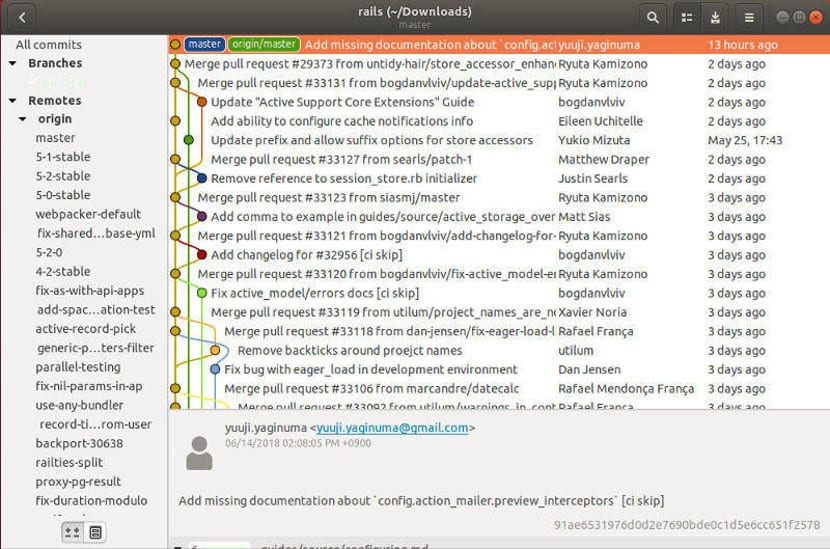
There are a number of commits marked as 3 days ago. It's only a little bit better than no information at all: or doesn't tell me if they happened in the morning or in the afternoon, or all within an hour or spread on all the day. That's important when I didn't logged how many hours I worked for a customer and I have to assess it one week later. I have to click every single commit and check the timestamp on the other side of the screen.
Outlook webmail is pretty bad. Not only does it do the "... days ago" thing, but it wants to show what it regards are important at the top. So you get two partly duplicated lists, partially shuffled together - it's horrible x 2.
Ugh, I pretty strongly disagree. This has become a common pattern in UIs, so I'm used to it now and I expect it, but I still hate it. At least for me, I agree with the article, I always prefer an exact date over "3 weeks ago". So why make me hover over a tooltip?
Also, I find myself needing to copy and paste information like this every now and then, which a tooltip is horrible for.
why? screen space.
"37h" is much short than the date and time of 37 hours ago.
of course, if you write out the age like "37 hours ago", that isn't as useful.
software doesn't _have_ to do it badly. the most recent version of this that i wrote will say it is Xmins old, but switch to the next unit after reaching 2*next-unit worth of time, so >120mins starts at 2h. then you get to 2d, 2mo (months), 2 years.
you can get the full datetime on hover.
all this is only in an object listing. when you open an object, you'll see the full date.
Screen space??
We have such large screens now, and yet most of these UIs are much more minimalist than any UI was 20 years ago when most of us were on 1024x768 or maybe 1280x1024 at best.
There is zero space excuse for this. It’s simply a fad, born from the Jony Ive fetish for form over function.
>We have such large screens now, and yet most of these UIs are much more minimalist than any UI was 20 years ago
need more room for the ads obviously.
>How is that a space issue?
it's all relative, but in your example you added a new line. Think of this HN comment section with 200 comments on a page and how much scrolling you need to add due to that decision.
Of course, the comment's design up the chain doesn't have this issue. But for horizontal space mobile is still going start to feel cramped when you add a time stamp to the existing:
[name] | 3 hours ago | root | parent | next [–]
because resolution means a lot less for mobile due to the smaller screen. Despite the much higher resolution there's less room to do things there due to the orientation and the size needed for readable text.
This can all be addressed with the best of both worlds using responsive design, but it requires smart design that is aligned with a goal of deliveing dense information. As you hinted at, that simply isn't the current goal for modern design. Less "newspaper" where the goal is to fit in information, and more "ad flyer" where the goal is to focus attention on the biggest eye catches and leave little else (except ads) to distract .
Just wanted to say that I put them on two lines to measure them, to illustrate that a simple date stamp is the same if not more compact. I think the relative one is bad, and at best should be the one stuck into the tooltip.
Alternatively, the actual date can be rendered on the page and if people want the relative they can hower over.
Rendering relative dates instead of actual is not a good user experience in my opinion.
Personally, if I'm looking at a date at all that's because I want to compare it to another date.
Why it's important for work-related stuff doesn't need explaining, I guess. But this is relevant even for personal matters -- e.g., was this photo taken before a friend's wedding or after, etc.
Given how imprecise relative dates are they are not of much help for that.
And in the case I'm not looking to compare dates, seeing relative dates doesn't really add any value for me either.
Also, it's quite obvious something happened 1, 2, 3 years ago from seeing the actual date.
Another thing about the tooltip is that it makes it harder to copy and paste. At my work I need to copy exact timestamps for postmortems and other investigations, especially to correlate with metrics. For some web pages I have to go to the page source to finally get the fully qualified timestamp.
This is about when you want to have both representations (either can be useful depending on the situation) but don’t really have the space to display both (such as for comments here on HN). This is why tooltips exist at all, to display additional information that you don’t want to be displayed all the time. In addition, I’ve been wanting to copy the contents tooltips in other situations as well.
This is what I did for a job code challenge - relative casual time in the main description, and then complete time details under the item:
https://imgur.com/qG0US5o
I want actual time stamp / date format rendered on page. The relative is completely useless and I do not want to have to hover over everything to see the dates.
That's only if the text isn't also a link. For example, on hacker news, the time is also a link. So long press shows the preview of the link instead of tooltip on iOS.
I used to put exact time/date information into tooltips, thinking "the users that need it can find it without overloading the UI". I ended up undoing a lot of that a few years later when user interviews demonstrated that hyperlink-style underlines was insufficient for users to think "mouse over this".
With the prevalence of emoji and higher resolution displays, I wonder if tooltip hinting with an obnoxious question-mark or magnifying-glass image would be sufficient to hint to older/less-savvy users.
i'm "underdotting" anything that has a tooltip (simple css style). most buttons have a tooltip with a sentence explaining what it does/how it works.
but this is in webapps that people use relatively intensively, so they can get used to this. it's better than desktop apps that often have no indication that hovering will show a tooltip.
Without underlines makes the data even more hidden. The style looks nice and clean to expert users, but I don't expect any of my less-savvy users to actually find it. (Though I could be very off-base as I've never A/B tested tooltip hinting.)
When I’m looking at when a merge request was merged in to master in gitlab, often the level of granularity I am interested in is ‘roughly how long ago’, or ‘what day in the last week was that?’ - the thing I am trying to figure out is just ‘did that go live last Tuesday or last Wednesday?’
I can recover that information from a date with a little mental arithmetic or a cross lookup to a calendar but it would be nice if the computer told me that.
On the other hand, sometimes when I am looking for when a git merge request was merged in I am looking for ‘was it a few minutes before or a few minutes after this error started happening in production?’ And the precise timestamp is of intense interest. At that point seeing a bunch of merge requests tagged as ‘last Tuesday’ is incredibly unhelpful to me. But so would just an unadorned date be.
In general I would lean towards providing the information in a raw form but also contextualized.
But ‘just a date’ is often the worst of both worlds. Even worse if I don’t know which time zone the date is being reported relative to (people often display UTC dates without clarifying that, or even considering that dates need time zone adjusting too).
My dream contextualized timestamp would be something like
Right, and that's the case with every feature implemented in software. Showing both the precise datetime of creation and a "human readable ago" seems to cover a lot of bases that users seem to like, though. Recall, we're commenting on a thread that's proposing removing a feature that already exists (so presumably people want it).
What are some situations where you find calculating the relative date useful?
Personally, if I care about a timestamp at all it's because I want to compare it to another date (maybe a past date, maybe a present or future one): a deadline, an event, a birthday. Relative dates actually make such comparisons harder.
On the other hand, seeing an actual date like 2022/10/03 it's dead simple to tell that was a year ago, it's equally easy to tell whether something happened this year, or last month, or two days ago, etc.
we're talking about a casual context, so the average user doesn't need an exact time stamp on when a picture was taken. The average person doesn't talk in time stamps, so the paradigm was shifted to display how people communicated.
Another nitpick is that relative dates solve the date format issue. No need to fuss over YYYY/MM/DD or DD/MM/YYYY or any other permutation, but we all can agree on when "7 months ago" was.
Because oftentimes you think in chunks of time not dates. If a meeting is in 3 hours in instantly know what kinds of things I can do before that meeting. If a meeting is at 4:45pm. I have to know the current time, calculate the difference then I can start planning my time.
Less trivial is taking into account time zones. if you're traveling and have some jet lag, "10:30" may not actually mean 10:30 to your biological clock. but "in one hour" is universal (even if your body is confused).
Almost every device you're viewing the web page on has the time showing in a corner (which, come to think of it, is surprising, by now I would've expected UX "people" to have ruined that too for everyone).
Also: include the year. I’ve been bitten so many times by web forums not showing the date on comments (“5 Jul”), only to find the comment was written years ago that I no longer even trust dates without years. I find myself hunting around to try to get a year to be shown to me if it’s not there upfront.
Also: use 4-digit years. There is a forum that I visit a few times a week. It's been around for 20-30 years. It prints dates as 08/11/02, 09/03/04. Very confusing
You are assuming an American date format. The format of the date may come from
1. Your browser locale.
2. The developer's preference and ignoring the locale.
3. The server's configuration (so the operators preference).
4. Guessed based on your current network location.
I guess if you are in the US using a US locale it is usually true if you are visiting a US site as almost all of these will select a US locale so it doesn't matter the source, but it is impossible to be sure. And if you live outside of the US or use a non-US locale then at least one of these will frequently return a different locale and you will have little way to know which format is being used.
I have never seen 2 digit years being used in YY/MM/DD formats. So I have pretty high certainty which place is the years.
The month/day confusion is very real, but that isn't what parent complained about. In fact, if the site had used 4 digit years like 08/11/2002, as parent requests, it would still be equally confusing. So that was clearly not the point of contention.
"1 year ago" may not be precise enough, but "11 months ago" often is.
When implementing such a function we tend to avoid "1".
Instead of "1 week ago" it is "6 days ago"
Agree, when they are archived like in (google or web.archive.org), they will be relative to the indexing date if the label isn't calculated in client side, probably the javascript won't be working well in archive though.
Plus, consider using time tag, datetime attribute for displaying dates in a more accessible way. https://developer.mozilla.org/en-US/docs/Web/HTML/Element/ti... It's not so much different than a span tag in browsers yet, but why not making out webpages future compatible.
This is an issue in the spatial domain too. Whenever somebody invites me to their house I ask them "what's the address?" and they inevitably proceed to give me a long verbal list of relative directions: "Go east on highway 10 and take the first exit, then turn left, go two blocks, and then turn right." There are a thousand ways this can go wrong. Errors compound.
Please just give me your actual street address, and Google and I will figure out how to get there.*
*Except yes, Google gets many addresses wrong. Those are the exception.
Google Maps used to be really bad in my then neighborhood which had roads and garages underground and bike lanes and footpaths on the ground level.
For the longest time they didn't even have the numbers of individual houses and treated the whole area as an atomic blob :shrug: A neighbor put the numbers into OpenStreetMap eventually and soon after Google Maps had then too.
For a while they still treated it as a normal road though which means "find route" was still unusable but you could at least use it as a map. Nowadays they have separate entries for the above-ground paths and it works.
EDIT: Please someone write "Falsehoods programmers believe about city planning"
I don't like these unnecessarily-fuzzy dates either, but:
> No human uses “less that 24 hours” as the definition of “yesterday”. Computers, unfortunately, do.
Is that right? I've never noticed anything using that definition of "yesterday". Plus, if anything within the last 24 hours were "yesterday", what would be "today"?
I personally use "yesterday" for anything before when I last slept. Yesterday can easily be technically today, but just in the late night before I went to bed.
I don't think it is right. Moment.js for instance, does not work this way. It uses the calendar day definition of "yesterday". Times between the immediately preceding midnight and the midnight before is considered yesterday.
Swedish has two words for day. "Dag", same as the english "day", and "dygn", meaning "24 hour period". I'm not sure if you can use it in the way the author suggests that no human does, but maybe?
agreed completely - "yesterday" usually includes times both greater than and less than 24 hours ago. People usually just mean… some time in the date previous to now. Roughly.
GitHub is my worst offender. When I need a timestamp for Git I always need the exact date and time, even if it's recent.
This was mentioned elsewhere but it's buried under another comment. I think GitHub needs top level placement for this audience. I imagine a lot of us feel this pain from time to time.
> No human uses “less that 24 hours” as the definition of “yesterday”. Computers, unfortunately, do
Correction: computers programmed by programmers who believe falsehoods about time zones and dates do.
It’s entirely possible to unambiguously slide a timestamp into the local calendar of your user and from that determine what the local date offset is. If you just take floor(now - time / 86400) then of course you’re going to produce garbage.
On a related note, I dislike when time zones are omitted from displayed datetimes. I have to guess: Is it my client's tz, the server's tz, UTC, or something else?
I'll leave my chat program open for two weeks and it says the message was received 'yesterday', even though it was actually two weeks ago but hasn't updated because it's just been sitting there idle. Anything other than the actual timestamp is utterly useless.
That particular point is an implementation issue, however. There are web forums I frequent where the time indications update in realtime while the page is just sitting there.
In the other direction (and on a different scale) I hate it when the bus-schedule app I use tells me that my bus leaves "in 8 minutes". Ok, I'll put on my shoes and jacket, check if I have all the stuff in my bag - darnit, I forgot my book, can I spend a minute searching for it and still catch the bus? I check the time, which is 9:57, and I remember that the bus leaves... 8 minutes after some unspecified moment a few minutes ago.
I actually really hate fuzzy date displays. More often than not I want to know exactly when something happened and 2 hours ago isn't usually good enough. Just tell me the exact time I'm a smart guy I can figure out how long ago that was.
It’s interesting here in that there’s a sizable group (looks to me like 25% but let’s be generous and assume 50%). Seems like the kind of thing that should 100% be a user preference.
Too bad “having too many options” is perceived as a bad thing by the current regime of aesthetics-first “designers.” It’s the only thing they hate more than using screen real estate for something besides seas of white space.
Where have you seen a service describing something posted less than 12 hours ago as being "posted last week" rather than "posted yesterday"/"posted today"?
The point is that both are technically correct. At 12:00am on January 1 that happens to fall on a Monday something that occurred 1 second ago can be considered to have taken place: last week (depending on when you consider weeks to start/end), last month, last year, yesterday, etc.
Sure, they’re both technically correct, but that wasn’t the question. The question was
> Where have you seen a service describing something posted less than 12 hours ago as being "posted last week" rather than "posted yesterday"/"posted today"?
Every single time display library I have seen will do as the poster explained, and show more granular information the closer it is (generally starting at “X seconds ago”). Your technicality is certainly true, but a strawman.
Actually, it's that question that is the straw man. jstanley's point is that to the reader "posted last week" could mean almost no time at all ago. It's not about the display library choosing to label recent things as this. It's about humans reading such a label and not receiving the intended information, because humans don't cut off what they understand "last week" to mean at some arbitrary 12-hours-ago mark.
Except they do get the intended information. The label doesn’t exist in a vacuum; the user would have seen other examples showing the specificity at intervals other than “last week” which sensitizes them to the cutoff points.
This is literally a non-problem. If a library behaved in the way the parent commenter makes them seem like, then, sure, they have a point. But they don’t. Something that occurred a second ago would say “a second ago”. Something that occurred 5 minutes and 43 seconds ago would say “6 minutes ago”, etc. There is no library in the world which takes a timestamp a second ago and outputs “a week ago” and pretending like there is is, literally, a strawman.
Yeah, I've seen enough examples to know that no 2 websites implement the same logic so I shouldn't try to second-guess anything more than what the text literally says.
But… users don’t. Literally no library out there does what the parent commenter claims they could do. They all use sensible cutovers for relative dates.
The point is that if a user sees "last week" it's ambiguous. They DON'T KNOW that your libraries don't behave that way. All they see is "last week". Are you really not getting this?
At the "last week" level, assuming we don't keep track of today's date, wouldn't it be good enough to see in the date if it's in the same month or not, and eventually see if it'rougly at the beginning, muddle or end of it ?
If you were told something was uploaded on 2023-10-02, with just the average feeling that we're currently around the middle of the month we'd know the video is roughly a week or two in the past.
Exactly. A video on YouTube posted '1 month ago' is not the latest episode I'm looking for. Much quicker to interpret than a timestamp. Sometimes a fuzzy date is enough.
Especially being from Europe: it is never clear if 10/04/23 means October 4th or April 11th unless you know which date format is being used.
Agree. I also like the relative dates. E.g. on Github where it’s useful to get an intuition very fast of when files in folders/projects were last updated. I don‘t care about the actual dates in this moment, the fuzziness of the relative date is the approximation I‘m looking for.
I'm glad I'm not alone in this, Apple's Mail app used to display Monday/Tuesday/Wednesday/etc for the last week of email before switching to numeric dates. It would drive me crazy as I mentally work with dates and having to constantly check "ok what date was last Tuesday", "ok what date was last Saturday", introduced needless complexity.
Someone must have spoken up, because it's now as follows: the time(for today's email), "Yesterday", then the numerical dates.
On a tangent: Maybe one of our german friends can answer if the day before yesterday is displayed as "vorgestern", since that's part of the german lexicon.
Second tangent: While we're at it, can English finally standardise what "next <day>" means. For example I'm writing this on Saturday, and "next Monday" is permitted to mean either in 2 days time or in 9 days time.
It doesn't increase ad revenue. It increases scores in A/B tests which is believed to predict ad revenue. Should be an entry in "Falsehoods project managers believe about A/B tests".
with a title to show tooltip for casual interest, but especially important, the chatty time within an explicit TIME tag that allows parseable stamps to be saved with pages and mined regardless of local naming conventions.
Github was the first thing I thought of when reading this. My only use case for the commit date is to quickly check if a certain commit merged before a branch was automatically cut, so I need the day of the week and time, not "11 days ago."
Fortunately, if you hover over the relative date, it will expand to show the exact date time, but it would be nice if this were swapped.
Yup, agreed. I came hear looking for this one. Whenever I need a timestamp in GitHub I need the exact time. I always have to hover to get the info I need.
Apple Wallet/Card is so annoying with this. It puts dates on transactions over a week old but within the last week it says “Wednesday” (DOW) or “Yesterday”. I don’t use my Apple Card for a lot since it doesn’t automatically integrate with YNAB and it’s always a pain to enter those transactions.
Thankfully YNAB’s date picker is a little calendar so I can figure out the right date easily enough but it’s always jarring to see “Monday” after I’ve been looking at real dates for older transactions.
This isn't just a "problem" with computers and fuzzy "<time ago>" labels. Humans do this, too. The worst is when people use inappropriately long periods, for example when a reporter says something like "Joe Criminal was convicted last month of XYZ", when "last month" means some time in the previous few days that happened to fall in the previous month (this kind of thing happens a lot). It takes more effort to come up with that bullshit than to simply be more precise.
Everything should just say the actual date/time. The “longer ago than yesterday” bit is the slippery slope. It’s never acceptable. If it’s not configurable, it’s always the wrong idea.
I have a slightly related problem: infinite scrolling as the only way to access the archive. Like, imagine I want to know what some blog/media site posted during some important historical event, and there is no pagination or calendar to pick. Or am I just using the web wrong and there is some way? Example: https://www.astralcodexten.com/archive
This kind of thing is especially egregious on the GitLab UI where,
for example, something was committed “a moment ago”, “just now”, or some vague shit like that.
That one makes perfect sense to me, as if it said like "1 second ago", this would almost always be a wrong statement due to differing clocks, and the time taken to render and send you the page.
If the time is static on the page rather than dynamically updating in JS, for such small intervals it'll already be out of date by the time you scroll down to read it. But dynamically updating timestamps is irritating because it causes the content to "animate", and that movement catches the eye for no good reason, since nothing is really changing with the content (Reddit does this).
Due to clock skews you can even have the event come from slightly in the future, and marking that accurately like "2 seconds from now" would be even more confusing.
I recently came across this conumdrum myself when developing a live streaming web app[1]. The app formats a DateTime using a fuzzy relative duration[2] which displays "1 minute ago", "2 days ago", "yesterday", etc...
I also concur with the author of the post saying "ago" is not enough. So the app has been updated to display:
  fuzzy relative duration
  hour:minute:second period timezone
  full_day_name abbreviated_month_name day_number
I had to write a bit of logic[3] since new items only arrive on weekdays so when viewed on the weekend, new items do not say "23 hours ago" and instead say "yesterday".
I’d be happy if articles included at least the year. So many times I’ll come across something, and have no idea how recent it was because there’s no date whatsoever.
I like the imprecise date, especially when they have the eact datetime, down to the second, in a ABBR title, which is clickable on mobile.
I work from home, for myself, and I don't care what date it is and I rarely both with the date, and knowing something was about a week or a month ago is about as accurate as I need.
For my work I use the following simple design: display the date and when you hover it tells you how many days ago it is etc. I initially had it the other day around, but users complained and said the date was more useful. I hate websites that don't even give the date on hover.
I absolutely hate that recent versions of Outlook (at least in a Mac) shows “yesterday” in the date field in emails. I get hundreds of dates per day, show me the bloody time too! And this is not configurable!
“Yesterday” is barely any shorter than the date in “yyyy/mm/dd hh:mi:ss”.
Yup. Configurable went out the window about the same time using any native UI widgets or windows did. One 24-year-old “UX designer” will decide the single best way for everyone in every situation, and their decisions are final.
The reporting of a message's timestamp really depends on the system you are working on. And the key aspect is to genuinely think how the users think about that timestamp.
I recently implemented it in a real time system where I write things like
"just now" (within the last 10 seconds)
"more than 10 seconds ago" (between 10 seconds and less than a minute)
"more than a minute ago" (between 1 one minute and less than 10 minutes)
"more than 10 minutes ago" (between 10 minutes and less than 1 hour)
... (I think you get the gist)
After it say more than a day... then that's it the message is considered very old
I remember when I had to use Jira for the first time, which had this "n days ago" display for the tickets. I don't remember if that couldn't be changed or the person in charge just could not/would not do it, but I needed the proper dates often.
So I wrote a basic user script which would read the actual dates out of the title (at least the date was in there) tags and then replace the unusable default output with it. I put that in button on the bookmarks bar and over time, several people saw it and adopted my solution.
I never met anyone who liked the "human readable" format more that the actual date.
In Windows Explorer, it's always a mystery if my date specifier is valid. I would often forget a colon or use the wrong flag name or accidentally use a leading dash as most command line flags would accept. When there are then no search results, I mistakenly assume the document I want hasn't been uploaded yet. I email a colleague, they reply it's in the network drive as anyone in the organization would expect, I look like an amateur.
I've resorted to using "datemodified:this year -kind:=folder" on a keyboard macro and changing 'year' to 'month' or 'this' to 'last'... or using WSL to search.
One obvious problem here is that the number of files I search through changes with each season. January and February are the worst, because "last month" and "last year" overlap for one month, and then on February 1st, the query results are again exclusive. If I want all PDFs published in the past three weeks after returning from winter break, I need to use two search queries in Explorer.
Contrast that with Linux, where there are multiple standard, well-documented, reasonably easy to remember methods of searching by date, including within very specific timeframes---not just a choice of month or year. On the GUI side, GNOME Files has much more customizability and isn't any harder to understand than Explorer.
Just as the past decade has been a disappointment in home assistant progress, I had hoped in this present age, ANY reasonably query could be parsed, and optionally, the exact query shown as the machine sees and/or a plain-text standardized description of the search.
    [<Ctrl> + F] "PDFs from the past three weeks"

    ↓

    Parsed: find "//doc-network/rel/**/*.pdf" /createdafter 2023-09-24

    Searching for all Adobe Reader documents (PDF format) created between three weeks ago and today in the current folder ("rel") and/or any subfolder.
As a bonus, the best five results matching MOST (but not all) of the query would be previewed at the bottom of the search results, slightly greyed, with "84 weaker matches found, such as...", and this could also be disabled for privacy/performance/etc reasons
I disagree. Delta time requires less computational load on the brain.
You rarely need to process the precise dates. If the article or item is old, "years" is the perfect measure. You very rarely need to consider the precise day the thing was created on.
Most tools should simply show the date as a tooltip. I was just sharing this video [1] on another thread, and YouTube does it perfectly. Date shows up on hover.
If you're presenting records in a tabular format, then dates win. But consumer products are enhanced by relative time.
I'm surprised nobody in the comments (that I can find) has mentioned another problem of relative times: am I the only one who considers of the ambiguity of _when_ was the page rendered and therefore what is the reference point for the relative time?
Also, to be honest, I hate seeing times without timezone info. As someone often scheduling with people far away, it does not help me to have the calendaring tools silently convert times into my local timezone and display them unqualified. Particularly when everything tends towards a flat rendering style where it isn't always clear what is metadata from the system and what might be text written by the human far away.
Generally, I dislike when designs fixate on "simple" and blithely ignore real failure modes. I have to try to get into some weird headspace to imagine how the UX designers failed at their job so I can try to predict the right failure mode and recover what I can out of the tools...
Times are not universal. Displays are not always rendered at the moment the user observes them. Location of the observer is not always well known. Things fail. Doubly so with mobile.
> Delta time requires less computational load on the brain.
I highly disagree. A quick glance at an absolute date immediately gives me the general idea of when it happened. Most of the time I want to know the exact date to compare it to other dates. When I see a relative date, I almost always need to subtract it.
I would actually point to YouTube as a bad example. YouTube refuses to make the absolute timestamp available unless you actually navigate to a particular video's page. That makes it impossible to see which video uploaded "X period ago" is more recent from e.g. a search result page. Even if you don't _usually_ want an absolute timestamp, there's no reason to make it completely inaccessible in most places.
The main issue to me is the asymmetry on how much it really matters when date need to be precise, vs how how little it matters the rest of the time.
Putting the spotlight on the format optimized for the people who care the less feels odd. There's not much load on the brain if we just skip the info we don't care about.
Maybe. Usually, relatively recent deltas are great which is mentioned in the article. They are less ambiguous enough to be helpful. But longer the deltas are from NOW, the higher is the cognitive overhead in my experience. And interfaces should reduce the overhead to make life easier for people.
The compromise is to have the actual timestamp as a tooltip, and/or have a click/tap toggle the representation. But yes, it’s often annoying to only have a vague “3 months ago”.
I like how apple photos does it. It's today, yesterday, then day of the week name (tuesday) and then the date after you pass the 7 day threshold. And they always put in the time
Whatever fancy misguided millennial time encoding your planning to use, display the actual time stamp as well (yes with TZ) for the rest of us. Plenty of screen space these days.
Maybe I’m in the minority, but if you’re ever not going to display the actual date, put the exact date/time in a nice, readable tooltip, or otherwise surface a way to see/copy it on right-click. I feel like some of this could be highly customized user agent settings. Always send the most precise data to the renderer and let it render how the user wants to consume it. By default, that could be how you want them to see it, but don’t get in the way.
I find these imprecise, rounded, relative timestamps very irritating and I am so happy to see that I am not the only one.
If you have the exact absolute data, then just give me that.. in its original form. Unbelievable that people put effort into making it less precise and making relative. Why? Because it looks _cute_? Personally, I always find it hard and tiring to mentally process these and map it back to an actual point in time.
JIRA/bitbucket: something that really pissed me off. It was early January. I was in a rush and needed to know if some commits deployed a few days ago, 1 week ago, or 2-4 weeks ago, or never. Nothing overly specific. I get to the specific page for it. All of the deployment dates say something completely useless like "last year" or "a year ago".
Meh. You should be able to get to the date, but relative times are super useful. Especially as inputs. And realize relative dates are calendar specific. Last week could be just 12 hours ago.
If I want a picture we took, odds are high I will have a fuzzy recollection of when. At this point, "last decade," is probably pretty useful.
I disagree. I don't know what day it is, have to check and I dont want to run this computation even if I knew without checking. Likely this is preference thingy, you prefer precise, I prefer convenient.
If I added up all the seconds I've waited hovering over a GitHub date waiting for the proper timestamp...
It seems to me part of this 'friendly' design and copy that is everywhere on the internet these days. You're not my friend, you're a tool, like a screwdriver or a kettle.
Since everyone here seems to be screaming for absolute dates, let me say the opposite. Whenever I look st a timestamp, 80% of the time I’m interested only in how far back that time was relative to today. Relative timestamps are great for at a glance viewing.
Gitlab gets me with this every Monday morning. I see someone did something "two days ago" I think "they worked the weekend?" I hover over the date and realized Gitlab thinks Friday afternoon was two days ago.
That is so true. Many websites provide no age indication whatsoever... I hate guessing if the information provided was correct yesterday or five years ago.
* Displaying "October 13" for dates that are years old.
* The convention that published papers don't have dates on them. This is a convention from the days when papers came in bound journals with a date on the cover, so there was no need for a date on each article. Now they come as standalone PDF files with no date info.
I think we can all agree that youtube does it horribly wrong. But it seems silly to complain about a practice that increases utility by citing examples of software that has done it wrong.
And anything less than a week ago (but more than 24 hours ago) should just say the day of the week.
> And anything less than a week ago (but more than 24 hours ago) should just say the day of the week.
Why is it so hard to understand that the importance of the precision does not depend on the date or the event, the date is attached to, but on the activity of the reader. Therefore no rule a programmer can implement will be good in all cases. That leaves the developer with two choices: Let the user choose or display a complete date and time.
That doesn't sound like it. This is a frontend thing. The only sort of strategy I can think of is caching the page for a year, but you can cache it forever if you use an absolute date.
I’m definitely not an expert, but my thinking was that perhaps a “sort by new” would be much faster if there were only a handful of potential values which could be indexed, rather than every single datetime value being unique.
The obvious solution: milliseconds since 1970/1/1T00:00:00Z.
The best compromises make everyone equally unhappy.
Either that or "Wednesday about teatime".
/s
But seriously. Youtube: NOBODY cares whether a video is 2.46 years old. Github: slightly annoying, but 3 days ago is generally more useful if you have to choose only one.
So if I see two videos that were both uploaded "a year ago", it's impossible to know which is more recent without actually opening the videos, going to the description, and looking at the date.