I wouldn't mind touchscreens as long as these imbecile developers would strictly limit UI response time to under 16ms.
In no world where you're barrelling 3,000+ lbs of mass at tens of miles an hour should you be distracted by some moronic app or subsystem failing to respond in time because it was written by under-experienced software "engineers."
Any software running as a part of a motor vehicle should be federally regulated to not fail response time tests, and if they do, they should be deemed unlawful to be equipped by either the manufacturer or the owner.
It's absolutely ridiculous that this still happens today, and it doesn't have to.
So what? You've got physical buttons? Big whoop. That physical button that takes 500ms to respond is still as dangerous. You've just removed one problem.
> So what? You've got physical buttons? Big whoop. That physical button that takes 500ms to respond is still as dangerous.
No, that's wrong. Problem with touchscreens is that (1) you need to look at them and (2) there is no tactile feedback of whether you pressed it or not and (3) you need to hover your arm in a moving car at just the right spot.
Physical buttons cleanly resolve all of these major problems.
If the actual action has a perceptible delay, that's annoying but not dangerous. Given that with a physical button you didn't have to take your eyes off the road and given the tactile feedback you know for sure you activated/pressed/moved the control, you know the control has been activated even if the effect is delayed.
With a touch screen, if there is a delay, you'll have to keep taking your eyes off the road again and again, triple checking if you pressed on the right spot or not.
The fact that these cars pass safety certification, makes me question certifiers. It's illegal to look at your phone while driving, for good reason, but it's legal to fiddle with a damn computer screen, because it's part of the car.
I predict it's a matter of time before we'll see a correlation between number of crashes, and cars with touchscreens.
The fact that my touch screen will often display a distracting message that reminds me that it's unsafe to take my eyes off the road while driving and require someone to touch the "ok" button to dismiss it is the epitome of dangerous stupidity...
Yes, it is the most useless thing ever. I think my truck displays it maybe once per day? It isn't every drive, which ends up making it worse because I look to tap on the radio and I have to first reach across the entire display to hit OK, then wait for it to load, then tap the radio...If it was every drive I could just be programmed to tap the button without looking at it, which of course defeats the purpose of it in the first place.
At least my Corolla doesn't persist the screen--and it's instantly dismissed if I go into reverse and the backup camera activates. The driver assist stuff is fairly mild which is good because it's prone to errors. It routinely gets confused about what constitutes a lane, beeping about my not following something that isn't actually a lane. Usually something on the road but I've been scolded for not respecting the shadow of an electric wire. It also thinks I'm not holding the wheel when I'm in a very gentle high speed turn--there's a spot where the expressway gently curves that's very prone to triggering it.
The adaptive cruise is pretty good, it's been fooled once by two cars moving in front of me at the same time and it appears to have no understanding of cars with huge speed differences. (Bozos that enter the road at half the speed limit.) It also refuses to operate below 28 mph which I dislike because cruise control is good for using the engine to hold your speed down on hills--and there's a certain 25 mph mountain road I sometimes drive. Yeah, maybe the adaptive stuff can't work but at least give me basic control so I don't need to use my brakes!
> but it's legal to fiddle with a damn computer screen, because it's part of the car.
In Germany it is only legal to operate a touch screen while driving for essential functions with only a brief glance. For example, a judgement was handed down against a Tesla driver who tried to switch up the interval of the windscreen wiper via touchscreen and ran off the road in the process.
And risk having to go to court over whether it really is unfit? That's not something they should decide, that's something that regulators should have stopped before the car was even put on the market in the first place.
My ex (one of my best friends), born and raised in Seattle, used to give me serious grief anytime I mention rain in Boston or NYC. She had no belief in what I would describe.
Work finally ships her out to (NYC). She calls me up to say she just ran ~2meters from the hotel to the taxi and is soaking wet.
Many years ago we had a guy working for us who was sent over from our company's parent company in Southern Cali. He was not keen on going out in the rain at all, and was absolutely terrified that we still drove at 60mph when it was raining. "But what if you skid? It's raining!" he'd wail.
He'd never driven in rain. He just did not take well to a Scottish January, especially the bit where you get 140mph winds for a couple of weeks.
When it rains after being dry for some time an oil layer forms on top of the water. This is why he is afraid of skidding. In Southern California, where it is very dry there can be very substantial oil buildup.
There's a map here that shows that most of the eastern US gets more rain than Seattle, but Seattle is very high on the number of days of measurable precipitation.
my 2003 Honda Accord allows you to change wiper interval the same way you enable/disable it -- moving the right-hand stick a notch.
setting it to a high speed will fuck up the wipers when there is little rain, a /low/ speed will be useless when there is appreciable rain, and when driving you often move from one to another.
I can't help but feel like we've made a mistake by concentrating so many of the people who design our standard software UX patterns in California. From Tesla designing car interfaces that don't understand how wipers need to work to Apple designing weather apps that don't clearly communicate wind chill to smartphones that require use of the touchscreen to answer a phone call rendering it impossible to answer while wearing gloves. It's like they only understand the concept of weather from TV shows set in New York.
Why wouldn't the safe thing be to reach out from the steering wheel with one of the fingers of your right hand, and move the little slider thing on the wiper switch to increase the wipe speed?
You know, like on my appallingly primitive 1998 Range Rover, or pretty much anything from the same era?
They meet crash standards, yes. But the interior design of them encourages unsafe driving. Between putting almost everything inside a touch screen and pushing autopilot (which encourages drivers to pay attention less), they are creating more distractions from controlling their 2-ton metal boxes.
Drivers are licensed operators of heavy machinery that travels at high speed. Let's not encourage systems that turn us into more dangerous operators.
If they were "death traps" the stats would have them as the most dangerous cars on the road rather than one of the safest (in terms of deaths per mile). The grandparent was speaking absolute nonsense.
It's a critical function--high speed in light rain will cause problems from the rubber moving across basically dry glass, low/intermittent speed in heavy rain won't clear your view properly.
I didn't believe it could be that nad, but I looked up the video at Tesla and you really have to go to the touchscreen to speed up the wiper. That should absolutely be illegal. Does it have some autosense feature so that you usually don't have to ise it?
I'm sure it's the type of thing in an Elon meeting he would say "Surely we can think of a solution better than relying on drivers to provide meaningful input to the desired outcome?"
Yes, in theory it would be best to have the perfect speed without intervention but there isn't one perfect speed for the conditions.
The speed the driver wants changes from driver to driver and might depend not just on how much rain is coming down but on the amount of traffic on the road, proximity to pedestrians, eye sight and time of day and any number of other factors.
It's always going to be better to have an automatic system that can be tweaked by the driver because everyone is different. The more easily the driver can do that without thinking the better.
Does changing the speed using the wheel require either knowing a menu layout or looking at a screen to know what the wheel control is actually controlling at the moment?
If you know ahead of time how to do it. If you are in a new car, discovering which of 12 different switches, knobs, and dials adjusts the wiper speed is somewhat baffling. I always spend 5 minutes in a new rental car trying to memorize how to do this, but if it's been a couple days since I rented the car and I'm trying to do it for the first time, it is not something that I try to attempt to adjust while still on the road.
Sure. But for physical controls it's generally easy to discover as well. Indeed it only takes a few minutes in an unfamiliar car, after which it's easy to use the controls with at most a passing glance.
This obviously depends on the jurisdiction. Here in the UK:
There is a specific ban on using phones while driving.
There is an obligation to drive with "due care and attention" so taking your eyes and attention off the road to spend time fiddling with a computer screen can be an offence as well.
In practice the bar for "due care and attention" is low (ie. you have had to be really, really careless or really, really inattentive to be convicted). The courts in the UK hold drivers only to a pretty low standard in general. That's why they had to pass a separate law to ban handheld use of mobile phones.
An example of how oblivious drivers on phones are is this:
I parked (where I could not be seen by the van) to warn oncoming drivers of mobile speed van 50 metres ahead over brow of hill.
While nearly all made eye contact with me and speeders instantly slammed the brakes, two drivers on phones (both women with kids), despite me flashing my headlamps AND putting my hand out of my car and waving at them, they still did not look at me or put down the phone.
This was after the penalty was doubled to 6 points.
(And yes I know its not legal for me to warn drivers of speed traps like this)
This can be a fixed penalty (no court involved unless driver does not accept penalty). So I think it really depends on what the driver was actually doing (especially impact on driving), how the driver responds to being stopped by police, and whether police is having a bad day.
The way that the separations of powers work in the US, basically all driving laws are set by the states. The rules for driving can and do change when you cross state lines in the US, sometimes significantly. It really doesn't make any sense to talk about specific driving laws in the US as a monolith.
Same here in Australia. I actually think we have developed the technology (and the matching legislation) that allows pole mounted cameras to detect this while driving at 110kmh down the expressway. I know many people that have been "busted" and even though I use a handsfree holder, just placing (when you forgot to do so before you drive off) is just as illegal here.
I did laugh when of course sometimes they would pickup someone holding a chocolate bar while driving. While not necessarily the best thing to do with the one hand, not illegal all the same.
I wish them all the best here in NC, but the auto dealer’s association is easily one of the most influential lobbying groups in the state, which is why Tesla can’t even sell their own cars here.
Do auto insurance rates on touch screen cars show this to be the case? Cars with touch screens have been around long enough that they should have data, and consequently be charging more for insurance on those cars if they are is that is indeed the case.
Auto insurance models like many other insurance models are often not that smart. The insurance company will charge more of there is more claims payout, but they also want to attract certain client segments and compete with competitors.
Also, claim rates have all kind of confounding factors. Maybe a car is safer but more prone to theft, or more dangerous but easier to repair, or has better controls but is driven by inexperienced drivers etc.
They need to make a profit over their whole insured client population, not necessarily over any given segment or car model, so I wouldn't use insurance rates as data points in determining car safety without a lot of caveats.
Compounding this on a touchscreen is slippage. Cars can be bumpy. If you slip and hit the wrong control it can take an unacceptably large amount of concentration (given what you are meant to be actually concentrating on when driving) to work out where you are now, how to get back to where you are, and try to do the original thing again. A few seconds of confusion and distraction is more than enough to kill.
Tactile buttons are usually much harder to press by mistake. I'm glad my i30 only seems to require the touchscreen for CarPlay (a necessary evil), or settings which I'd generally only check when parked.
Especially this. I had too many times where the road was bumpy and I needed to press a button on the infotainment system. You need to rest your thumb off screen first in order to be able to press the correct button on the touchscreen. It's an unsafe way to control the car.
Indeed, a big beef for me is trying to get to a "Input Source" menu in my Honda. I just want to change from Bluetooth (Spotify to FM radio).
Tiny field, not an obvious button, hard to hit while moving. Takes way too much time or effort. Meanwhile trying to do it in my wife's Mazda 3? Just press the big FM button, can't miss it, and can feel for it.
Repeat ad infinitum for other functions. The touchscreen is great for when I'm in the driveway and want to change settings but otherwise terrible for everything else.
Worth mentioning Mazda has an interesting approach where they have the screen but it's controlled by a dial instead of touch. Never tried it myself, it has both fans and detractors. It would keep the screen clean of fingerprints at least.
My 2005 Honda Accord gets this right (big, obvious buttons). Definitely not looking forward to finding a car whose UX doesn't suck when this one finally kicks the bucket.
> or settings which I'd generally only check when parked.
I think this is key. I'm perfectly happy to adjust the frequency/folume of the rear reverse sensors, or the date/time format, or whatever, via a touchscreen.
Stuff I use while driving though is a different thing completely, that's where physical buttons come in.
Fortunatly my Skoda meets this - temperature, volume, radio channel etc all on buttons.
Not all buttons are created equal. I have an admittedly older 2016 ford galaxy. The physical buttons are mostly all low profile smooth and flat buttons with thin gaps between them. There is very little tactile feedback to indicate where you are when 5 buttons are all next to each other. The cruise control and temperature control are particularly bad. I've been trying to remind myself to put some little bumps of silicon on each button so I can map them without looking.
> physical layout of buttons is usually stateless - press button thing turns on, press it again it turns off
Not to be pedantic, but that is a state. But I get what you mean: the button has a fixed place. Know your car well enough and you won't even need to look there to turn the thing off or on.
A switch with two positions is still a stateful UI unless it is a momentary push button without LED as the position of the switch represents the state of the system.
But gotcha, this depends on your definition of "stateful UI"
That is not really true these days. for a Long time many cars have had small screens in the center of the dash and 4 way buttons to navigate into menus of the car to preform different tasks. These buttons are contextual to the menu they are in, and many even have double tap, hold, etc options with in the button response matrix.
> Physical buttons cleanly resolve all of these major problems
> Given that with a physical button you didn't have to take your eyes off the road and given the tactile feedback you know for sure you activated/pressed/moved the control
I never understand the "you don't have to look at buttons" argument—my car has lots of physical buttons and to push them, I briefly have to look at the console, find the button, and press it.
If a touch screen interface were properly designed with large enough touch affordances and the correct levels of responsiveness, I'd be just as happy with that as I would a big dashboard full of buttons.
For me, when things get dangerous, its when pressing the button (physical or touch) doesn't do what its suppose to do.
my car has lots of physical buttons and to push them, I briefly have to look at the console, find the button, and press it
For things that you do regularly the button should be optimized to not be in the middle of a cluster. Ideally it'll be somewhere you can see easily (like on the steering wheel), and most importantly of all it isn't dependent on context. In my car I can easily turn on the aircon, or change the music volume, or answer the phone without looking away from the road because I know where the button is and one press always does that thing. On a touchscreen you always need to give it attention because the screen area changes what it does depending on what you've pressed before pressing that area. That is a huge disadvantage.
Your point about pressing a button not doing what it's supposed to is right, but I have to admit I can't remember the last time that happened in any car I've owned. Buttons not working isn't a common issue as far as I know.
> For things that you do regularly the button should be optimized to not be in the middle of a cluster
I found that I was using the wheel warmer button way more than I through I would. It's located right in middle of a cluster on the central console, in an awkward place to look at (right next to my hips in a blind spot).
I devised a nice and cheap fix for this UI problem that wouldn't be applicable on a touch screen: I put a googly eye sticker on it.
Better tactile feedback, no loss of function, and more whimsy in my otherwise boring car.
I'm glad that by using and defining the word "predisabled", I have raised your consciousness enough to consider your own mortality, and the fact that your vision, hearing, dexterity, mental acuity, and memory are all inevitably going to degrade as you get older.
Not everyone is predisabled: many unfortunate people won't live long enough to suffer the consequences of old age.
But I'd rather not die before I get old, myself.
Do you know anyone currently alive who isn't pre-dead?
I certainly hope I'm currently predisabled instead of just short lived, myself.
It sounds like you're the one who needs a counselor if you're so depressed and having such a hard time facing the fact that you're getting older and less abled every second, until you die.
If you're designing user interfaces, you might want to seek out help from an accessibility specialist.
My car has plenty of buttons on the steering wheel, but unfortunately there's only so much real estate so you'll still need to fiddle in other places (ventilation and warming). And there are also menus, handled by the steering wheels buttons and displayed on the screen right in front of your nose but I still don't recommend that while driving as the menu structure was put together by throwing D12 dices on a drunk night out (luckily many menus are disabled while driving so there's less room for error)
> I never understand the "you don't have to look at buttons" argument—my car has lots of physical buttons and to push them, I briefly have to look at the console, find the button, and press it
You don't realize just how MUCH worse doing it on a touchscreen is.
A touchscreen button is in a specific region of space, yet that region jumps and jostles around because the car and the touchscreen are moving and your arm is moving (usually in a different direction).
If you bump or drag your knuckles on the touchscreen, you accidentally engage some other control.
It's not as bad if the control is at the edge, is a large enough target and the touchscreen has a raised bezel around it to rest your knuckles on, but you still have to use your eyes to locate the button.
It's really annoying with tesla - the targets have gotten smaller over time, they've adopted apple's ios 7 mess of buttons that don't look like buttons, and now the buttons move around due to context, or passenger in seat, or other nonsense. Some buttons have state, but it times out. Some buttons can be moved. Some buttons change depending on what you used last. lots of map stuff auto-hides. Buttons along the edge are good, but they made them smaller and left lots of unused space. many buttons are in the middle with no good reason. ugh.
My suspicion? I suspect the model S/X touchscreen was designed by people who don't drive a model S/X and test it at their desk with a crappy dell monitor and a mouse.
I don't think that's the case. e.g. My car's AC controls are physical. I sometimes look at the dials but that's a passing instinct rather than a need. There are three dials and I can feel for the one I want to press with my left hand (our drivers seats are on the right) and then turn it. If I'm adjusting the fan, the sound from the AC gives me sufficient feedback to know if I've set it correctly. This is especially apparent when I'm paying attention to the road more than usual (e.g. while driving through an unfamiliar area).
With the entertainment system, it's a tree of menus on a touchscreen to find what I need to do and then the screen has several buttons neatly arranged which I need to look at (not just feel for) to find what I need. When I tap on something, it's not immediately clear to me without looking and verifying whether the function has been executed or not.
If you want to get better at manipulating your car's buttons without looking, practice doing various tasks with your eyes closed while stopped at a light. If that sounds ridiculous, just own the same car for 15 years instead. Realistically unless it's a rental car you're unfamiliar with so you don't know where you're going, you should be able to move your hand to the approximate area and feel your way to the right button without activating all the buttons you come across.
Touch screens have no such luxury - a graze is a press, the same as an actual press, and because it's a smooth surface, so even if you know the button you want is the second from the bottom, you can't find the bottom button and then go up one.
Ultimately the problem with the touch screen interface is that it has to be looked at, in order for the user to know what mode it's in. Is it in climate control? Is it in radio mode? Is it in Carplay navigation mode or deep in settings? Who knows! Let's find out by not looking at the road where the cars and people are.
> If a touch screen interface were properly designed...
Huh? They cannot be. You cannot get the same level of tactile feedback from a touchscreen as from a properly designed knob.
> For me, when things get dangerous, its when pressing the button (physical or touch) doesn't do what its suppose to do.
I have experienced that regularly in cars. When you have clear, unambiguous feedback that you gave the input exactly how you're supposed to, it's a minor annoyance; you instantly know that the UI failed to pick up on your input. Redo and if failure is consistent, have it repaired.
When you have to start debugging whether it's your input method or the UI having an off day, while driving, that's when things get dangerous to me.
> Huh? They cannot be. You cannot get the same level of tactile feedback from a touchscreen as from a properly designed knob.
That's true but also I feel like they could make much more tactile touch screen if they actually spent the money. For example, you could use a pressure sensitive touch screen so that mere touch doesn't activate buttons, and you could put a haptic feedback mechanism in it like that of Apple that actually informs you when you press something. The haptic feedback could even subtly tell you whether you are touching a button before you click it.
The reason they don't do that is that touchscreens are a cost cutting measure and making them as expensive as buttons would cut into margins.
> I never understand the "you don't have to look at buttons" argument—my car has lots of physical buttons and to push them, I briefly have to look at the console, find the button, and press it.
It's true of some buttons, but there are lots that you don't, mostly on the dipsticks: indicators, wipers, lights and the like.
Others are well delineated and just need a quick glance, but lining up your finger and multiple presses on a touchscreen is not that at all.
You might need to use your eyes to find the button, but once you've seen it, your finger will probably find it while you can look back at the road. Or if you still need to guide your fingers, once you're touching the button, your eyes are free again. There's no need to look at a physical volume knob to get feedback on your actions, there very much is a need for a touchscreen slider.
> I never understand the "you don't have to look at buttons" argument—my car has lots of physical buttons and to push them, I briefly have to look at the console, find the button, and press it.
Do you look down at the shifter every time you use it? It's the same thing really.
I guess it depends on the car, I don't need to look at the buttons in my car, at least not the ones on the steering wheel and the ones by the main console that are used for navigation (including a navigation wheel).
There are a few buttons I would need to look at but they are not something I would usually need while driving.
> I briefly have to look at the console, find the button, and press it
Even if that’s the case, you can lightly drag your finger across a row of buttons, and remember that the button is the third one in without taking your eyes off the road.
Yeah - I do wonder if a giant touchscreen with permanent controls (Zero context switching) could be nearly as effective as a climate panel with fixed buttons. Part of the issue of a touchscreen in a car today is that every single view is context dependent, whereas a physical volume knob is always in the same spot, performing the same singular function.
My chevy has fixed buttons/knobs, but the only one I don't have to look for is the volume knob. There are too many climate buttons that I use maybe once every two weeks for me to gain any muscle memory from pressing them.
It wouldn't work because you still have to use your eyes to guide you to the spot since it can't be done by touch.
A simple demonstration of this back from the 80s: My mother was blind. Along come microwave ovens with their flat control surfaces with push buttons behind. She had no way to find the buttons without inadvertently triggering wrong buttons. Labeling them would have been fine if she was alone but a problem with sighted people in the house. She solved it with a crude jig to let her locate buttons without applying pressure, but that was a two-handed operation that required concentration and still wouldn't work on a true touch screen.
Car UIs are just overly complex, poorly oriented, and full of cruft these days. Look up the UI of ‘96 Toyota Camry and you’ll see the pinnacle of efficiency. I could manipulate everything I needed to without taking my eyes off the road after a few months of owning the car. It was dead simply and each system was unique enough to distinguish by touch and interpret what the setting was by the knob orientation.
Likely a problem with your memory. Why do you always have to look at the console to find where your volume knob is? If you can touch-type on a keyboard, you should be able to remember where the buttons are.
I keep my hands at about 2:30 and 10:30, just up against the the airbag cross-member. With my right hand I reach out and a tad down but not much and a bit forward and land on the temp knob (also a toggle push button for temp auto mode) and I can do this every time with perfect muscle memory, to the right of that are six buttons, the closest is the power toggle button, then there's the recirculate/outside switch button, then a pair of side by side buttons for fan up and down then vent modes and against the right edge is the ac toggle button.
It's a breeze to slide my finger across those buttons from closest to farthesst and know exactly where I am. Depending on which I'm after I can come in from the left or right side. Never need to look as the feedback for all of these is an environmental change I can sense by air movement or temperature or whatever, and so I generally know if I got something right or wrong without looking. On a rare occasion I'll be in a rush to flip from outside air to recirculate and will hit the fan down button but that's immediately recognizable and I correct and then easily reach the recirculate button.
Below that space under a lip in the dash face, is, first in line to the right of the temp knob, my 3 stage heated seat button, then the windshield defroster, then the big giant slightly elevated hazard button in the middle and the rear defroster to the right of that. Like with the controls above, I start at the temp dial for orientation and then can usually leap right to the button I want since that distinctive center hazard button provides wayfinding at the mid point.
Reaching down to the console I have two dials, a big one and a small one and I can easily land on the right one directly from the steering wheel in one jump. Then, still without looking, I can rest my hand on and move the dial leisurely, under no pressure for having my arm extended into space holding a specific pose, muscles poised to move quickly as soon as my gaze can align with my finger tips and the touch screen. Instead, my fingers fiddle the knob and usually get what I want on their own, or with only peripheral vision on the screen, but certainly those fingers can just sit there indefinitely until my eyes are safely free to make a glance that's not down at the knob, but due east, horizontally and to the right, atop the dashboard where a low and wide horizontal screen can be seen without losing peripheral vision directly in front of the vehicle and even some out to the left.
The two dials are also joysticks and push buttons. Navigating the stock software and Android Auto are about equally easy and only require peripheral vision on the high-mounted screen most of the time, or the occasional short glances where I can have my eyes on it and the road in front of me considerably more at the same time than if the screen were extending down toward or even to the console.
I've been through models of this same car that were screenless, fully touchscreen, hybrid, and now they've completely dropped the touchscreen and settled on dials and buttons far away from the screen. This is the way.
>What actions are you referring to? Changing the audio volume? The interior fan speed?
This entire thread has me wondering the same thing. I've owned many cars and drive far more than average. What are y'all adjusting so much that's causing issues here?
If we exclude infotainment, which even the best have lousy driving ergonomics, you need to be able to turn wipers on/off (most are automatic now), turn the HVAC up or down (many you can just leave at a single temperature in more modern systems) and turn your headlights on/off, high/low (these have been automatic in the last few cars I've owned). Most other things should be adjusted before you start driving.
What are you having to adjust, outside your music, that's so difficult?
Some things that I personally have have had to do include adjusting the HVAC to have full output on the windscreen on a hot setting, enable the rear demister / mirror heaters or turn the hazard lights on. The windows or mirrors steaming up is a visibility issue and is dangerous if you allow it to occur.
This may not be needed at the start of the drive if people's breath gradually steams up the windows or the weather changes. I have noticed that passengers from warmer climates probably don't have the same problems as they didn't understand this and were complaining at me to turn the fan off.
Though I always buy cars with physical buttons that are in ergonomic places and wouldn't buy something with a touch screen. I am also not sure how a touch screen would work with the thin gloves that I wear in winter when driving to work in the early morning.
These are all the controls that I use while driving, and these are pretty consistent for other cars I've driven (these are just off top of my head - I'm sure there would be more if I looked). And my car is fairly old at this point. I've driven newer rental cars that have a lot of extra features.
- Climate Control:
-- A/C On
-- Circulate / Outside Air
-- Temperature Up
-- Temperature Down
-- Fan Speed Up
-- Fan Speed Down
-- Dual Mode
-- Dual Mode Controls ( 4 buttons - Repeat the temp/fan buttons for passenger side)
-- Front Defrost
-- Rear Defrost
- Entertainment
-- On/Off
-- Volume Up
-- Volume Down
-- Mode (Switch between radio/android auto/sirius/etc)
-- Next / Radio Tuner Up
-- Previous / Radio Tuner Down
-- Radio Presets (6 buttons)
-- Play/Pause
- Calling / Voice
-- Initiate Voice Command
-- Answer call
-- Hang up / Decline call
- Mirrors
-- side mirror switch left/right
-- side mirror adjust
- Windows
-- front driver window up/down
-- front passenger window up/down
-- rear driver window up/down
-- rear passenger window up/down
-- window lock
Yes, but if you are bored from a long drive, you can watch some commercials on the screen or navigate 20 submenus to move the AC one degree up or down.
Are you sure you want to modify the temperature? Please read the following agreement and type I AGREE if you agree.
Strong disagree about response time. There is a huge difference between a quick glance and tap, and having to watch an interface and figure out if it registered the touch or not. An unresponsive screen demands significant extra attention because you have to monitor it.
> Physical buttons cleanly resolve all of these major problems.
It depends on how the physical button works. You functionally don't get tactile feedback if the response time isn't good. You don't actually always know that you've activated a control (e.g. Did I not press it hard enough? Did I need to rotate it further?) Cheap buttons or knobs or dials can often feel mushy and be unclear as to whether you've fully turned them or pushed them.
Not taking eyes off the road is definitely better, but general distraction is still a problem even if you don't have to look away.
> Physical buttons cleanly resolve all of these major problems
That’s not true with all buttons. Those infinitely turning dials have some of the same problems, especially with response latency and the same magnitude of input not always resulting in the same magnitude of change. The presence of the dial is better than the touchscreen, but with those dials you still need to monitor the screen to get feedback on how much change you’re (usually slowly) effecting.
Physical buttons have the distinct advantage of being physical (duh!)
I can triangulate my way to the right button on the dashboard with just my fingers without ever taking eyes off the road.
I can touch and feel a button without "pressing" or activating it. Impossible with a touch screen!
Buttons can be differently shaped to make this even better.
Touch screens invite and allow bad ux with nested menus. You need to know which screen you're on, which menu is activated.
I know distinctly if I pressed a button once or twice or thrice, or long pressed it. No dice with touch screens.
No software update will ever change the physical layout of those buttons. Period. So much simpler.
And if buttons are more expensive, well thats good ! Make it harder to put more buttons. We don't need more.
Anecdotally, my 2006 prius had a touch screen. Always worked as expected, no lag. I could never, through 5 years of ownership, change the temp, or start the defogger without looking at the screen. A nissan I drove last week with physical buttons, took me a day to get used to with physical buttons and knobs for these functions.
I dont see a single end user benefit for touch screens. I see a bunch of reasons for the manufacturer tho.
Clearly that is a problem with Subaru (and Honda from someone else?) and not physical buttons themselves. Just because some vehicles have a piss poor implementation doesn't mean the idea of physical is wrong.
I have a 2015/16 Ford and Chevy with the infotainment screens - both have physical buttons and both respond instantly to my changes. They also both have an additional volume control on the steering wheel itself which also responds instantly.
I'm not advocating everyone go buy Ford/Chevy by any means, but physical buttons - when implemented correctly - are superior to touchscreen controls.
My 22 Ford has problems with the volume. Sometimes it just keeps pumping to max and you have to fight with it for up to 30 seconds as it's blasting your ears out.
That's kinda the problem; these 'Infotainment' systems keep getting upgraded/etc for marketing purposes but don't have enough care put in the upgrades to make sure stuff works right.
"Move Fast and Break things" is not a good motto for anything that does in a car IMO.
> Just because some vehicles have a piss poor implementation doesn't mean the idea of physical is wrong.
Yes it does. We constantly ban entire classes of goods because some of them can be badly built or badly used by customers knowingly using them wrong. Sydney even banned a few hundred bars in 2013 because tenants were using alcohol then misbehaved on the public street.
Of course, a proven track of horrible implementations of OS for physical knobs should ban those companies from using them for 10 years. Come back to us when you can control how your gear behaves, we should tell them, this is the textbook implementation of no-upfront-regulation-until-you-misbehave.
This is great satire. I just can't understand how people go home at night knowing that this thing they built could easily have got right but they just got it so wrong. I think the big "system constraint" isn't so much the technical system but the business management system that clearly has to please "stakeholders" allows these flaws to keep continuing.
As a Sydneysider you know we like those shame pages for bad restaurants and the like, maybe we need one for crappy UX
i'm dropping my subaru for this among other reasons.
1. throttle response, move your foot to 20% and experience between no throttle and wide open as the 'turbos' kick in in my outback
2. every time we get near an intersection with bollards, it thinks it's a kid and slams on the brakes
3. you're not allowed to persist auto start disabling
4. you will be nagged for looking anywhere other than dead straight, especially if looking around a curve, you'll get beeped at
5. sometimes when driving the main 'touchscreen' just dies, takes about 5 minutes to reboot, and the entire time i have no climate or audio control, luckily the adaptive cruise control seems to stay working, you just can't reenable it...
I thought 3 was federal law and was universal amongst US cars.
I personally don’t mind it, but thought it was indicative of how unpopular that feature was when a software update moved the disable button to my Subaru’s dock.
FWIW my Subaru doesn’t experience the other issues mentioned besides 1 & 5. 1 is like any turbo I’ve driven before so maybe my expectations are off but 5 is crazy annoying.
1. Subaru's engines are notorious for being low powered. A 2.0 with 152hp and a 2.5 with 182hp? That's... NOTHING. Even with turbos that is shamefully low. Pair that with a slow-acting CVT and you have a recipe for disaster.
I do wonder if the mapping of the pedal is direct. Because one can do it in 2 ways: First one being: putting your foot down 20% means open up the air intake valve and derive fuel requested from that. Or 20% is give me 20% engine power, which then can actually continuously remap what that means in terms of how much we open up the air intake valve and how much fuel we inject as the turbos spin up.
3. I have never seen a car that allows you to do it as the user. I program it in my BMW.
5. If the car is new enough I'd start the lemon process.
Turbo lag is normal, but is is rarely more than a couple seconds. Even my F350 when pulling a heavy trailer I don't notice it - unless I'm in too high a gear for my speed. (I've only had a turbo with a manual transmission - I've driven some automatics that are slow enough to shift that you might think it was bad turbo lag, but those cars didn't even have a turbo)
I think it's mostly transmissions and other non-turbo effects that cause these contemporary lag complaints.
With all the fleet mileage requirements, there are much higher gear ratios for cruise and coast modes, so the engine can be bogged way down near idle speeds. Also, there are more software based throttle controls and interlocks. Some of this has to do with heavy-handed reaction to prior "unintended acceleration" panics, and some is just part of all the modern traction/stability control and efficiency programming.
The programming can get utterly confused and fail to dip back into a ground state where it is ready to accelerate. People doing various combinations of heel-and-toe or other transitions between braking and acceleration, including rolling stops, may get their car into a different mode than they would want, and the recovery from this seems like "turbo lag" or worse.
I wouldn't say that is a thing anymore since the 1980s. My old 2003 truck a 5.9l turbo diesel was quite responsive but at nearly 6 litres spewed a lot of exhaust to spin up the turbine. Smaller cars may suffer a bit more although some sporty cars may have two stages; separate small and large turbos. The small is good at lower rpm and the large better at high rpm.
Huh, that sounds terrible. I got two Subarus (nether if them outback) and never had any of these problems. Maybe a bad model year or some controller issues?
I quite like the CVT, but yeah my Outback paint is pretty much not up to the task of protecting from the Aussie sun, the branches and nuts that fall out of the, and birds and bats that poop all over it. I actually like cars that look nice but I'm now almost at the state of mind as long as it stops the body from rusting it is good enough.
I love the gentle suggestion. I'll use that next time when I try explain to my wife about how it does annoy me as much as it does her. I would have really hoped the engineers that made clearly poor decisions (I cannot believe it is a fundamental system constraint) were brought to reckon on it somehow. Obviously not enough people at Subaru (or their OEM) cared.
And you can't even (or I haven't worked out how to ) just have the media start muted every time you start the car. Often for a trip you just want to few moments of quiet contemplation thinking about what you have forgotten to take with you - and not the DJ yelling at you.
You sort of hit the nail on the head there. That's not a physical button. It's a physical button tied to terrible software. The software is the problem, and if the button either changed the volume in an analogue way (ideal), or Subaru had engineers who were writing better software (both less ideal and much less likely to happen), there would be no issue.
I'd rather have good digital than analogue. The aftermarket head unit in my car has an encoder that responds instantly, and accurately. So I can either click it once for a small change or turn it quickly more for a big change.
I'd much rather that than an analogue potentiometer that is guaranteed to be scratchy in a couple of years. Also you won't get steering wheel controls to work with a true analogue knob.
I guess that's what we get when a rotary encoder is much much less expensive than a 4-6 gang potentiometer. And I also feel your pain with the car "booting up" phenomenon. I don't even have a particularly tech-heavy vehicle and upon starting the car the entire infotainment system feels like booting up a packard bell in 1996.
> I guess that's what we get when a rotary encoder is much much less expensive than a 4-6 gang potentiometer.
Also a rotary encoder doesn't age in the same way as a potentiometer. A potentiometer can wear out the area being used most heavily while simultaneously developing oxidation on the areas not being used. Eventually this leads to crackling, dead areas on the dial, and other misbehavior.
A rotary encoder on the other hand doesn't wear out in a practical sense. The only part that even could wear is the bearing or bushing supporting the rotating assembly, and if that's specced appropriately for the application it's effectively a lifetime component. It's possible to build a crappy rotary encoder that falls apart earlier than desired, and of course they can still be damaged by abuse, but a well built one should outlast the useful life of the device it's installed in by multiple orders of magnitude.
Relative rotary encoders are much cheaper than absolute rotary encoders, and I expect that's the problem here. If the encoders were absolute, one could make them work just like a potentiometer (because potentiometers are absolute). Relative encoders cannot remember where they were last set because they only sense dp/dt, rather than position itself. So it's up to the software to remember the last position, and everybody knows car companies won't pay software engineers tech company salaries, so by definition car companies get B-level and C-level programmers, and the driver gets weird misbehaving audio in the car.
While you are correct, if the knob was only used for a single task, most car stereos I've used in the digital era give multiple roles to any knob(s) they may have. In the common configuration with one knob on each side the default modes are usually volume nearest the driver and either manual tuning or rotation between presets nearest the passenger, but if you go in to the menus one will usually scroll the menu while the other one changes settings. You don't want to have your volume or station change just because you needed to tweak a setting.
Yes, but they don't really "wear out" to get that way, just some debris ends up blocking either the sensor itself or some amount of the openings in the wheel. It's a random event rather than an inherent result of age or wear. It's also often possible to fix simply by cleaning the debris out. Unless it's been physically damaged it's unlikely to need replacement.
You can't really use a user facing pot for volume control when you've also got volume control buttons on the steering wheel and keywords for voice control.
Well you can and some kinds of high-end audio equipment are actually built to do this by putting servo motors on the pots so that settings can be stored and retrieved automatically. But that's probably too expensive for a car company to consider.
I can't recall seeing a single car that used a potentiometer for the volume control, and I've had cars from the early 90's all the way to today. They've all used encoders.
Do you have some examples of makes/models that used potentiometers for volume control?
> I can't recall seeing a single car that used a potentiometer for the volume control, and I've had cars from the early 90's all the way to today. They've all used encoders.
That's because the switch happened earlier than that. Go back earlier than the "DIN size" head units of the '80s and '90s to the "shaft" style radios with two large knobs flanking a center section with an analog frequency display and maybe some preset buttons if you're lucky.
The problem is not a rotary encoder, but how the software handles the signals. That's what interrupts are for, the command should make it into the software queue basically instantly, ensuring commands aren't lost.
Oh great, why don't you just implement automotive user interfaces in PHP? ;)
"I'm not a real programmer. I throw together things until it works then I move on. The real programmers will say "Yeah it works but you're leaking memory everywhere. Perhaps we should fix that." I’ll just restart Apache every 10 requests." -Rasmus Lerdorf
"We have things like protected properties. We have abstract methods. We have all this stuff that your computer science teacher told you you should be using. I don't care about this crap at all." -Rasmus Lerdorf
Last year's top trim Tucson was the most uncanny valley of cars I've ever driven. All the controls are there, and sort of work, but everything is slightly off and inconvenient in an almost imperceptible way. That and it managed to break GPS with Android Auto, so plugging the phone in resulted in a worse reception and the car frequently lost itself, jumped to parallel roads and rerouted.
Chiming in with a Toyota Corolla with a physical volume knob.
Most of the time it works fairly well, I can perceive some latency but I'm pretty sensitive to it -- my wife can't tell at all.
But when the car is first starting up the infotainment is clearly overloaded and the volume knob is suddenly a gentle suggestion. This is particularly upsetting if it decides to switch to a different input like Bluetooth then starts blasting at the last volume level of that input, and it takes a good 2 seconds to respond to the counterclockwise turn input.
My 2015 Ford Fiesta had a more reliable volume knob, and it was as bargain bin as they come (manual windows!).
Thing is... most of these are quite small bugs. The software development team working on this stuff for just a week or two more would have fixed 80+% of these.
Problem is they probably had project managers breathing down their necks about "don't spend time working on non-release-blocking tickets".
Every button with major function can have different surfaces and haptics according to function. After driving a car for a week or two I typically get really good at just using buttons without looking. But that's just subjective. The VW ID.3s I drive I can only change stuff at red lights or parking spots because of the terrible UX mixed with the downsides of touchscreens. Also regular freezing and crashes.
I would be curious to see a well implemented, fast response touchscreen design. I am strongly in favor of buttons but I would love to try a touchscreen operating with the boundaries set by users in this thread (16ms reposne time etc...). I will keep an open mind but have not seen a working example yet.
Because haptics "like in phones" suck. They are nothing but vibration motors. There have been a lot of research of patents for more interesting interaction, but what we have now is arguable worse than what we had in a Nokia 3310 (because of the lower mass of the motors). The feedback is like if the entire screen was a single button.
Haptic tech I have seen are ways to vary the drag coefficient across the screen, tiny actuators that deform the screen, or use of interference to create vibration on a specific location. There is even touchless haptics, using ultrasound.
The only instance where a manufacturer seemed to care was with the iPhone 6 "Taptic Engine", which is little more than a better vibration motor, giving a better "whole screen button" effect. But they didn't improve further, in fact, if anything, the newer models are worse.
The haptics in the trackpads for the Steam Deck are pretty good. They manage to communicate textures and boundaries on the trackpad. They're not magical, but they are a bit step above anything I've used anywhere else.
That solves that one problem, but you still get the feedback only when you pressed it, you cannot feel where the button is without looking. I can blindly turn the AC on or off, adjust the fan speed, turn on the hazard lights and adjust the volume of the radio in my car, because it's all good old buttons and knobs. How is that supposed to work with a touch screen?
It's an additional potential point of failure that will be expensive to fix. Phones generally have a usable life of 2 to 5 years before people start hankering to upgrade. Cars ought to last at least 8 to 10, and ideally closer to 20. I know car designers don't actually think this way, but it would be nice if they did put more thought into making sure every part of it is easy to repair or built to last for that whole stretch instead of trying to put new-car buyers on an upgrade treadmill and telling used-car buyers to suck it up and deal.
> because it was written by under-experienced software "engineers."
I used to be an infotainment software engineer for an Auto maker. There’s this idea in the software industry that because the software behaves poorly on your car’s system, it must’ve been written poorly by someone who didn’t know what they were doing. In my experience it was almost always a matter of the hardware being stretched way past its limits. Your brand new 2024 car’s system has been in development for 4 years. Product people have been picking at the design and asking for changes way too late, and someone in accounting has asked the hardware contractor to cut more cost off the BOM.
My colleagues were tremendously talented. Some of the brightest engineers I’ve had the pleasure of knowing. The developers aren’t lazy or inexperienced, they’re just being asked to turn lead into gold and often get silver.
I'm willing to credit this type of feature creep for some of the problem, but only some.
Decades ago, we had hardware that was so much less capable than anything anyone has put in a car in ten years that the comparison is absurd. Nonetheless, those old systems were often very capable of doing useful things, and the UIs were often very, very fast by modern standards. And a lot of this was that the software stack was tuned for performance and latency and did not do things that hurt latency too much, and this came at a substantial modularity cost.
Back when a TI calculator with a whole OS running on a Z80 was an order of magnitude or so faster than your average new car, it didn't have a compositor (which still eats a good frame or so of latency, maybe more, and, as an industry we still don't know how to solve this). It ran an OS that was surely far harder to tweak than a modern car stack, but it had fewer layers and could be kept performant. An Apple ][ and its clones were, of course, much faster than a TI calculator, and we still can't match that level of performance.
A group of engineers that were willing to keep the managers away and make a simple, limited-purpose system, could surely get excellent performance out of any currently available car computer hardware, but it would come at a cost. Buzzwords would not happen :) Also, the software developers had access to full data sheets for the hardware, and when you told the hardware to put something in its framebuffer, it was there, and no blobs or firmware were in the middle.
I still remember when Windows 2000 launched with "layered windows": an application could opt in to being composited, and it would gain the ability to be translucent, but it came at a very obvious performance cost. Sadly, 23 years later, that performance cost is still there, but it's not opt-in any more.
The kind of development you’re describing happens in aerospace. I know some people who work in aerospace. They’re not any smarter than the people who work in automotive, but the people in aerospace have a much higher tolerance for dealing with bureaucracy, and management is much happier to get something less impressive but reliable.
automative main problem is the constant push to cut costs which leads to worse SoC being shipped. Aerospace profit margins are much higher (or don't matter for gov programs) so they don't need to cut costs that much on computer hardware
> management is much happier to get something less impressive but reliable.
^ this is accurate though. Management wants bells and whistles (animations) which are hard to build without abstraction layers
Even as someone who believes in the indefensible bloat of modern software, I'd say TI-OS on my 84+ (from using it in high school and college several years ago) is not exactly the fastest to use:
- Graphing a plot was slow due to slow CPU and high-precision math libraries (could take 3-10 seconds depending on function complexity and detail)
- MathPrint mode slows down printing expressions to an extent, IIRC even moving the cursor through history felt sluggish.
- The B&W LCD screen with slow color transitions adds more latency than a compositor does.
- Garbage collecting the flash memory could take dozens (IIRC) of seconds, and would happen unannounced when manipulating saved programs (IIRC not in regular calculations).
The main latencies in TI-OS (from memory) boil down to actual computation (graphing, solving equations, etc), the really slow LED, and those occasional slowdowns (GC).
Of course computation was slow on the slow, under-featured CPU, but that was to be expected. My car’s touchscreen system doesn’t do anything that is computationally complex — a computer from the late 90s could run a media player and do work at the same time, and my car’s CPU is faster.
The LCD is what it is. I’m talking about latency too when the pixels start trying to change. Anything with a CRT avoided this problem.
And GC is a fair criticism. But my car’s touchscreen is always slow. Oh, and it also often. takes a minute or two to start working when I get on the car.
Doom does very little work to draw each frame. It does a handful of small calculations to update the game state, and then traverses a BSP tree and draws some vertical blocks for walls followed by a flood fill for the floor and ceiling (although I suspect that was missing on the TI-84 ports because filling is slow). Calculating and drawing a complex graph often requires far more operations.
That's what's wonderful about Doom. The simplicity of what it does belies the effort put into achieving that on limited hardware.
When it come out it was mind blowing and I think it's a testament to what can be done when people actually care about the product.
I suspect the issue with software for consumer goods in general is a stake holder/project management one and not software engineering.
If the stake holder cares more about a tick list of features than how well the features work there's not much the engineer can do. In my experience stake holders are often much more interested in their burn down graphs and Gantt charts than in getting a really polished core which could later scale quickly with just config.
You need a product owner with real vision and understanding of what good looks like. It's almost a cliche now to reference Steve Jobs but he really did get that a few really excellent features are better than a laundry list of stuff that sucks.
I adapted the very old FM/AM, cassette, and external CD changer in my very old Range Rover to have Bluetooth because it doesn't have an aux input and my phone doesn't have a headphone jack anyway, and I want to listen to music or audiobooks off it when I'm driving.
I looked into reversing the protocol between the CD jukebox and the stereo, and using an Arduino to inject the appropriate commands - maybe even get the "next" and "back" track buttons working too - but in the end I just fitted a cheapy bare-PCB bluetooth deelie into the cassette deck and wiring it to permanently think it has a tape in.
It works pretty well, and it looks pretty standard. My phone sticks to the flat 1990s dashboard (remember when cars didn't have to have swoopy curves everywhere?) with a couple of bits of double-sided sticky Velcro, and plugs into a USB-C socket fitted where the lighter socket used to be.
I'm personally a fan of mushroom hooks (3M Dual Lock) besides the high price, because it's less spiky than Velcro and has more lateral rigidity (though unfortunately you need 3 pieces on each side in a triangle for a robust stable mount free of tilting wobbling). Though I actually wouldn't recommend it for mounting a phone; I added a piece to my phone case, but took it off because it kept catching onto my hand and surfaces, and ended up with more entangled dust than soft Velcro.
I actually stuck the velcro to a cheapy Otterbox rubber sleeve knockoff rather than the phone, which has some weird sticky-thing-repelling coating that the Velcro wouldn't stick to.
Not really though. You played a different game using a much simpler sort of engine (probably a raycaster, similar to wolf3d) with much simpler level geometry (probably square on a grid, and probably without stairs, windows through walls, elevating platforms, etc) There are several games like that on the z80 line of TI calculators, for instance Gemini: https://www.ticalc.org/archives/files/fileinfo/247/24742.htm...
But the real Doom isn't a simple raycaster, it uses an engine that exists in the space between a raycaster and a true 3d game like Quake. A so-called "2.5D engine". The level geometry had height data, but couldn't overlap itself (so no navigable bridges unless you fake it using raising and lowering platforms (or teleport the player to another part of the level, like the Build engine did.) Rooms could have arbitrary polygonal shapes, walls weren't all at right angles to each other, which complicated the process of rendering and necessitated the use of BSP trees to traverse the level geometry efficiently.
I know of one instance of such a game engine being created for the 83/84 z80 lines of calculator, detailed in a series of blog posts here:
if you make the UI software more performant the sourcing team just picks a cheaper SoC in order to cut costs. There is little incentive to bend your ass backwards to make performant software when cutting SoC costs doesn't come up on your team's KPIs for upper management
I believe that the engineers are competent at developing software, and think that a lot of the quality issues are due to engineers abdicating authority over the software to managers and never saying "No, adding in that feature at this point in the timeline is going to make this a steaming pile of shit and I refuse to do it and still call myself a software engineer."
I get that we have families to feed, but I've seen far too much of a mindset shift in fellow engineers into thinking that we're warcraft peons rather than professionals. "The business" has engineering feedback as a necessary input, and speaking individually with steakholders they expect this - they'll push until we push back.
There's no incentive for an engineer to do that. Saying yes and delivering crap gets you a bonus, hard truths get you shuffled around or made redundant. There's no real consequence for delivering crap, so that's what happens.
Contrast this with other engineering fields, where the engineer is truly responsible for the decisions they make. My civil engineer friends face losing their licenses, fines or jail time if they are found professionally negligent. The same is true of other high stakes professions - think doctors, lawyers, even accountants. It's probably not appropriate for most software engineering roles, but for safety critical systems it doesn't seem far-fetched to me.
The product team for the touchscreen control system scoffs at the engineering team’s concerns because “customers don’t care, they’re wowed by the touchscreen at the dealer lot.” It’s only after purchase that the regret sets in. Product teams know this and exploit it. The business side knows they’re selling a steaming pile to customers and don’t really care for engineering’s concerns. In most situations they’ll override these concerns forcefully. It’s a hard pill to swallow as an engineer in these companies.
"My civil engineer friends face losing their licenses, fines or jail time if they are found professionally negligent."
These standards ought to be applied more widely and done in conjunction with tightened consumer law. In many cases the quality of electronics equipment has gone to the dogs. I could give instances of appliances I use that can only be used in a hobbled mode—numbers of published functions simply don't work—because their firmware bugs are so bad.
These devices are so bad they wouldn't pass as early developmental mockups let alone early prototypes in a professional engineering establishment. I'm damned if I know why the hell consumers put up with the situation and haven't revolted, it remains a mystery.
I'm not a strong advocate of this, or of jail time in general for non-violent offenders, but as a thought experiment, suppose that Acme Auto release updates to their car's software which make the UI more laggy and less intuitive to navigate. After they do, there are a cluster of similar accidents - distracted driver hits a pedestrian when they should have stopped. These can be shown statistically to affect Acme models with the software updates significantly more than any other make of car, and more than Acmes which don't have the update. A class action lawsuit is started against Acme by both crash victims and drivers. In discovery, correspondence between software engineers is found. Engineer A writes to Product Manager B and says that they don't think the new build is safe, because they were forced to compromise latency performance, and button placement is now more surprising, having changed again. QA Engineer C chimes in and says that since the changes apply to features critical to driving such as de-misting, they won't be prepared to sign off on the change. PM B says that they have to go with the new version in order to meet internal targets on engagement with entertainment apps. They overrule A and C, as company rules allow them to do.
Do you think B should face any personal consequences within a public justice system? Or Acme is just liable for a big payout and then upper management decide who takes the blame?
"Do you think B should face any personal consequences within a public justice system?
Yes he should. Reason, because he now knows the consequences of proceeding if the problem not fixed first (he was told them by engineer A.).
Once aware, everyone has the responsibility to act. The Occupational Health & Safety laws of many jurisdictions are written exactly on this principle. Such laws don't just apply to managers and decision-makers, a floor sweeper who overheard the conversion would also be culpable if it were proven that he did not inform authority of the fact and or if he had good reason to suspect Management would do nothing.
Same for Engineer A, he would still be culpable if after telling Product Manager B the facts and he knew or had good reason to suspect Product Manager B or others responsible did not or would not act to fix the problem. Moreover, unlike the floor sweeper, Engineer A, due to his extensive knowledge of the facts and his senior decision-making position (as an engineer—even if not in charge of marketing or production), the Law would still require him to follow though with either senior management and or external authority until he was satisfied (to the level of his professional ability) that the problem was sufficiently in the hands of responsible others.
Whilst these laws vary between different jurisdictions the common themes are if one—and that's anyone, inside or outside the company—knows there's danger and or potential for someone to be harmed or killed then that person has to act, irrespective—full stop. Second, the more responsible or more knowledgeable someone is as to the consequences of something or some process going wrong then the more incumbent it is for that person to act (the floor sweeper in Boeing's factory would not be expected to know the wrong alloy had been used in engine turbine blades but the engineer would).
These laws were introduced to avoid problems like the Challenger and the Boeing 737Max disasters, and the Purdue Pharmaceuticals opioid crisis. Unfortunately, the US lags behind in either implementing them or making existing laws sufficiently strong.
You don't find the idea both kinda hilarious and somehow vaguely appealing even though it's a bit nonserious at the same time? I love it as a thought experiment.
I neither said nor implied this. To be clear, the products in question were sold under false presences, as they were sold with features that—as far as the lay consumer is concerned—don't exist (just because I'm a technical person and I know they are almost certainly software bugs and or are not designed as per specifications is immaterial). In essence, by deliberately selling a substandard product they've committed fraud.
Here's one of the many examples I could list but it's a clearcut easy one to understand. I have three identical PVRs/STBs (Personal Video Recorders/Set Top Boxes) of one brand and type—so the problem is not just a single faulty unit. These are the type that you add external storage via USB, 2.5" or thumb drives.
Advertised on the outside of their boxes is the statement that they will take external storage to 2TB in size, the scanty manual—if you can call it that—that's sealed in the box which you can't read until one unboxes the device makes a very clearcut statement that the maximum limit of external storage is ONLY 700MB drive (a rather strange limit methinks), and 1/3rd that published on the box. In practice, these units simply wiil not work with ANY external USB drive 2.5" rotary or SSD drives—even the lowest current SSDs of 120GB or smaller—which is in direct contradiction to what's stated on the box and in the so-called manual.
They will however work with thumb drives up to 128GB (I haven't tried bigger). Incidentally, have you ever seen a 2TB thumb drive? Right, I haven't either.
Thats not all, there are software bugs and an UNSTATED limitation that only six programs can be programmed at one time (this is an unheard of restrictive limit, I've never reached the limit on my other units although one type, which has other bugs and problems, says its limit is 32).
I also have three other PVRs but of a different brand (a well-known international mob). All three have the SAME identical model number but two have completely different electronics and their firmware operates in a totally different fashion to the first (clearly built by a different subcontractor), Even the boxes they came in are all identical.
I discovered this when the first unit failed and I bought two more of the same. Moreover, the first unit wasn't even out of warranty so the second purchase was only about six months on from the first.
To make matters worse, before the first unit failed and after getting nowhere with the local distributer I'd hunted around the internet for a firmware upgrade to fix the annoying bugs but couldn't find an ungrade (little wonder if different hardware exists for a given model). The so-called identical replacements are not only operationally very different but they have so many bugs that they are actually unusable. I'm still working on exchange/warranties and such.
Those two brands are not alone in having masses of bugs, I've three other brands—five all up with even more model numbers (yes, I've boxes of these damned things). The bugs in a third band are so bad that it allows one to program the same timeslot on different channels simultaneously—which channel takes precedent and is recorded is pot luck, at other times, about one in three, it fails to record the scheduled program, only a black screen (it switches to blank instead of a channel—but give credit where credit's due, it does switch to blank at the correct time)!
And believe it or not that brand/model has been on the market for several years and it still is without any firmware upgrages being available.
Here, I've presented only the tip of the iceberg—and that's only the PVR/STB story. Where else would you like me to start?
People should not have to put up with this shit, it wastes time and human effort not to mention wastes resources and the environment is clogged up with dead and discarded e-waste and other junk. A simple way around the problem would be to license both companies and their design engineers and threaten them with loss of license for producing junk. With importers, bring in junk and they'd lose their import license.
Implement these rules and most of the problems would soon disappear. In extreme cases where irresponsible designs threaten safety and life then loss of license and jail time would be a just measure.
You'd just get a lot less software as people instituted enough checks to make progress glacial. Not everything needs to be developed like it is a medical device or aerospace software.
Singapore has criminal liability for software malfunctions. I don't think they've sent anyone to jail for a software bug yet, but the law allows for it.
Rightly so, if justified by the consequences—to the extent of causing injury or death.
As with other professions, civil, chemical engineering etc., when the outcomes are the same (people killed or injured etc.) then the punishment should also be the same.
Software design should be no exception to any other profession just because it's common for programs to have bugs.
Moreover, the profession of programming now calls itself Software Engeering, if it wants to play with the Big Boys then it must face the same consequences when things go wrong.
The incentive is having a rewarding job where you develop products you are proud of. Once I have food to eat, this is by far the most important incentive for me and it greatly outweighs e.g my desire for promotions, raises and bonuses. If I can have both, great. If I need to choose one, it’s the fulfilling job and product pride every day.
Yep agreed. If you raise a flag, you'll be looking for work. Head down and build crap, and you have a job for life. I see it all the time. I've lived it.
Sometimes you have to decide, do I build a better system, or do I feed my family. The craft and world suffer, but...
It should be, at least on countries where Software Engineering actually means something, and not a title that one can easy peasy call themselves after a six weeks bootcamp.
I think it's the liability that matters, not the certification -- which usually translates to "X years in a government facility, pretending to learn something which may or may not be misguided and out of date."
I have a 2 month old baby, and got fired from my last job after 6 months of unpaid overtime...
I am currently trying (again) to get into embedded development. I would gladly take the job of the guy that refused to make shitty software, if that means I can keep feeding my baby. Unless it would be too unethical. (I refuse to do work that will kill people, for example I won't work for Palantir, companies that make sketchy software related to flight controls or medicine or other critical applications and so on... but the car media player? yeah, I am willing to make a crappy one if I get the job, I prefer to make a good one, but if my boss want a crappy one... then what I can do? overtime to get a promotion, clearly doesn't work ;) )
We know that phone using drivers perform worse than drink drivers. They regularly kill people because they're not concentrating on what's in front of them.
If you change the car's UI from something with low latency[1] to something with much greater latency[2] then you are definitely putting others at higher risk because drivers spend longer not concentrating on driving.
--
1. See button, move hand, feel large physical button, look back at road, press button, feel feedback click.
2. See screen, move hand, see screen pops up menu on hand proximity, see menu item, click menu item, miss-press try again, wait for animation, attempt to select feature but hand moves due to bump in the road, move hand again, try to select feature again, miss-press try again, wait for feedback animation, look back at road.
Then why is anyone skating for the decision to abandon buttons in the first place? The driver is responsible for paying attention to the road rather than fiddling with the radio.
> Then why is anyone skating for the decision to abandon buttons in the first place?
Cost.
My guess would be that manufacturers want touchscreens because they're cheaper to develop and implement than an inventory of individual physical controls.
Adding a new touchscreen widget to a car that's already in production is just an over the air software upgrade vs a very expensive redesign/recall for physical controls.
Drivers don't think through the consequences of the control system at the time of purchase or have it as a low priority compared to things like purchase price.
I think it's pretty easy to tell yourself that your not going to mess with a screen while driving but in reality it's much harder to fight that compulsion. If it wasn't then we wouldn't need the "I'm Not Driving" feature on phones.
I don't find it hard to resist the compulsion. If I'm driving, I don't look at my phone. Seems like a pretty simple rule to follow.
Anyway, I understand that they're doing it because of cost, but if you're going to start saying the guy who worked on the infotainment system has blood on his hands because he implemented some animation that takes half a second then surely the person who put a touch screen in the first place is more culpable.
We completely understand - and we would all
make the same decision.
Which is why (in the UK) I view the rise of strikes and unions positively - workers need to hang together - set standards that they won't go below, and also ensure the spoils are fairly shared out.
Recently the deputy governor of the bank of england said "inflation has made everyone poorer - get used to it not ask for wage increases". Which tone deafness misses the point that this is not about wanting a 10% pay increase - it's about how is society structured and how do we share the vast wealth.
The question is not how do I get more, it's how do I build a fair system that inwill be part of.
we are playing the sociopaths game as if it's the only game in town. There should be no game we all play where the rules include not feeding babies. That's a bad game
>"inflation has made everyone poorer - get used to it not ask for wage increases"
Which is absolutely horseshit, because the European countries that had the least amount of inflation (besides the super wealthy Switzerland and Luxembourg), were the countries where salaries are automatically indexed with inflation, like Belgium.
So it turns out that forcing companies to increase wages by inflation is a very effective deterrent against price gouging and inflation, yet those in charge try to convince us otherwise, that we should accept lower wages for our own sake lol.
Can you believe the nerve of these people? It's disgusting, but we get what we vote for. You want better, then vote better.
This doesn't help. Even if you were the guy that read all policies or whatever a candidate pushes, the vast majority if people are still just gonna vote with their emotions.
The industry works as follows: the OEM (Daimler, Toyota etc.) says they want a software spec implemented. Other companies (Tier 1 suppliers) bid to win the contract. The cheapest usually wins.
If you have a company and refuse to take the crazy deadlines and low quality and low pay then don't worry, there is another Tier 1 supplier across the street who will do it for you. OEMs know that you need them more than they need you.
And on top off that, some product manager at Mercedes might say they absolutely need let's say Atmos in the next release and ask the Tier 1 to implement it. The Tier 1 usually uses multiple Tier 2s. The Tier 2s say they need more memory, but that's not practical at all because that hardware was fully validated years ago and you just don't make incremental changes to automotive hardware, and there won't be a hardware refresh for another 4 years. It is in none of the tiers' interests to say they can't do it and lose out on a multi-year contract so they do the best possible job within the constraints.
That’s fine. But the worst case response time across the entire UI must be the first item on that spec! That spec is of course the responsibility of the OEM to create. Where this goes wrong I don’t know but competition, price sensitivity etc doesn’t explain it. Having soft and hard limits for response time seems obvious and someone either forgot, or they had a meeting where they (the OEM, after deciding on a solution and having it implemented) said “ok we can save $20 on the BOM by going for a cheaper SoC if we accept 200ms response times instead of 50ms” and that should basically be criminal due to the safety aspect.
It's not criminal so they will continue to lower the cost. 50ms quickly becomes 500ms response time when you realize that no tier 1 supplier can hit within your OEM budget and your boss is becoming impatient :)
Another thing that happens is when there is a 50ms response time mandated and at the start of the project you have 30ms and it slowly creeps up until you get to 55ms. Then the blame game starts. Like I said previously, each component is usually won by a different tier 1 supplier. So everybody puts the blame on somebody else. One tier 1 is building the linux distro, the other is making basic system libraries and the applications are written by another 20 tier 1 suppliers.
Then the deadline hits and the car needs to be sent to the showrooms. So whatever 50ms was chosen initially is changed to whatever it currently is so to say they are within spec and can ship the damned car.
I think this describes a lot of how software is developed (which just goes to show how immature that part of the industry is.). Similar contracts and agreements exist between manufacturers of the brake system as well but if there is an issue there where the ABS system doesn't prevent lockup in 1% of cases, then the problem is solved or the car launch is delayed, because that's what the system is designed to do. The problem here of course is that these things are seen as gadgets without safety aspects and there is no regulatory oversight.
I guess it's also up to buyers: don't buy cars with shoddy infotainment.
ah, there is some regulatory oversight and there's awareness of the safety aspects.
Not much, but, there is some.
After working on infotainment, I'm doing my best to avoid purchasing a car with an infotainment system. I had to compromise and got a Civic with an infotainment system for my wife, but I'll probably stick to late 2000s, early 2010s for as long as I possibly can to avoid them. Seriously hate touchscreens, and there's just not enough value in an infotainment system for me to be OK with what I'm losing by having one.
Something missing here is that the Tier 1 supplier will take one look at the spec and know that latency hasn't been mentioned or considered.
They will not tell the customer this because either the customer doesn't care, so why waste time and resources
...or when the customer realises they will open a Change Request to fix the issue. Change Requests are how you make an actual profit on unprofitable, low-balled contract and probably gain an extension on the unachievable timeline agreed to win the bid in the first place.
The "customer" is the person that signs the contract not the user of the product. They probably don't care that it's a pig to use. It just has to look OK in a presentation to their boss (...who isn't going to ever use it either).
If Tier 1 suppliers didn't behave this way they wouldn't be able to pitch bid responses cheap enough to win bids. The responsibility for crappy products lies entirely with the product owners. Only they know what's good enough.
From what I observed product owners know that the system sucks and it's laggy. They also know that the OEM management only keeps repeating "cheap, cheap, cheap", "with a renewed focust on costs" and other sayings like these.
That was true and it might be true for most of the production process, but as you may read in this article https://arstechnica.com/cars/2023/02/mercedes-ceo-tells-ars-... they are actively working to change and speed up the software development process:
Källenius explained the current system to Ars Technica like this:
"So some engineer in Sindelfingen comes up with a concept. You have to write that down. You have to send it to the supplier that needs to be quoted. Then procurement people need to negotiate with each other. Then that supplier goes to some sub-supplier in Eastern Europe and wherever they do. It goes back up the chain again. It gets tested and nine months later, you have actually changed something in your infotainment system. Now you go into the ESH [Mercedes' electric Software Hub]. To say, let's change this and you just do it."
Working on a product vs working on a project. The latter means that the usefulness of the thing produced is a non-goal because the customer is not a user.
It's very rarely a developer's role to say outright "no". It's our role to make trade-offs understandable by decision-makers, and to clearly articulate why we think something is a bad idea. Sometimes (usually...) the broader business has different goals that just delivering quality software, and I think part of being a professional is understanding that.
There is, of course, a time and a place for a hard "no". I've genuinely threatened to quit rather than implement a particularly user-hostile feature in the past.
I completely agree with you, and I think you've worded this better than I have.
I was trying to advocate for the middle path, where there's healthy communication from both sides, to the point that developers trust when "the business" makes a decision - not to the point of engineering completely blocking the, unquoted, business.
Yep. It's part of your job to tell managers "yes, it's possible, but it'll negatively affect performance in a significant way because of such and such hardware limitations, so it's not the most valuable feature to implement at this time".
And it's part of the manager's job to tell you "I agree but don't care. Do it anyway or I will find somebody else to do it. For cheaper." Always remember that you are replaceable.
When the newborn is crying and wants food you do what you've got to do. And there are many people like that.
Most of the time the hardware team doesn't get to choose their hardware. There is usually a budget and in automotive you can select only hardware that has some specific certifications for use in a car so that narrows the list even further.
And once that hardware is selected for a given range of vehicles, it's literally impossible to change. Updates to some parts of the software stack are also basically impossible at a certain point.
It’s your job to tell them if the requirements cannot be met and that something’s gotta give. It’s his job to decide what, and it looks like he’s choosing latency When push comes to shove.
I don't own the company. I will push back a bit, but if management insists on using the foot-gun, why would I get on their bad side? They are adults as well and if they don't agree with me, I do as they tell me.
I often see sentiment like this here but I think there's a disconnect between the sacrifice you're expecting people to make and harm caused by the work. It's admirable for someone to put their own job security second to obeying really harmful directives, but something that's going to make the music system laggier?
Even if the infotainment has been in development for 15 years, all new cars I've played with seem less responsive than a 1st-generation iPhone despite having a UI that is no more capable. Either the engineers aren't making the most of the hardware or the hardware is underpowered by a few decades.
I can imagine that customers are annoyed by laggy UIs but don't weigh that very highly when deciding to buy a new car.
Especially if the competition is roughly equally slow, the costs to engineer a responsive solution might be to high for its impact on sales.
Consumers, being used to feature rich phones, may indeed value feature count over quality (for the entertainment System). Despite what OEMs claim a car is first and foremost a means of transportation and a "software Plattform" only after that.
I think it's a growing factor and the linked article would indicates that manufacturers are receiving feedback about it.
It's not clear whether that feedback is from sales channels (i.e. potential customers are shunning particular products) or from service channels (customers are reporting issues that require additional development spend resulting in profits being eroded).
Personally, I've been looking for a new car for 3+ years and the quality of controls (which are nearly all touchscreen based these days) is a major factor.
This is also a reflection that trust in car manufacturers to address software related issues is low - they are used to designing and building cars that are churned out in 3+ year cycles. Moving to a scenario where the product is changing monthly is a huge change. My 13 year old current car is extremely solid and the controls don't change month to month - something that does happen without any customer choice in more recent times. :/
customers are annoyed by laggy UIs but don't weigh that very highly when deciding to buy a new car
UI is not something you can evaluate on a 30 min test drive under sales pressure. Sometimes there’s no way to test it (no rain, no snow, no free straight road, no immediate glitches). And there’s no reviews that cover it. It’s not a weighted decision, it’s a decision out of only parameters that are most obvious.
The same way you play a lottery with e.g. a washing machine, whether it beeps after unlocking the door or you have to go and sit near it like an idiot for a whole minute.
Seem is doing a lot of lifting there. For one, there is no generation of iPhone that is safe to use while driving. Such that you have a ton more tolerance for a phone than you would a car system. Mostly for good reasons.
It doesn't help that iphones from that time frame aren't really in use today. Car systems are.
Also, maybe the expected lifetime of something used to turn up and down the volume and show a map while being in a fixed case and not even having its own battery is different than a device running on battery, thrown around in everyday life and literally being pressed on 0-24. And even then an iphone from the last 5 years might well be expected to run for 5 more with a battery replacement at most. Mobile hardware went over a huge change in this timeframe.
I confess I am not a frequent driver. I do frequently get mad at my phone. And my computer. Though, not as often as it seems the average hn visitor does. :)
I did not mean my post to dismiss the idea that we should expect better. I'm just worried that the practices we put up with elsewhere in software would not, necessarily, be the answer.
There's a 0% chance 4 yr old hardware can't handle what GP is asking it to do.
> Product people have been picking at the design and asking for changes way too late
Sounds like classic everything-bolted-on-never-refactored-always-add-features you see in the vast majority of companies. Which is fine if you're making a social app or CRM but not okay when talking about heavy machinery. No company ever prioritizes making things snappy and it's ultimately always on the engineers to push back. Sorry, this one is still on the software developers to me.
That still just sounds like people not knowing what they're doing.
In no world would automakers say, "Hey you know, we just did all of this tire engineering with this rubber, but let's change the composition at the last minute and not retest all of its physical properties."
So, why should it be any different with software? Because some sucker PM didn't have the brains to say, "We can't actually do that."?
It feels like there’s some derision towards the infotainment software engineering since it’s perceived as not safety critical. It’s in the name, “infotainment”! Fun and optional! It’s not like you’re working on the PFD/MFD/EICAS on an Airbus. “So what, the seat heater button lags sometimes. Not gonna kill someone like the tires. Ship it” says some MBA higher-up.
But then the seats kick on automatically when the car starts and the driver tucks in with her morning coffee for a commute down the highway. The coffee kicks in, the cabin heats up, and suddenly that warm seat is like sitting on a griddle. She taps on the menu to bring up the seat controls, then lag, then has to hit the seat heat button twice to go from “high” to “low” to “off”, lagging each time. Oh, she hit it three times, now it’s on high again. Tap, tap, tap, tap… Meanwhile she has crossed three lanes of traffic and is staring down a jersey barrier at 70+ mph.
I know you're getting a lot of pushback here, but you're totally right.
Qt (among others) has been a thing in the embedded space for decades, and we've had snappy UIs on sub gigahertz CPUs for decades. I just don't buy that's it's a matter of under specced hardware.
I'd actually buy that it's more a matter of the corporate sausage making machine that turns ok hardware and talented developers with good intentions into an output of barely usable poorly performing crap. Ie: exactly how we end up with something like Spotify.
> I'd actually buy that it's more a matter of the corporate sausage making machine
This. The devs don't have a say in the tech stack. The decsion is usually outsourced to the lowest bidder. Other than Tesla and Rivian, I can't think of any OEMs that I've dealt with who have full control over control over their display. Almost everyone outsources it to the Koreans who have a lock on that market – i.e. OEMs send in their designs but it's actually implemented by LG, Samsung etc. From what I've seen, any changes or new additions to any on-screen components has a 2 year lead-time unless (not a typo) it's safety critical or catastrophic in some other way.
The corporate sausage making machine is merely only doing what it's customers want, for the price they'll pay, nothing more, nothing less.
A lot of these are good impulses but also feel like an unfunded mandate, like rear back up cameras being mandatory - obligating everyone pay a thousand dollars more every year.
The feel good comes from the DOT, the cost gets paid by the customer.
It's not that that the sucker program manager doesn't have the brains, or at least less so than PMs in other fields. It's that the PMs in automotive are not empowered to say that. There are 7-8 layers of management above them, all of whom are being shat on by the layer above them, and there's a greater disincentive to causing delays to a vastly interconnected program vs. staying in their lane and polishing the turd they've been assigned the best they can.
Another big problem is a very high employee turnover and there is no redundancy in roles and skillsets because of severe cost cutting through the ages. Tech is chosen by senior engineers but vision, knowledge and experience are lost and implementation suffers every time anyone moves companies. My company has been working on an automotive project for the last 3.5 years. I deal with around 10 people on at least a weekly basis. Out of those 10, only one was around at the start of the project. We're also working with another Tier 1, where only 2 out the 12 have been around for 3 years.
Dude Winamp was a clean, simple and wickedly responsive UI that allowed a multitude of real-time audio tweaks and supported playlists with thousands of files. This was in the late 90’s running on 166Mhz processors with maybe 16MB of system ram.
Are you saying modern car infotainment systems have fewer resources allocated to the UI?
You’ve just reminded me that I lived in a time when my desktop machine was not powerful enough to decode and play MP3s in real time. I had to decode to wav files and play those.
This was in a time when far fewer instructions were accelerated on the cpu, and my cpu at the time was something like a 66MHz 486-dx2, and even the (Frauenhofer) mp3 codec wasn’t as optimized as it was later.
>Are you saying modern car infotainment systems have fewer resources allocated to the UI?
Relatively speaking: Yes.
Response lag is always because the hardware is chugging to process all the bits in time (they're not in time). Between underprovisioned hardware and shittily written software, hell yeah fewer resources are allocated to the UI.
We need a small supercomputer's worth of resources allocated to bring the software of today up to snap like it was the 90s.
Nearly everything automotive now has a GPU. When you have a GPU, even a very low power one, graphics get far easier. simple operations like "fade from this screen into that screen at 60 fps" become easy. They would be impossible with CPU graphics, simply because a slow CPU can't update every pixel on the screen at 60 fps anyway.
Despite that, automotive graphics ramain laggy because they normally build something barely gpu accelerated using java or QT or something else laggy by nature...
At the highest resolution of the GP comment, 800×600, and a 240MHz CPU/MCU and 8MB RAM, 60fps smooth updates for things like scrolling, scaling, and drawing new buttons and icons should normally be possible with the CPU alone. Fading and blending large areas of the screen won't be, but small areas will be fine.
Basically anything that involves copying pixels or solid fills without per-pixel calculations. 60fps at 800x600 is 28.8Mpixel/s. Copying and filling at that rate should be achievable by a 240MHz CPU with some tight coding. The rest is 2d geometry, mostly axis-aligned, with relatively few edges. That's not demanding at all.
(I used to write 2d and 3d rendering engines for slower CPUs than that.)
A GPU is necessary for fancier effects like fades and shading, but the basics can be smooth on a CPU and the fancy stuff too if confined to smaller areas.
Also, for the car, people would be happy enough if it could do a consistent 30fps I think.
Those annoyingly slow GUI updates you tend to see on TV set top boxes are not slow because of the hardware... it's usually the software not being written with sleedy rendering in mind.
All that said, you're right that if there's a GPU or even just a Blitter, it should be used and then the CPU speed almost doesn't matter as the geometry calculations are so simple.
Automotive is different. They're selling a $30,000 car attached to every CPU, there's no reason to have to penny-pinch on the hardware, when an additional $50 would quadruple the specs.
It's great to get your perspective on this. Aside from the GPS/navigation features, aren't car infotainment systems extremely basic?
We've been controlling heating, cooling, audio source, and audio volume since the dawn of time.
How are technical requirements related to these basic functions changing such that their UIs haven't been absolutely perfected by now? Is the entire infotainment code being rewritten all the time so there's no chance to iterate and improve on the previous versions work?
Yes. The infotainment code is rewritten every time. By different devs. Because that is how automotive industry works. This time BMW wants infotainment and a third party wins the contract (because it's the cheapest usually). For the next BMW car another company wins the contract. Everything is rebuilt from scratch.
The components that make up the infotainment a lot of times are actually developed by different companies. So navigation is one company, media player another etc.
Also, the deadlines usually make no sense and there is zero time for any optimization work. It's not the devs, it's the way the automotive industry works outsourcing every little button on the dash to another (cheapest) company. They just don't understand that that mentality doesn't work with software. Most of them are mechanical engineers not software people.
I'm currently going through a quote cycle and one of my requirements for the component is a sub 8min boot, which the tier 1/2s are pushing back on as unreasonable. The insanity is real.
That can include booting after an update and self tests, but yes, nothing about the component should take that anywhere near that long. We just needed a number to design the manufacturing workflow and assumed it was a reasonable ceiling. They simply don't want to do the (potential) optimization work as part of their initial contract if they somehow manage to exceed it.
> Because that is how automotive industry works. This time BMW wants infotainment and a third party wins the contract (because it's the cheapest usually). For the next BMW car another company wins the contract. Everything is rebuilt from scratch.
Yeah, that's how the automotive industry works. For each car BMW will change the third parties manufacturing each piece and every model is completely rebuilt from scratch. They literally reinvent the wheels all the time.
You shoudn't read too much into the fact that you have a dozen or two of models listed under each version in https://en.wikipedia.org/wiki/BMW_iDrive because it's just a concidence that starting each time from scratch they arrived at the same thing.
I've never understood why that is happening. Are they trying to make sure there is no knowledge accumulation at a single tier 1 supplier? Kind of make sure nobody can create a competing product and just sell it to different OEMs?
I actually know for a fact that a new iDrive version was reimplemented from scratch even though it was just an upgrade from the previous version and there would have been enough code to reuse. Maybe he was sarcastic but this actually happens a lot.
That's very different from "This time BMW wants infotainment and a third party wins the contract [...] For the next BMW car another company wins the contract. Everything is rebuilt from scratch."
(And "code being rewritten" is very different from "no chance to iterate and improve on the previous version" when it comes to perfecting the UI - but it wasn't you who introduced that confusion. Rewriting the code could actually facilitate incremental improvements to the interface - and arguably that's what BMW tries to do.)
No. It's not "very different". You're just trying to be contrarian. 3 series and M3 has 90% the same infotainment. But 5 series and M5 competition is being developed by a completely different company. Even if they are 95% the same. Nobody is iterating on anything. The same climate control is implemented 20 times by different companies. It's just that the 4 variants of the 3 series usually are made by the same company.
"For the next BMW car everything is rebuilt from scratch" does sound very different to me from "the system is developed by a different company in each multi-year cycle that covers dozens of models".
Maybe you're trying to tell me that I should have understood that you couldn't really mean what you wrote because that's just absurd? In that case you may be right.
I guess that when you say "nobody is iterating on anything" you cannot really mean that either - because it's just equally absurd to think that completely independent systems were designed from scratch multiple times without any reference to the previous ones and it's just by chance that the first version had a dial only, the next "non-iteration" a similar dial and two buttons, later more buttons appeared, etc.
For what it's worth, at least in German auto companies it's becoming the norm to demand source code and build tooling, precisely to avoid lock-in and constant reinventing of the wheel.
>Most of them are mechanical engineers not software people
Ah yes, the trillion dollar industry (that's been writing software in many forms for decades) just doesn't have people that understand software.
Meanwhile, you have the "software" people at, say, Tesla, who has the worst driving interface of all and the iPads were melting out of the dash in the summer time. But at least the latency was low!
I wouldn’t necessarily the engineers, but I’ll certainly blame the designers and product managers.
I absolutely hate my Acura’s infotainment system. My “favorite” feature isGPS autocomplete.
You type in part of an address (which of course has a very slow response time), then you pick the completion off the list.
Sounds fine right?
But when you click it, you’re met with a SLOW ANIMATION OF THE COMPLETION BEING TYPED INTO THE SEARCH BOX. Motherfuck dude! What the hell is that? Why does anyone want to watch the keyboard flash for five seconds?
my experience working with industrial manufacturing is that there is ALWAYS a push to cut costs and the SoC that runs your software is usually the first thing to get to the chopping block. Given it is extremely hard to gauge how well software will perform before it is actually built and the SoC is chosen way ahead of time it leads to bad performance
And from the other side, there is a big push to add more and more fluff to make the UI design sleek, you could make it performant if you used DOS-style interfaces but no product manager is going to allow that and making animations from scratch (vs using a platform like Android or browsers that has a ton of abstractions to create fancy UIs) is extremely costly
The kind of manager I’d happily walk from. Either way, I won’t be doing pointless work that inevitably leads to failure - said manager can enjoy their low quality development team and failed outcomes.
When the managers bosses see the manager failed a project after firing all the people who said it would fail, it won’t look good for them.
Plus 400 layers of abstraction because the lowest bidder doesn't know any actual software engineering and every time they face a problem they add yet another library to the project that someone on SO mentions because the accompanying sample code in the answer has the least amount of lines.
This absolutely boggles my mind. I had to do some javascript recently, and every time I had what I thought was a very basic question the most upvoted answer was "just npm install this library, and use this one-liner". I honestly never experienced this before with any other language, it's horrifying.
The solution is quite evident is it not? Regulatory bodies to set response latency and limits with over-life degradation as an additional parameter.
Only reason "they’re just being asked to turn lead into gold and often get silver." happens is because automakers know they can get past all regulatory approval with lead/silver or whatever metal you prefer.
Yeah this is nonsense. If not for hardware considerations, probably some bureaucratic nonesense. Disputes between teams, or suppliers*, something fell through the cracks because it was nobody's problem; stuff like that.
Probably not because they lack 10x l33t coding skills, and have fat fingers.
* I'm not sure if people realize that many automotive dev teams are buying enormous stacks of software from outside parties that often have motivation to throw you under the bus... if it's not an external supplier, it's probably another team on a different continent... but maybe it's different in infotainment?
Unless the hardware can and will be upped from a $20 to a $200 SoC because it’s required to keep response times low, then someone isn’t doing their job. There has obviously been mountains of specs during these projects, but the most important one - the response time - was obviously overlooked.
I’m not saying like the GP that this indicates inexperienced developers, but it does indicate poor technical leadership and priorities. Further, good/senior developers would have been more likely to call this out.
A higher powered SoC might help make it lag-free... But the real solution is simply to put in the requirements that 90% of taps must be fully responded to within 100ms. Animations must complete within 350ms and be 60 fps. Dragging must have a glass to glass latency of under 50 ms. Booting from door open to usable must be done in 5000 ms.
While we're there, lets put in the requirement that a random joe from the street, with no training, when given the UI and asked to complete a task (eg. Play me some coldplay, turn on the window defroster, pair a bluetooth phone, get directions to the nearest gas station), must be able to figure it out within 20 seconds and 6 taps on average.
> In my experience it was almost always a matter of the hardware being stretched way past its limits.
I find this hard to believe. An Intel 486 from 30+ years ago could run Doom full screen with nearly instant key press response. A 6502/6510 C64 could repaint the entire text screen each frame. Why would today's auto hardware require 500ms to respond to touches on a static menu?
Car infotainment as responsive as a 2004 iPod would be earth-shattering. I refuse to believe that in 2019 the hardware to do this was a material expense on a $25,000 car.
We had responsive hardware/software 20 years ago, and car UIs are not doing anything out of the ordinary. To what do you attribute the low quality then?
My top of the line Android Auto compatable head unit is pretty ordinary. A RAM mount on the windscreen holding my phone is significantly more responsive!
The benefit of buttons isn't in the response time, it's in the tactile feedback that makes it so you don't need 16ms response time. I heard it click, I felt it click, it clicked. If the thing I wanted to happen doesn't, it's because it's broken and not because I can't tell if I clicked the right spot on my iPad. Not having to take your eyes off the road in these cases is the benefit of buttons, and no improvement to response time in touch screens will fully solve that.
This isn't how tactile buttons in modern cars work. You're doing the same thing as pushing keys on a keyboard. The software can still be slow.
Turn the physical volume dial on a car with a slow Apple CarPlay interface and tell me how that works out for you.
Oh, it's too loud? But it takes 2 seconds for the software to respond due to lag and now you're fiddling with the volume button trying to not make it worse?
It does fix that because I dont have to look at it while I wait the 2 seconds. On a touch screen my finger will be slipping as the car is moving and have to constantly divert my eyes as I wait for the lag - even if its the same lag as a physical button.
You turn the physical dial, and regardless of the outcome, you know that your input was received by the HCI, so you don't need to wonder if you should try again.
If it worked, great; if not, oh well; no need to look at it and try again though. That's the benefit.
My Android phone has a similar issue while operating over Bluetooth. While holding "volume up", it takes several seconds for the volume change to register. So I have no feedback for how long I need to hold "volume up". If I wait until the volume is loud enough -- it keeps going up for another two seconds, to the point that it is painful and possibly damaging my hearing.
Most rotary encoders are programmed to have "acceleration", so it's not quite that simple. And the amount you need to turn it may vary nonlinearly based on the volume and ambient conditions (sound perception is complex!).
What if I'm switching air vent direction? There's only 5 positions in most cars.
I know the one it was on, and I know how far to turn it to get to the one I want.
This removes the necessity of looking at it.
Same for steering wheel buttons (e.g. Up - next track, down - previous track, same for volume)
Same for wipers - only 3 positions and you can tell by their speed which position it's in.
The problem is when manufacturers take existing solved problems and move it to a strictly worse system like touchscreen. That's an inexcusable regression.
True, but dealing with the consequences of laggy response even in this case does not result in taking your eyes off the road. Rather, the troubleshooting feedback loop can happen entirely using your hand and ears.
When using a touch screen, if you don't know whether the lack of feedback is due to its lag or your bad aim, you would likely take your eyes off the road in order to aim better, given that bad aim is a likely culprit.
I’ve used car stereos where the physical volume knob was so laggy and buggy that sometimes it would misread its own input and change the volume in the wrong direction unless you turned it very slowly while watching the display to see if it was registering. People will absolutely find a way to fuck it up.
Yeah it's less bad, but it's still an inferior UX to pretty much everything that came before bloated infotainment systems. Both factors are important, an intuitive physical control and responsive feedback.
My car has this problem, only sometimes it takes a lot longer than two seconds.
The car when started always turns on the radio at the last volume the radio was on at, regardless of whether it was on when the car was turned off.
More than once, I have turned it on, and it was playing at full volume the Sirius FM ads, and would not lower the volume or turn off ( via the other physical buttons) for at least half a minute. I've done some damage to the volume button after that, and I have taken to just getting out of the car until the stereo responds.
We have a Renault and it is similar. I don't listen to the radio. If I have any audio, it's either something from my phone or navigation (also phone, usually off).
The default on the car is to turn on the radio on engine start. No way to change it. No way to make it remember that the last time the car was used it was set to Bluetooth audio. Switching back to Bluetooth requires navigating through 3-4 layers of menus. Even when you turn it off, it randomly turns back on for no reason. :/
My 10+ year old VW: remembers which audio source was last used. Phone autoconnects via Bluetooth every time with no hassle. Volume is never an issue (real buttons that respond in a timely manner on the steering wheel). Off is off until you turn it on again (with a physical button).
I can operate physical buttons without taking my eyes off the road.
I know where the volume knob is and I can easily grab it and turn it without looking away. If it's slow to respond I can go again and dial it back down, without looking away. Or I can just keep my hand on the dial and spin it back a bit.
With a digital screen I can't leave my hand on it without continually pressing the input, and if I want to put the volume down I have to look and see where that button is.
I don't think it's CarPlay specific. I occasionally get similar erratic results for both volume and speed control on my Model 3 if I spin the steering wheel dials too quickly (and in the case of speed control, it's actually intended to be a supported function, spin it fast enough and go up in 5-mph increments instead of 1). I suspect it's just an artifact of that sort of infinite dial technology.
If only it was possible to adjust the volume without talking to the phone - heresy, I know.
Having your phone decide how loud or quiet it should be playing is rather stupid anyway.
A lot the knobs and buttons these days are digital anyways. So there is no real tactile feedback, since they are just activating some digital function anyways.
The knob still exists as a physical thing between in your fingers. You can feel it turn, you feel how much you've turned it, you feel the little clicks if it has those, you feel if you turn it into an extreme position.
That's what tactile feedback is. It doesn't matter if the knob is connected to a digital or analog circuit. It has tactile feedback either way.
You don’t get resistance when you turn the knob all the way up or down. You don’t get confirmation that the button you pressed did something. It’s tactile in the sense that they are physical, but otherwise not a great experience.
Most of my time looking at the screen is because I need to look to know where the button is. That's a huge thing, I should NEVER have to take my eyes of the road. Big woop? it absolutely is. Things are still mediocre, and I do admit the lag time should be criminal. but yes, this is a win that could possibly be saving a few lives.
From my experience touchscreens are only superior in terms of customization and sometimes size. In everything else they're inferior to a hardware interface.
I disagree. With a physical button, you know you pushed it because you feel it give and then stop giving. After the first couple of uses you can get used to any response time. With a touchscreen, there is no tactile feedback difference between a button press and a miss. So when you press it and it doesn't do anything, or behaves unexpectedly, you don't know if it is lagging or you missed. Touchscreens are much worse for drivers.
When slow response times are because of software, they not only slow but variable.
If you're accustomed to 90ms delay and the adjustment doesn't come in 250ms, then it pulls your attention, and even your eyes. "What's wrong with my volume knob" shouldn't occur to someone driving a vehicle.
the apple Macbook trackpad proves that this tactile feedback could be done for touch screens also.
touchscreens are worse but they don't have to be. manufacturers just don't care enough to make them better. they're too busy charging more for touchscreens while saving tons of money on buttons, which are expensive in comparison.
> You still have to look to find where to press. With real buttons, you can find the right button purely with tactile feedback, as well.
that's not a given at all. maybe for computer keyboards I guess, but not for cars.
car makers always seem to want buttons to be flush with their surroundings and have no bumps or dips on them to help you find the button you're after. I always have to look for the button if it isn't on my steering wheel, and I usually have to look when it's there as well.
the only control in my car I don't ever need my eyes to find and use is the volume knob for the entertainment system. maybe the hazard button, too, but I haven't needed to push it yet.
I just checked and I could reach and operate aircon knobs (3x), radio volume and phone answer/hangup buttons without looking, fast. Granted most of these are on the wheel, but even aircon controls would be a no go on a touchscreen.
IMO there's a lot to be said for a well done knob. It sticks out, so is easy to find with your hand without having to search. As long as you don't have so many that it can be ambiguous. I'm a fan of the climate knobs on my F250, which for example turn the temperature up and down incrementally, but it has a momentary switch at the end of the travel so you can just spin it until it hits that, then spin just a little more against the switch and it'll turn the entire climate system in max heating or max cooling.
I remember the first time everyone decided we should have buttons for volume instead of knobs. Thankfully that lesson was learned. Now we do the same for touchscreens. They have their moments, but knobs and well-designed buttons are not replaceable with a touchscreen. No matter how much haptic feedback it might have.
One nice thing about buttons instead of knobs is that buttons don't get that annoying thing where they will start randomly skipping forward and back when you turn them.
turning on and adjusting the defroster on a ford edge rental is insanely dangerous. turning on the defroster to full blast takes one touch screen yes, but no one leaves it on full blast. Adjusting the fan speed requires poking a small icon in order to get a slider to pop up and then poking the narrow slider in just the right place.
It's crazy that's replaced physical controls. Poking a large physical button and then turning a large knob can be done blind folded in half a second.
It really depends on a car. Camaro has possibly the best knobs for changing stations and AC I've ever seen. The AC ones are integrated with two air outlets in the center - they are big, distinguishable and I could find them blindfolded with no problem.
Mini is not as good, but also similar - all the important buttons are physical and distinguishable easily.
I believe what GP meant is the feedback they offer. Do you think the Magic Trackpad moves? Hint it doesn’t, the “click” you feel is a haptic feedback motor.
there is no reason that a light touch couldn't produce haptic feedback as you move your finger around, so you can feel where buttons are, and when you find the button you want you simply remove your finger and tap again. not immediately intuitive, no, but not difficult to learn. as usual, a tap on a button at any time would simply press the button.
i'm a bit sad that experimentation isn't being done, here. I feel like there's a lot of unexplored stuff with regards to touch screens with haptic feedback.
"That physical button that takes 500ms to respond is still as dangerous"
No it's not. With mechanical buttons you have tactile feedback, that is you don't have to look except in the broadest sense to get the general direction. Tactile feedback not only tells you that you have the correct position but also lets you know when the job is complete. That's why rotary potentiometers with knobs make much better volume controls and so on.
Can you imagine trying to play a piano with a glass keyboard? It'd be damn near impossible even for the most skilled pianist as nearby keys wouldn't provide tactile positioning. Same goes for a typewriter or computer keyboard. If you've ever used a flat panel keyboard you'll understand the problem.
I have a memory from the 90's of sitting in someone's car and fiddling with the ventilation system. The blower would take seconds to respond to changes of the fan speed dial. I don't know if that was electronic or if the fan blade was made out of depleted uranium. I know it was distracting, which is not something you want in a cabin control system.
Luckily I was just the passenger. If I'd have been driving that car my distraction level would be higher until I got used to it. You don't want people crashing in general, but crashing their brand new cars is ugly.
That's a totally different problem and it can apply to analog or digital systems and those with and without tactile feedback.
I had a car radio with volume, tone, balance controls etc. that used rotary knobs for adjustment. The trouble was that instead of the knob being connected to a rotary potentiometer which adjusted an analog circuit that responded instantly to rotation, it was connected to a digital rotary shaft encoder which converted the rotation of one's hand—an analog function—into digital which then changed the level of the analog audio.
So what you may ask. When I rotated the knob a finite and very annoying delay occurred, one's hand could be already off the knob before the volume altered.
This is not a slur on digital systems but on bad shoddy design. First, one questions why bother with such digital complexity in an otherwise analog radio, the second why put a complex digital system in place of about the simplest adjustable system around—a variable resistor. Third, if one designs a digital replacement for an analog system then one would expect it to be better or at least as good as the system it is replacing. In this case the digital system was far substandard to an equivalent analog one.
We see shitty design like this everywhere and it's very annoying. I could spend considerable time outlining why but that's a whole topic of itself. I'll just say this, if enough customers complain then it wouldn't happen. This story shows that consumers can get bad design problems fixed if enough complain, however garbage design would be rectified much faster if many more did so. Unfortunately, many people have high tolerance, it takes a lot to make them complain (manufacturers know this and use the fact and there's essentially no laws to stop them getting away with building crap products).
> That physical button that takes 500ms to respond is still as dangerous.
My Volt's physical mute button seems to be software controlled. Normally it is very responsive, except when the car is starting up. It kills me whenever I start the car and the volume happened to be cranked up from earlier, music blasts, and the mute button is ineffective. Fortunately the volume knob seems to be hardware controlled and can be used to lower the volume when the car is starting. It's really unintuitive since both controls are physical.
Yeah, it's just poorly thought out engineering. There's really no excuse. I owned a B7 Audi A4 which simply limited the volume level to a user-defined setting when you turned on the car.
And it's not something limited to premium car either, my first generation 500x has three different radio startup behaviour to choose: always on, always off, as it was when you turned the car off
Going from audiobook on one trip to radio on the next sure wakes me up, and not in a good way. At least I have a physical volume dial with a power button in it.
> That physical button that takes 500ms to respond is still as dangerous.
It doesn't matter if it takes 1 second for the radio to change stations. The problem with delays is me spending 500 ms trying to get the buttons to react. When I touch a physical button, I instantly know I did.
> That physical button that takes 500ms to respond is still as dangerous. You've just removed one problem.
Major accidents are almost always a cascade of errors. It may not be perfect, but not having to take eyes off the road can really break the chain of a big accident in progress.
A touchscreen UI probably won't cause an accident on its own, but it will be a link in the chain of a driver already tired and lost in the area, trying to find the button to press to turn on the headlights. Because yes recently there was one car manufacturer that moved that function to touch also, and proudly claimed their software was 100% bug-free. I'm sure the audience here knows how ridiculous such a statement is.
Though all in all it is a minor nuisance, my car navigation system has this safety feature of randomly displaying over the map a popup (that you have to touch/click OK to have it go away) about how you shouldn't be interacting with it when driving.
For some reasons it tends to pop up every time I am approaching or already inside a roundabout, preferrably one of those where if you miss the right exit and take the wrong one it will take you 20 minutes in the traffic to get back to where you were.
Yes there are reasons why people want to override them sometimes and this needs to be reverted.
My dad used to sleep in his car for an hour before work, with the engine on to provide heating in winter. Because traffic was too bad an hour later. Just one of the many examples.
Point 1: I think the failure to respond in time is, while annoying, a minor problem. The real issue is that you HAVE to look to navigate 3 different incosistent submenus instead of just turning a knob using haptics only (unless you own the car < 1 week when you are still getting to know it).
I drive a lot of VW ID.3 and Audi A6. The ID.3 is hot garbage when it comes to its interface. It regurlarly crashes and freezes as well. Winter and freezing temps outside? Too bad the software for climate control just crashed. Have fun with your frozen windows and mirrors.
The Audi lets me turn all knobs without looking just by feeling their surface and clicks. No eyes off the road at any point once you know the car.
Point 2: it's much less the software than some assume although the engineers aren't entirely blameless. The CPUs used for these systems are the absolute ass low end crap you can find on the market to drop manufacturing costs by another $200 on your $50,000 car. Also management of the engineers is TERRIBLE from what I heard from colleagues at 2 different car makers (one being VW).
That’s only one part of the problem (somewhat mitigated by solutions like Apple/Android auto), but the very fact that you are expected to touch a small area on the screen when you are on a somewhat bumpy road should have never left the engineering desk.
Signing off on interactions has usually been an iterative process and so on most projects there's a bit of frog boiling going on.
The logarithmic increase in set/insert times as your user base swells by orders of magnitude, for instance. This was all fine when we had 100 test users in our database. Response time is not so great with 100k. The first app I ever did performance tuning on essentially had time series data and (when I got there) quadratic search time with 2 criteria. Nobody before me had bothered putting a year's worth of data into the sample data, let alone 5. They also hadn't dreamed of 3 search criteria (surprise, cubic time!) Of course before me the app was too slow to care - literally could watch the UI paint it was so slow.
When you have two buttons on the interface everything is snappy. Each new button should reasonably expect logarithmic overhead, decent designs often add square root overhead (memory costs on real hardware are n^0.5), and bad designs add constant or quadratic overhead, and either nobody checks or is so focused on the deadline that they can't see the project burning down around them. Every day that click takes a few milliseconds longer.
Developers or cost optimizing MBAs? What developer would advocate for slower touchscreen response time at the expense of having a good UX if money was of no issue?
It costs way more to build out physical ergonomic interior controls when they are permanent fixtures for several model years and any changes require new physical elements to be created and fit (and designed for mass production).
Software can be updated over the air, so there's less pressure on engineers to get it perfect.
The solution is not to point fingers and guess, but instead measure and revise. Study the amount of time drivers' eyes are off the road for routine tasks, develop acceptable limits and enforce them.
Software engineers of any ilk are just as capable of following sensible guidelines if everyone else in the company is obliged to as well.
In newer software versions, you should be able to control the wipers with the left scrolling wheel, right after you have activated them with the push button on the left arm.
Two poor decisions. One is to not use a real rain sensor and the second is not to pay a couple bucks to put a physical dial on the stalk. My other cars i don't even need to mess with the wiper controls because the rain sensor works great.
In a Tesla, you can press the physical button on the left stalk to operate the wipers. Pressing that button performs two actions at once:
1. The wipers perform a full sweep, clearing the windscreen.
And
2. The wipers' configuration appears on the screen, ready to be set to any configuration with a single tap.
I did not like it at first, but after some practice it really works well. I still hate the AC controls, though, and must enable lane keeping before even trying to adjust the climate.
I'm not sure how they got the idea that it's ever acceptable to need to press a button to open a menu in order to turn wipers on. Particularly when the rain sensor is so bad that auto is basically useless.
I find that the in-built systems are all horrendous and designers create lots of inefficient designs so they look good in the marketing video but are a pain to use.
I have a Toyota and when I want to change the audio source I have to press 'Source' and then it displays a carousel of inputs that I have to scroll through. Or I can press the 'All' button and it displays a neat grid with the options laid out, why not just show me the grid? That's quick and efficient, the current setup is not.
I agree about buttons, if we try and control computers with a button, we will end up with lots of buttons a la 90s ICE system, or a simple interface with mystery button syndrome where you are looking at a screen to see what your button is going to do next.
> It's absolutely ridiculous that this still happens today, and it doesn't have to.
But then how will the suits save 5¢ per car by buying antiquated hardware instead of something appropriate that can perform the tasks requested of it efficiently?
The "ipad-like" touch screen looks cool, but it's very uncool as software updates have slowed it down over time... When I shift into reverse, the camera often doesn't come on for what seems like ages... The car also does not turn completely off when I turn it off, completely bewildering to me, as the battery can go dead easily in a crisis because of this issue, especially when the car is connected to Android Auto, the car never wants to turn itself off.
The volume control on the car turns up every time I switch the radio to a new station or input, even when the stereo is on mute, which is verrrrry jarring. The car beeps constantly for no reason as well, reverse sensor noises and a lot more unhelpful options need to be turned off every time the car is started, almost feels as if they want to frustrate drivers.
I am really beginning to hate advanced technology in cars, because the software in them is geared towards people that constantly want to be distracted and entertained by the tech, whereas I like to stay focused on the road. Mobile phones also drive the tech and stimulation obsession for many, whereas old cars just serve a common and simple purpose, and with an audio jack and car-native GPS (which phone/car makers got rid of) life was so much more simple and enjoyable while driving from what I can recall.
Software driven cars create tons of distractions that translate into real world accidents that could be preventable, especially with developing hands free commands (they work very poorly still in most cars to this day).
Believe me it's not about the developers. Even just a few years ago premium, even luxury makes used a 333 MHz processor in the head unit to power their onboard entertainment. Again, it's no such much about software - in safety critical automotive ECUs load must never reach above 33% or so.
The hardware is ridiculously underpowered in most cases due to cost cutting. Remember most car makers operate on razor thin margins, often (much) less than 1k USD per car sold.
This isn't about response time, but about what you can do *without looking*.
Everything I generally need to do while driving I can do without using the touch screen. Being experienced with my car I can do it purely by touch, no looking *at all*.
We make a big issue about hands-free use of phones while driving--other than for a new driver I do not believe that matters. I learned on stick, that most certainly isn't hands-free but nobody says it's unsafe. What's actually important is that driver tasks be eyes-free and concentration-free. (And, yes, once you've learned stick is concentration-free.) And hands-free doesn't eliminate the problem of people taking phone calls that require thought--that's what is actually dangerous.
I don't give the slightest hoot about the response time of the controls so long as they count activations independent of the response time. (I click a control 5 times, I care that it actually moved the relevant value 5 but if it takes a second per click to acknowledge that's irrelevant. I'm unlikely to even look at the result.)
Most of the time, the unresponsiveness is due to the touchscreen itself not the software. They usually use inexpensive touchscreens. It's expensive to use something like the iPhone's touchscreen on large screens in cars.
When I'm barreling down the road with 2 metric tons of steel under my ass I'll prefer the shittiest tactile UI that let's me FEEL by touch alone if a) the command I'm about to issue is the desired one and b) if i actually issued the command!
I'll take a physical button or dial for my AC over a touch screen submenu slider any day in a car, even if the touchscreen was <18ms and button had a second or two of delay.
In this scenario the responsiveness of UI is completely irrelevant if it requires me to take my eyes off the street to find it and to validate my input in the first place. When i operate a secondary control in a car i technically already have to shortly compromise ideal safety by taking one hand off the steering wheel and thinking about an additional process. That might be brief, but things happen FAST at 100 km/h. If __on top of that__ I have to stop observing what my car and other cars around me are actually doing, hence interrupting the control mechanism that would let me interrupt the current action and react in the case of imminent danger, I'll be compounding the risk of the whole operation (driving) by orders of magnitude.
"Waiting for response" might feel annoying, but it's nowhere near the safety concern "looking at a screen on the center console to hit the right thing on a glass pane while moving and experiencing inertia" will always present. And that's even without additional complications like "hitting the wrong thing because I didn't look and having to visually debug what i just did on the fly, all still while driving".
Touchscreens aren't an issue because their software is bad, but because they're the wrong interface in the first place.
If the UX is bad, the best UI won't fix it. And this goes x1000 for tools that can literally kill me and others.
That would require a device with the power of an iPad. I’m sure it could be done but again adds another $500-$1000 to the final price of the car. A physical button costs a couple bucks. If we are going to get people on board with electric cars we need to get an economy version and any cost cutting they can do will make the difference.
First of all, an SoC comparable to an iPad isn't $1000 more expensive than what they're using.
More so, the current hardware they use is quite faster than the original 2010 iPad, yet the og iPad is dramatically more responsive than all these laggy cars.
Comparing Apples to oranges. The iPad ran so smooth because Apple spared no dev time expense in optimizing the SW to perfection using budgets of millions and devs with wages in the six figures plus.
Meanwhile automotive software is developed by the lowest paid and most crunched people in the industry, in line with the gaming industry, in bottom of the barrel, race to the bottom of cost cutting.
Especially that in Automotive you often have tons of legacy code that gets carried over because nobody wants to touch the old codebase, so all the crust keeps getting carried over, with new layers added on top because the device can't exist in a vacuum or in a tightly controlled ecosystem of the same manufacturer like the iPad, bust must be compatible to all the the other ECUs in the car developed by other companies and still be backwards compatible with the old platform.
Imagine having the iPad team operate at 10% of their budget and write their SW on top of Symbian OS, and be compatible with the Android ecosystem. Good luck getting a smooth experience there.
"What do you get when you cross a computer with a car?" "A computer!"
It's a "Riddle for the Information Age" that in Alan Cooper wrote in 1999 [1] in "The Inmates Are Running the Asylum". One of the riddles is: "what do you get when you cross a computer with an airplane?" but things have gotten much much worse since then, it needs an update with the contents of this article.
He writes: "That something like this slipped through shows that the software inside the car is not coming from the same Porsche that makes the rest of the car... Acceptable levels of quality for software engineers are far lower than those for more traditional engineering disciplines..."
We have seen this coming for 20 years now easily. iDrive happened and excuses were made.
Nobody cares about response times or human-oriented design, it seems, which is incredibly baffling in a car! Where the rest of the controls are supposed to be designed with humans in mind.
My 2022 Subaru's Harman Kardon-built head-unit will block out my entire navigation view for 3 seconds if I dare to brush the volume control with my hand. I've learned to not adjust it after that because doing so only prolongs the time that I can't see where I'm supposed to be going. Also, if I am so unlucky as to lower the volume while the navigation speaks, I end up adjusting the "voiceover volume" and not the "radio/media volume." So when I wonder: "hey why did the navigation stop talking?" I have to remember that I hit the unlucky time to use the invisbily-modal volume knob. Of course, nobody cares and they let this travesty out the door because it's just the "entertainment system."
I'd be curious as to where the magical 16ms figure comes from. Yeah, a single monitor refresh. But is that really needed for most UIs?
these imbecile developers ... under-experienced software "engineers."
Yes, I know we've all been conditioned by the relentless pecking order of this industry to direct our ire downwards and sideways, rather than where it belongs.
But in my experience, at least 80 percent of the time the developers (whatever their caliber) are perfectly aware of when stuff is inadequate, and how to do stuff better. Ultimately it's managers and executives who make the call on what to create, and when to release.
I spent a lot of time in my career directing it upward, but it's not wrong to blame your peers either.
Boundary setting is a two way street. There's a certain ratio of 'no' in your responses and if you don't hit it then you don't have a healthy relationship. And as the member of a group dynamic, you're letting down your peers.
But the real shocker was when I caught developers agreeing with me in philosophical discussions and then sitting around doing nothing when slack occurred in the schedule. It didn't occur to me that developers would agree with engineering philosophy only to appear high minded, and then defect when the cameras weren't rolling. Boy was that a hard (and angry) week.
"Groomed for failure" is one of the oldest engineering terms I stole from someone else. There's a definite "drive it like you stole it" mentality among managers about how to get work out of devs. I've never had much luck with Burnout and Replace. Building momentum by getting better at writing code (not better at taking shortcuts) has a lot going for it but seems hippy dippy to some people.
I was just thinking this morning that Ted Lasso may make it easier for some of us to try again to reintroduce some of these concepts.
I worked on an infotainment system some years back.
Trust me: we hated the response times more than you do, and I'm sure you hate them a lot.
There were, and are, layers and layers of issues leading to it.
"So what? You've got physical buttons? Big whoop. That physical button that takes 500ms to respond is still as dangerous. You've just removed one problem.
"
At least for me, response time isn't the issue. It's being able to reach without looking, feel the position of the button I want in relationship to other buttons, and then press it and get the desired results. That is something that can't be duplicated with a touch screen, particularly one on which the button I want isn't on the very top level.
Touch screens arguably make development and feature iteration easier, but they are clearly and obviously a net negative for safety and ease of use. Cars are safety-intensive machines.
This is basic soft realtime programming 101, but unfortunately it doesn't seem to be taught in schools much. Nor do many managers seem to understand that it's even a thing, much less a desirable thing, much less a dealbreaker if it's not done.
I also suspect many of these in-vehicle infotainment systems are using a non-realtime OS like plain-vanilla Linux without PREEMPT_RT.
Let me see if I am understanding what you are saying correctly. Docker microservices running a python backend and a JS frontend with 1000 dependencies for a web-based UI for basic car control systems?
Edit: Fuck it, let's put some AI in there too. Volume adjustments should pass through a 100M parameter model first to determine if we should change the volume and by how much.
I agree, but blaming the devs is completely incorrect. In any nontrivial piece of sotware most of the latency is added by synchronous network requests. I'll leave it to your imagination what those are for and whether it was the devs who wanted it or the PMs and execs.
Your constant blaming of bad engineers is s clear invitation to point out that you’re incredibly incredibly naive to think that software people are sitting unencumbered by wider business realities and are just deciding to do a Bad Job.
The thing is that with physical buttons you’re suddenly back with electrotechnical engineers, whom, on the whole need to be a whole lot more competent than software engineers to do their jobs.
They should be faster, but don't they support voice commands while driving? That's the idea so you don't have to touch it much or at all while driving.
Other touch screens (or similar things) I dislike:
- the controls on my stove top
- the controls on my monitor
- the controls on my tv
- the controls on my thermostat
- probably more
All of these should have physical buttons for the limited number of functions required. Or, at a minimum, for navigation and confirmation. Touch screens there suck.
My wife's car has a touch screen on the control/infotainment center whatever it's called (where the radio is), and a few physical buttons on the steering wheel. There are two clocks: one on the control center, and one in the main dashboard display.
The dashboard clock is controlled by the buttons (just one for menu nav and one for confirm selection) is super simple and frustration-free to change. The touch-screen controlled one is a shitty pain the ass.
By far the worst though is my touch-controlled stove top. Just give me some damned knobs.
How were these stove-top touch-buttons ever considered an upgrade to their predecessor? They always have no feedback, or that annoyingly high "beep" feedback. They are always slow to respond. They typically use only two or three buttons to control the actual temperature, forcing you to select location first, which is typically slow and terrible as well. Nobody in their right mind can prefer these to the good old separate knobs which we used to have; which my relatively new stove still has (they still exist luckily). I'll add a link to the one I have, for others looking for stove's without the annoying touch controls.
Speaking of stove tops - Neff's "TwistPadFire" somehow manages what I previously thought was impossible - it actually takes touch buttons and makes them even worse. The control is a a magnetic circular thing you stick on a specific area on the stove top. It comes off the stove top so first of all you have to manage not to lose it / you have to find it before you can use the stove. Then when you try to use it you have to press down then turn it without using too much force. If you use too much force, or fail to turn it in just the right way, it will pull it off the magnetic area and the whole thing stops responding to any input until you do some magic incantation to unlock it.
The problem is that you don't realise any of this until it's too late and your only option is to rip the stove top out and replace it with another brand.
I found it not that bad. Was considering to get a third one (after moving the 2nd time), but didn’t as the previous two tops failed right after being out of warranty.
Key for me was to learn that to activate the knob, you needed to make sure to touch both metallic rings on the knob at once.
I overall preferred the UX over a pure touch based interface. We stored the knob by attaching it to the hood (the knob contains a magnet), so it was always at the same location.
> The problem is that you don't realise any of this until it's too late and your only option is to rip the stove top out and replace it with another brand.
Honestly it is unreasonable to think something so ridiculously overcomplicated would ever work.
I like their solution, much better than just touch and still easy to clean. Very fast to go from 0 to max and back. No problem in activating them, you're 'probably holding it wrong'. ;)
I don't know how one can loose/have to find them, mine is always on the stove, I only take if off while cleaning and put it back on afterwards, which is a thing of milliseconds, thanks to the magnetic attachment.
Never heard of it; but after seeing a video demo; yikes! That idea looks dreadful. Even the little coin flip that's done with it after they're "finished" using it, makes it seem quite easy to misplace. Two bad ideas poorly stuck together with magnets :-)
The only saving grace of those is the ease of cleaning spills. Otherwise I completely agree with you and GP - how annoying it is that every physical button is now a clunky touch surface!
> The only saving grace of those is the ease of cleaning spills.
Disagree. Spills can turn hobs on & off, and at best cause the entire control surface to lock up and start beeping - which can quickly turn worst, if a hob happened to turn on a split second earlier.
If you're embedding the hobs on the top, then embed the knobs on the front, and run a wire in between. It's not like it was meant to be portable, if you are making one cut-out, why not make two.
> The only saving grace of those is the ease of cleaning spills.
I have never in my life seen a stovetop knob that isn’t easily removable for cleaning. The shitty touch panel on my cooktop is recessed in a way that it is impossible to fully clean a liquid spill out of the seam without disassembling the appliance.
I agree with this. I like physical controls in most places but purposely picked a touch-control stove because it is just so much easier to wipe down. The controls are a bit less convenient than knobs but the ease of cleaning makes up for it in my opinion.
On my particular electric stovetop if I spill a tiny bit of liquid from cooking onto the buttons, the whole stove goes into protection shutdown mode, and I have to thoroughly dry the buttons to get it to work again. I hate that something that is so simple has such a terrible design flaw.
It's not just your stovetop, it's every non-high-end stove top with touch buttons. I move around a lot and stay in short term rentals. They all have stovetops that stop working if you spill a single drop of water on the controls. It's crazy.
I don't think it's anything to do with touch buttons being easier to clean. I think it's just that they are cheap.
I tend to agree. I have a high end induction cooktop with touch controls, and I don't have the same problem. If I spill water on the capacitive touch buttons it might ding at me because it thinks I just pushed that button, but it doesn't freak out or anything, the buttons all still work.
I did choose the touch version specifically because I was tired of all the work cleaning my natural gas cooktop. Now that I've used it for a few months, I think I'd like the knobs better because the cooktop would still be a lot easier to clean overall, but it's not terrible. My biggest complaint is that the cat walks across it at night and I can hear the dings as it steps on the buttons. And then there's the paw prints on the glass. Sigh.
I have the Ikea Högklassik induction stove top, and it has 4 touch sliders, one for each zone. I'm actually quite happy with it, it works well enough, not as easy as knobs but close. Also they seem to have worked on the spilling/wet hands problem, it's still sometimes annoying but seems much improved from older designs.
Gaggenau has this, we have the Vario 400 series. Physical buttons, crazy fast, reliable and beautiful. The downside: it cost us the same as a small second hand car...
It's because they're easy to clean. No crevices or edges where oil and grime can accumulate. Sure, you can still clean buttons, but to have them look "as new" takes more work than touch controls, especially in an environment like a stove, where "accidents" can happen regularly.
I've used some kitchen equipment (fortunately, not ovens...) that think the buttons are pressed if you spill liquid on them. You have to stop and clean the thing before you can continue.
I literally just came from Ikea for a new kitchen and asked for this feature on my stove haha. Luckily they said i could choose my own stove so i will think i will do that
Kind of the opposite; touch controls are easy to manufacture to a standard that will last the 10 odd years a stove is expected to live. Physical and moving parts are much harder, particularly in the context of a kitchen where there is heat, water, and oil. Physical knob induction stoves do exist, but primarily for industrial kitchens, and they cost a lot more.
I feel like industrial designers looked at Apple in the early 2000's with how well their touchscreens went, and just lost any sense of logic or sensibility. Everything had to be touchscreen, with no thought or reason put into why phones in particular needed touch screens.
Buttons meant there was less space for a screen. They couldn't make the display any bigger, or the buttons any smaller, so an innovation was needed. It's a unique device; the input is as important as the output. Designers don't seem to understand that.
A car has more space to put button and knobs than a mobile phone ever will. Not only that, while the output to the user required is minimal, but the input is critical. I need an input that is as easy and clear to activate as possible. All I need in response is a noise or light to tell me that the feature is active. A touch display might give me more visual feedback, but that is not the important factor!
Don't even get me started on capacitive touch buttons...
In a way though, Apple tried to solve the problem with haptic feedback. What is completely lacking in all touchscreen controls these days is any kind of feedback. So Apple actually recognized the need for a feedback with touchscreens and invented a solution. Industrial designers didn't even try to "solve" this problem.
The elevator in our apartment building has a touch-button(?) panel.
Guess what happens during the cold season when you you've got your gloves on? Yep, absolutely nothing! (bonus f.u. points if you are carrying stuff and cannot easily take the gloves off)
Luckily have a fully analogue car so I'm maintaining my sanity somewhat.
Touchscreens on ticket machines. They don't work when it is sunny, cloudy, raining or snowing. And even when working, ticket machines with physical buttons are just way faster and easier.
My fridge has touch buttons, and they often go haywire and reprogram the desired temperature! They at least beep while the ghost is interacting with them, so I can go and make sure my drinks don't end up frozen.
Problem #1 is that touchscreens are difficult to operate in applications where you're supposed to keep your eyes on the road.
Problem #2, which makes Problem #1 ten times worse, when when you get crap like Tesla does where the UI changes every month. They don't have any genuine functionality improvements to make, so they just move buttons around and hide or eliminate buttons "in preparation to make the car driverless". I never use Autopilot, much less Partial-Self-Driving. Give me back my UI from five years ago.
Thankfully I have physical knobs on my stovetop, so my current least favorite is my dishwasher. When am I practically guaranteed to have damp hands? After doing the dishes. When do I need to start the dishwasher? After doing the dishes. Why have an interface that requires dry (but not too dry!) fingertips?
The extra knife twist is that if I misjudge how wet my hands are, I get a little water on the dishwasher controls and then they don't work at all until I dry them thoroughly.
My new washing machine has touch buttons to start it and pause it.
I normally have to push start a few times to get it to actually start, and there is no feedback that I've even pushed start at all. So I don't know if it's just not registered the push, or it has and it's just not doing anything.
It's so dumb, I don't know what is wrong with a physical button.
Totally agree. Lately touch switches have been riddling every electric appliance: kitchen hood, microwave, washing machine, dishwasher... I think that being easier to clean doesn't pay off for the utter loss of usability. That's why I'm very fond of Breville (Sage here in Europe) appliances: they're covered with buttons and knobs.
Touchscreens were always just a horrible interface. Their only advantages were portability and recently cheapness. That made them the best choice for mobile devices but due to fad chasing and cost cutting they have been bolted onto every device where they have no business being in some cases with outright dangerous results.
Pro Tip: So do ER Doctors and Insurance Companies.
What would be best is something along the lines of a hybrid aircraft controls. See F/A-18 Hornet cockpit. Basically tactile buttons around the perimeter (maybe just side or bottom for consumer), but the options can change. Also for consumers, touchscreen should be a value-add to tactile controls, with hardware buttons as primary. So you could touch-scroll with a finger, but you could also just hit pagedwn tactile button.
Touch screens are also pretty terrible for older people. Vision and fine motor skills both degenerate. Without tactile feedback, it is hard for older people to determine if they've successfully clicked on something. Gestures can be tough to teach and successfully implement without error.
Worse than touch screens are those touch buttons (you know, where the thing is just printed on the outside of the TV).
I have no idea why, I'm fluent with touchscreens in the usual way but something in my brain just.... I don't know. Theoretically it should be the same, right? Except it feels horrible and wrong and I even have trouble trying to find the button.
Probably because I'm vision-impaired and an actual touchscreen is usually backlit and easier to see, while for physical buttons I've always compensated by using my sense of touch more (move hand towards general area of button, narrow it down with my fingertips).
The lack of the tactile click also certainly has something to do with it as pointed out above.
I'd actually be really interested to know from any UX design people here that work on this kind of thing - am I an outlier or does everyone hate them?
It's not just you. Most touch screens will have some sort of feedback (visual, tactile or auditory) to let you know when you've pressed a button. Those touch buttons on screens and monitors don't.
I thought previously and how I'd be fine with it, but then realised its only tolerable when I can just completely ignore it and at that point I'd rather the cost go in to a part I do use. The 2021 model improved so many parts.
I rest my finger by the Esc key for some reason (vi use maybe) and every once in a while the screen would suddenly fade to black because it was registering a long key press on the Touch Bar[1] for the screen dim control. After a few times I realized I could customize the Touch Bar to only have a few necessary keys and keep them on the far right.
Just another case of inadvertent button activation for touch screens.
Yes, I'd love to have the touch bar as long as still had the function keys. It was not terribly useful, but it was very expedient for stuff like controlling volume.
About touch buttons, I have seen once a lift with touch buttons for controls.
For accessibility, the floor were also written in Braille. I thought to myself: "nice, they thought about vision impaired people".
Then, a friend of mine, which has completely lost vision and can read Braille, jokingly said to me when he arrived: "Trying to find the right button, I probably send the lift to all floors!"
That’s funny. And sad. Vision impaired people have really been taken by a rollercoaster with modern tech. First the touch screen which is useless (not sure if that’s the case still?). But then tech companies invested massively in voice interfaces for completely unrelated reasons, which I assume, is a godsend.
> Touch screens are also pretty terrible for older people. Vision and fine motor skills both degenerate. Without tactile feedback, it is hard for older people to determine if they've successfully clicked on something. Gestures can be tough to teach and successfully implement without error.
And I've seen that when people are holding their phones in a living room. The cars are vibrating (normally), and the user is trying to drive, with one hand on the wheel, etc.
I’m not THAT old (although grew up without touchscreens) and touch screens are horrible when I’m in motion in the car. No chance in hell I’m able to hit what I what when there’s even a slightest minor bump. And with the state of USA highways it means - all the time.
Especially, as designers think it’s cool to have tiny buttons on the touch screen.
I am that old, and I don't need to be in motion to hit the issue. Tactile buttons feedback through your finger that your finger is indeed in the correct location, and when you get that positive feedback you click the button.
Touchscreens don't provide this. If your finger comes into contact in the wrong place, the wrong thing happens. So your first contact must be absolutely correct.
Your arm is extended. Your hand/finger partially blocks your view of the button. Your depth perception of that flat plane with fluid reference points is not good. Bang! The wrong app completely opens.
Now you have to spend time dealing with the consequences of that your error, even if you don't feel inclided to try again. Instead of rewinding to re-listen to the last 20 seconds of a podcast because traffic demanded your attention, you are now listening to the radio and have set an alarm for midnight.
I agree with you on the tactile angle, but the Tesla touch screen offers larger font sizes for people with presbyopia which is something that physical controls cannot offer.
It would be best not to change what the buttons do very much. It could add unnecessary levels of confusion. "OK, I think I hit the wrong button, and now I'm not sure what mode the system is in... better look down at the controls while I drive along at 60 MPH."
Maybe I'm biased. My old car has a great UI. No touchscreen, just a panel of physical knobs and buttons for media and climate control. The phone integration could be better, but that would really just mean a place to put my phone (without clipping it onto a vent) and a stereo that lets me play/pause/skip songs on my phone using the car's physical media controls.
Hyundai I'm looking at has 2 customizable buttons. It's a cool idea, except they really limit what you can make the buttons do (I was hoping it would be possible to use them for climate controls but that's not an option)
My 2020 Mazda has a touchscreen (that weirdly only accepts input below 10km/h, sorry passengers), but pretty much all the important controls are available as tactile buttons / knobs. The heads-up display is also nice for checking your speed without taking your eyes off the road
My 2018 Mazda3 has the knob and a touchscreen. However the touchscreen is so poor I didn’t even know it was touch-sensitive for quite a while after I got it
Cockpit UI like on the F/A-18 are called Multifunction Displays or MFDs, but wouldn't they be terrible UI as well, until you memorize the sequence of buttons to do something? You'd still have to look at the display to see what the submenu options are.
Apparently they're available for flight sim games, if I had the time and know-how, it'd be neat to bu one (e.g. on AliExpress) and integrate it to my car:
https://www.youtube.com/watch?v=gysmVPYX2Fc
The way they're implemented, I've found them pretty intuitive.
Avionics manufacturers are generally pretty serious about Ux. Or at least the test pilots berate them into caring, when I was in Flight Test Engineering I remember a lot of "spicy" feedback about avionics usability issues getting sent back to the manufacturers lol
Fighters like the Hornet use HOTAS (Hands On Throttle And Stick) which places buttons, 4-way switches, or other controls (mini joysticks, etc.) under most of the fingers. So pilots have something like 30+ commands that they can perform at any time without moving their hands. Interacting with MFD's would mostly happen when the plane is cruising straight and level, probably on autopilot.
Planes have the nice feature that 99% of the time there's nothing but air around you. With the exception of features used in a critical moment (takeoff, landing, etc), the UI of planes can afford to be far worse than a car!
That sounds like an excellent idea. Operating a fighter aircraft (flying is just one of the tasks the pilot does) is very complicated. So i'm assuming the manufacturers optimise for the ideal combination of versatility and accessiblity while leaving little margin for error. In the middle of a dogfight and flying at mach 2.5 a pilot has very little time to glance at the screen and press the correct button and cannot afford to make a mistake.
On gliders it's common to have buttons on top of the stick. There are <enter> and <escape> like buttons and a 4-way button emulating the arrow keys.
Using these to navigate menus still demands a whole lot attention. It just isn't very predictable.
I drove a friend's Audi and it had the best input method possible, down on the center console next to the gear shift there was a little nub joystick that allowed 8 way movement on the map, the collar of the nub rotated to cycle around the menus, and you pushed it down to click. There was a back button next to it on the console.
This actually made me consider an Audi, except for the fact that by the time I drove it this was an older model, and that input had long been superseded by a pure touchscreen.
Because they're not really a safety issue in an aircraft.
When you're in cruise flight, things happen slowly. Heck, on a pre-touchscreen general aviation GPS unit, you dial waypoints in one letter at a time with a single rotary knob. As annoying as the touchscreen is, it's still an improvement - and you still get your single rotary knob in case things are turbulent, so it's no really any worse.
Takeoff/landing is a different story. Things happen quickly there. But you're also not messing with the avionics during those phases of flight.
As the saying goes: aviate, navigate, communicate - in that order. Touchscreens are mostly the realm of navigation and (sometimes) communication.
Too many buttons is a problem, but how about a few physical buttons whose labels are screens (high-res LCD, e-ink, whatever) and change according to the mode.
The issue is needing to look away from the road. If I don’t know what the button will do right now because it arbitrarily changes, that’s just as much of a problem.
Good point. I suppose each mode could be color-coded, so the driver might identify the mode and function in their peripheral vision, or at least notice that the mode changed.
That’s still suboptimal but better, IF the labels never change. I’ll quickly learn that rear defrost is button 2 on screen 1 or whatever, but if some software update changes that I’ll be pissed.
I have an older Mercedes (2004) that is like this. There’s a screen, but it’s not touch. There is are columns of physical, pushable buttons at the left and right sides, and the labels appear on the screen next to the buttons.
fighter planes actually do that. In relation to another comment, the pilots memorise sequences of button presses, which slightly negates my own comment. I remember reading a book where a harrier pilot describes a systems pod which upgraded the plane. Unfortunately, the RAF couldn't afford the software upgrade to make the button labels match the actual function of the buttons so the pilots had to memorise every sequence.
I believe what the OP meant by hatred is that ER doctors and Insurance Companies need to clean up after auto accidents caused by drivers who were distracted by mandatory touchscreen use (which is ironic when mobile phone use, and distracted driving in general, is outlawed in many jurisdictions.)
I am sure ER doctors hate to use touchscreens as well, but that's for another thread.
I did a project once for a touchless interface using a Leap Motion (remember those?) for use in operating theatres. The software was a 3D viewer for MRI scans. The surgeons attached to the project were excited, because currently they operated the software by telling the nurses how to rotate and zoom, which didn't work so great.
In the end it ended up not working well enough (the Leap Motion would often give glitchy positioning data), but I believe it's the way forward.
Yeah, those have been around for decades on all kinds of old specialised keyboards and equipment... The real reason stuff trends towards touch screens is people trying to keep the BOM cost low without considering cost to the user.
A generic touch screen with dynamic controls is cheaper than a larger custom made keyboard or physical controls. It's the same reason we end up with power inefficient IoT devices that could be made with very cheap and efficient microcontrollers, but developing for those requires expensive expertise, so we end up with huge powerful ARM cores because it's more general and easier to code.
The common factor in both of these issues is cost to manufacturer vs cost to user (power, safety etc).
I'm surprised the article didn't mention one of the key regulations that led to this as an unintended consequence: By law, cars in the US must now have a back-up camera. That means every car must have a screen.
Given that, automakers figured they may as well use the damn thing for everything else too and cut costs.
It wasn't just that they wanted to take away tactile controls to save money. It was that they had to make room in there for the screen anyway, so they figured they'd make the most of it.
Eh, those backup cameras are super useful though, and the screen can be small. My 2013 Kia has mostly physical buttons and like an 8 inch or so touchscreen (that I never touch). I would hate losing that camera.
Plus those screens can be useful for safety. I much prefer the screen on my dashboard for maps compared to having it on my phone (even with a mount it's bouncy and small)
Automotive screens sizes are small because they must exceed vibration and temperature tolerances of other devices, which drives up cost. Unlike an iPad, in-car screens need to work from ~0F to ~130F every day, because the back-up camera MUST work.
When Tesla introduced giant screens, then ran into problems with panels not being "automotive grade."
A large screen with bad UI design would feel cheaper.
With physical buttons and knobs, you can have finishes and smooth tactile feedbacks that make them feel luxurious. However with touchscreen UIs it is extremely hard to make it feel polished and high-quality, almost perfectly balancing efficiency and aesthetics, like apple used to do.
My car has a screen. But it isn't a touch screen. It displays the imagery from the back-up camera when reversing, and displays what's currently playing when not reversing. Everything has tactile controls.
I'm not sure thats it at all - Most brands have had the option of the non-touchscreen screen before this, and most luxury brands have had a non-touchscreen by default before they all started going touch.
"After His Son’s Tragic Death, This Doctor Fought to Put Backup Cameras In Every Car"[1]
"He had gone under the vehicle, I had gone right over his head and killed him. I jumped out of the car, tried to do CPR.” Gulbransen can still taste his blood in his mouth, remembers the way Cameron bled from his nose, his ears. “I knew at that moment he was dead.”"
You're really more upset at him for quoting a doctor who accidentally killed his own kid then fought to make backup cameras mandatory, than at the auto industry and regulators who fought against backup cameras for 15 years?
Just whose sensitive feelings are you trying to protect with such censorship, and why?
Did reading that upsetting quote ruin your day as much as backing over and killing your own kid would?
Some times you just have to upset people to affect change.
Do you also oppose quoting grieving parents to pass gun control laws too?
If you feel so strongly about it, then instead of just telling people to shut up, why not spend 15 years of your own life trying to pass a bill and enforce government regulations to prohibit quoting grieving parents -- maybe they'll name it after you.
>But while King and then-Senator Hillary Clinton got on board early, automobile maker resistance made sure that results came slow. King and Clinton introduced backover safety legislation in Congress and the Senate in 2005 and Congress enacted the Cameron Gulbransen Kids Transportation Safety Act in 2008 requiring federal transportation officials to write a regulation to correct vehicle rear visibility problems. President George Bush signed the bill into law. But the the bill languished, thanks to the Office of Information and Regulatory Affairs.
>The Advocacy Battle Behind Rearview Cameras in Cars
Tragic "backover" accidents involving young children gave advocacy groups a reason to push for a law requiring the use of rearview cameras. This week, federal regulations will require the devices in every new car on the road—a decade after the law was passed.
>[...] “I’m a pediatrician, I baby-proof my house, I go out of my way to make sure children are safe and healthy,” Gulbransen said in a recent interview with WABC. “And it happened to me? OK, guess what? It can happen to anybody. So use my example. I own it, I took responsibility, here it is. Let’s channel our grief and get something productive done out of it.”
>[...] “It took a long time, and sadly, along that journey, we had more families joining us in our fight because they had lost their children while knowing there is this preventable technology,” Cathy Chase, president of Advocates for Highway and Auto Safety, told the Los Angeles Times. “It’s heartbreaking.”
Yes. I am. That guy (and everyone else involved) probably has ten times blood on his hands as a result of "wE doN't need TO CarE aBOUT REaR vIsIBILITY BeCaUsE we have a BACKup CaMERa" engineering and touch screen distractions than he's saved by getting backup cameras put in things.
Backup cameras are the unholy trinity of upper middle class moral panic and shirking of responsibility, government Doing Something (TM) and people's inability to accept small but concentrated bad things versus large diffuse and hard to measure bad things.
You can put duct tape over your federally mandated backup camera display if you really believe they're so distracting that they cause you to run over more people in reverse.
But maybe you should just stay off the road instead, so you have less blood on your own hands.
He's clearly talking about the second-order effects of backup camera-centric design (worse visibility through the windows and touchscreen controls). Try reading a little more closely.
>You can put duct tape over your federally mandated backup camera display if you really believe they're so distracting that they cause you to run over more people in reverse.
>But maybe you should just stay off the road instead, so you have less blood on your own hands.
Tape won't undo all the other changes to cars that OEMs engaged in once they were required to have a screen.
Congratulations. Your pet regulatory change has reduced back over deaths by under a hundred a year. In a vacuum with spherical cow that's great but reality isn't a vacuum with spherical cows. And now that you've put this hardware in cars and engineers have taken advantage of it you've increased back out accidents and merging accidents (both are inversely correlated with rear visibility) and you've made many of the critical 2nd order functions of operating a car less intuitive and more distracting to use. You've but you don't care about that because the metric you were gaming (back over deaths) is marginally improved. And when called out by people who want to look at the big picture you respond with insults. Screw you and the safety vest you rode in on.
There's still too many involving normal sedans, at least in Australia. And modern sedans are sacrificing visibility for aerodynamics / fuel efficiency. So having them being blanket mandatory is the only sane thing.
They are still not a guarantee against these incidents, I personally added backup sensors to my previous car - a Subaru Outback. They saved me from reversing into another car that had kind of snuck up on me once.
The Tesla Model 3 (Ryzen '22 w/radar edition) is far, far superior in all aspects of safety when reversing now. Both a huge responsive massive FOV screen with side displays and the ultrasonic sensors beeping.
It's not always about lives saved. In the scenario that backup cameras help prevent, the vehicle isn't going very fast. And kids are small. That doesn't mean kids don't get seriously injured as a result. I've known three people that have been backed over, myself included (and that's just the ones I know; I don't survey everyone I meet). Minor injuries for two of them, very-much-not-minor injuries to myself that I deal with decades later.
No, it faced a huge amount of resistance, took about 5 years to pass a law, then about 10 years for the regulators to actually enforce it.
Exactly like sane and popular gun control laws to prevent thousands of childrens' tragic deaths per year from guns face fanatical well funded resistance from insane and corrupt institutions like the NRA and GOP.
Childhood’s Greatest Danger:
The Data on Kids and Gun Violence:
Few that wouldn't have been saved by Suburbans and Excursions going out of vogue with the upper middle class in favor of 4Runner, Pilots and a myriad of crossovers.
I like a big display with buttons on the side. I like getting to see the song name, the station and some of that digital info, I like Apple Maps on Apple car play. Those are nice features. I love the back up camera display. But I have to have a button or knob to adjust temp, audio, next track, etc... because while those things are helpful, when I'm going down the highway and I need to adjust while paying attention jumping between screens and the road sucksssssss
I think you can go more detailed on that and say physical controls for common, quick inputs especially ones people use while they are driving and you don't want them to look down for.
Touch screen is fine for setup screens, extra info, fine tuning stuff etc.
Point is when I'm driving down the road I should be able to muscle memory/tactily skip song, change volume, change air-conditioning settings etc...
But Bluetooth settings... changing colour of display, changing voice assistant tone... leave that on the touch screen. Don't need it.
You hate modal interfaces then. A non-modal interface would initiate pairing with a fixed button, this button would do the same thing every time, and it wouldn't require other inputs. Perhaps A, B, C buttons for three connections, where pressing once auto-connects to the previously saved device and holding initiates pairing (like a radio favourites button).
A non-modal interface for controlling audio settings (volume, bass, treble, etc.) would be one knob for each function—not one knob which changes function when you click it, or having to dig seven layers deep through in a touch screen menu. I change audio settings all the time on my car depending on what I'm listening to, because there are 6 knobs for this (big volume knob, small knobs for bass/mid/treble/balance/fader.[1]
Modal interfaces in cars are bad because their results are unpredictable. Touch screens are bad because they allow for non-modal interfaces, and also because they're not tactile.
> I think you can go more detailed on that and say physical controls for common, quick inputs especially ones people use while they are driving and you don't want them to look down for.
Yes, anything that could ever conceivably be needed to be used by the driver while driving must have a physical, mechanical control.
Things that can be configured while the car is parked and never need to be changed while driving, can be ok on a touch screen.
It'll be interesting to see how Android Auto / Apple Car Play adopt physical controls, if at all. I guess at a basic level a rotary encoder could emulate a "tab" key when rotated and an "enter" key when pushed (keyboard support already exists in the mobile OS, of course). Until then, at least they have great voice input.
Car Play in my Mazda3 works just great with the knob control. I much prefer it than the touch-only controls in my Forester. In fact I’d go so far as to say it’s the best physical option.
For example, when I’m listening to a podcast I can turn the knob to highlight the skip forward button, and leave it there. Then when adds come on I can just feel for and press the knob without looking at the screen. In the Forester I have to awkwardly hold my arm out, breaking my hand with my thumb while I try to hit the right button. Usually I don’t bother because it feels too unsafe.
You can change what the forward/back buttons on the steering wheel do, such as changing them to skip, but then I’m In the same situation when I want to go to the next podcast or skip a few.
Ah! Of all the cars I've owned (1) and rented (3+) that have it, all have had only touch screen input to it, as far as I noticed. Brb while I see if the Tune knob in my VW does anything in AA...
I'm not exactly sure how it works, but mobile OS accessibility layers provide support for "switch" devices which are used by disabled people. So I don't know if this is limited to on/off switches, or variable knobs as well, but this may be the same sort of principle that would guide a car-based OS interface with physical controls on the dash.
That's basically what Audi has (at least in some older models): it's a scroll wheel that also works as a d-pad. It works pretty well with Android Auto (no experience with Apple Car Play). Mazda also has a similar-looking interface.
But it seems those two companies are moving towards touchscreens due to market demand.
Our car UX is becoming terrible for both touchscreens and physical controls. It could benefit from simplification a lot, and I think Tesla had many good ideas, even if they might have over-committed to the touchscreen.
For example, VW cars often have multiple knobs and buttons just for controlling the AC, which is far too complicated. If the car is electric, one might also need to put it into a regular mode (non-eco) to use AC and heating through a dedicated button/menu option. A better solution would be to emulate electric mirror adjustments, incorporating all climate control functions into one single knob - up-down for fan speed, left-right for temperature, and clockwise-ccw for zone/area.
Similarly, gear shifters come in various forms, such as buttons, levers, and sticks, or a combination of both, creating confusion. For example, it's common for AT vehicles to have a parking mode on the gear shifter, but also a parking brake button or lever. Sometimes drive, neutral, and parking are buttons, but there is a lever for multiple drive modes. The most dangerous configuration so far I've seen is where D and R buttons are next to each other. Electric cars, in particular, should only require a simple but clear switch between forward and reverse as their pedals already can stop and go, and many will be effectively parked if fully stopped, they won't roll.
Head units are also problematic with unclear and inconsistent button labels like "Media", "Source", "Input", "Map", "Nav", "Car", sometimes different on the head unit and the steering wheel.
In some cases, like Porsches, there are over 60 buttons within the driver's reach, making it difficult to operate without looking. This is not much better than a touchscreen, it totally distracts you from the road. I would even say that any interface with more than 4-5 buttons in a row that feel the same isn't much better than a touchscreen.
All these issues may not be as pronounced for those familiar with their own cars and are easier to see in rentals. And perhaps they are not big issues, there is still very significant room for UX improvement.
I would like to see more cars go in the way of Tesla and remove a lot that is not necessary. This is not to say that they can't keep buttons. But as I said, climate control could be one knob, the automatic transmission selector could be another. If the parking brake will be electronic, just make the car automatically engage it when parked and turned off. The content shown/played on the media unit could be controlled by another knob - up/down for modes and input sources, left-right to skip tracks or tune radio stations, clockwise-ccw for volume. And then sure, the rest can be on the touchscreen.
To sum up - many buttons (especially when mislabelled or when they handle the same function in combination with other inputs) are also attention-grabbing and inconvenient. Buttons or touchscreens - the UX in cars can be improved a lot.
This has a lot to do with cultural preferences. German customers demand and expect complex multi-level menus. VW has a small UX team in Belmont where they simplify UIs for the American market.
Thanks for the insight, it would be very interesting to see some company's UX guidelines for the two markets.
I've heard that Americans prioritize comfort and practicality in their cars while Germans prefer control and performance. But I always assumed that individual preferences vary so much that any overall correlations to region would be weak. For example, I hail from Central Europe, but strongly prefer the Tesla aesthetic, even if I am not a fan of touchscreening everything.
Laser projection on windshield is by far the best invention in car security in past decades for me. I would make it mandatory in all new cars, much more important than over-turbocharged tiny fragile engines that have low consumption only on paper.
I literally don't lose sight of outside situation for hours. I have all the info I usually need - current speed, limit, any navigation info if I don't use google maps, selection of songs. Few buttons to control things on steering wheel is all you need.
And yes touchscreens were and are crap, didn't like first Teslas exactly due to that, while crowds were hyped how new and cool it looked, ignoring practicality and safety issues.
Not only are there buttons and knobs for most of the obvious things (temperature, volume, etc.) but even the infotainment is controllable by buttons and a joystick+knob+touchpad. I virtually never touch the screen itself.
For some bizarre reason, they do have a separate single row of touch "buttons" for a few functions, namely, seat heating and ventilation, which whatever, but also fan speed. Not the hugest deal, but just why? They were so close!
It’s the distraction of having to pay attention to where you are in the UI navigation that sucks… tactile buttons on the wheel wouldn’t fix this if you only get to use them as a proxy for the same UI navigation.
Physical buttons for common car features should be non-modal and not context dependent, and in a consistent location you can memorize without looking. You should be able to pause the music without having to navigate to some UI submenu first. Same with climate control, volume, etc.
9 & 3 is superior if you think about it, as it is symmetrical and thus gives you the optimal control regardless of how much you need to turn either way. It's what we teach for both street car control and track performance driving (been a performance driving instructor for over 20 years).
That said, if someone absolutely has their heart set on 10 & 2, that is still better than 98% of drivers out there with random single hand steering placement, so it's ok.
The absolute worst is single handed cross placement (e.g. right hand on 10'oclock). Please never do that, you stand zero chance of being able to do a controlled quick correction or emergency manouver if you have to.
I'm in Australia (and wrote the comment above yours) and was taught to drive (late 1970s) using a higher hand position - "ten and two" but without that phrasing.
Also to always have two hands on the wheel, sliding it through one hand by a solid grip of the other .. all centred about off bitumen rough road driving with unexpected dips, cambers, holes that might catch you by surprise.
I suspect the higher hand position gives a greater advantage in older vehicles with direct under geared mechanical steering as there's more travel from the hand griping position downwards around the arc before "running out of travel" and having to move that hand .. ie better control on bad roads with odd cambers etc.
As a fellow Australian I can agree and see some good points in this.
However I also think it no longer applies to post 2020 cars in a city/urban environment.
When I was in driver's ed in high school in America, there was a push to teach 8 and 4.
As far as I am aware, teaching students 10 and 2 has long since been phased out supposedly due to the increase of arm injuries in the event of an accident. 9 and 3 wasn't recommended to us because if your air bag deploys, your right arm will smash into your passenger or the passenger air bag. 8 and 4 is supposed to be safer but it comes with the caveat that you have to steer your car a specific way.
That being said, I prefer 9 and 3 and it's hard to find drivers in America that don't use this position as their default.
9 & 3 is the best for control, but you're right, it's worse in case the airbag deploys. 10 & 2, I imagine, is even worse, since you always have an arm in front of the airbag in that case, so your arm might be propelled into your face if it goes off. 8 & 4 helps, but seems pretty bad for control, but on highway trips it's more relaxing I think.
I think one of the most frustrating aspects of this whole kerfluffle is the automakers' longstanding willingness to ignore customers and double down at any pushback. It's downright stupid that it has taken this level of screaming from customers to roll back a design choice that should never have been made.
It ain't just cars. I can't think of very many people who genuinely enjoy the "smart" aspect of "smart TVs", for example; nearly everyone I know who owns a TV also owns some device that not only does everything the TV's "smarts" can do but does them consistently better and can be trivially replaced should that ever change.
In both cases it's a cost/finance reason. "Smart" TVs can profit from selling customer data and touch screen cars save some cost over tactile interfaces.
Everyone always says this, but how much do they actually make per unit sale. I buy $2k+ TVs, are they making $50 off of my data, or $5? Does it even pay for the department they hired to write the software that collects the data?
Same for car. It's hard to imagine manufacturers would care to reduce cost by $5(20 tactile buttons likely costs lesser than that) on a $10k car, but what would I know.
>I can't think of very many people who genuinely enjoy the "smart" aspect of "smart TVs", for example
Count me in the camp that does. My TV runs GoogleOS (Android), and it's great, because I don't need some other device plugged in to do what I want to do with it. There's only 2 things I want from this thing:
1. Playing external media. It has a USB port, so I can plug in thumb drives and play video files from them. The built-in OS works fine for this, and seems to handle any media file or codec I throw at it.
2. Playing YouTube with a good player. Since it's Android, I can load APKs from wherever I want, and so I installed "SmartTubeNext", which blocks ads and sponsor segments automatically. It works almost too well.
I think the mistake most other people make with smart TVs is that they get ones with crappy proprietary OSes, so with those you have no control over anything and can't run any 3rd-party software like SmartTubeNext. Of course, eventually this model could lose support from the mfgr, causing security issues or not being compatible with the apps I want, but for now it's quite nice.
im pretty sure nearly every single person in existence wants a tv that connects to the internet dude. people dont want to plug in an hdmi cord to access streaming services.
It’s all about the bottom line. Touch screens consolidate a ton of otherwise expensive switch gear. Going back to physical knobs and buttons means going back to paying for engineering, assembling, testing, etc.
From a product and even financial standpoint, the trade-off doesn’t make sense. All the litigation that could occur due to accidents caused by a less safe design plus the reputational damage that an inexcellent product could cause to the brand sounds so expensive to me.
It seems carmakers have situated themselves fairly comfortably regarding liability. If a car hits someone in "the road" the victim immediately becomes a "jay walker" and it's their fault. Otherwise the driver made a mistake. Otherwise the DOT is at fault. It's nearly impossible to blame automakers for the damage their products do.
A good example of this might be the lack of intuitive feedback regarding headlights. More and more, dash lights stay on despite exterior lights being off, giving the driver the impression that everything is normal. IIRC several countries including Canada are moving to require exterior lights to be on at all times now, but it boggles my mind that such a simple to understand phenomenon with so many straightforward solutions has to be solved through regulation instead of the automakers just, you know… doing better.
Still, despite a clear design defect and recognition by regulator agencies, no litigation is likely to occur.
It's great that you mention jay walkers because this wasn't a thing before cars. When cars first started appearing on the road there was a huge backlash because kids played in the street and people cross the street and they got hit by cars and people got pissed off. Car clubs started popularizing the term 'jay walker' and shaming people for it in order to reduce the backlash against cars and drivers for hitting people that were using the street. After a while it became normalized that people in the street are at fault and drivers are not.
> Still, despite a clear design defect and recognition by regulator agencies, no litigation is likely to occur.
I'm inclined to think it shouldn't. Cars are highly regulated. There are a great many very specific standards cars have to meet to be legal to sell for road use in most countries. There's stuff we all know about like crash testing for occupants, and more recently for pedestrians, but there's also weird stuff like cars not being allowed to have required lighting on movable bodywork in the US market[0].
I'd set a much higher bar for defective product claims when the design of the product is already subject to a great deal of specific regulation. Courts do not have expertise in car design and are probably worse at specifying design standards for cars than regulatory agencies staffed with experts and dedicated to that task. As you mention, there's a regulatory solution to the problem you're describing already in use in some countries.
[0] Exceptions to that one are occasionally granted on a case by case basis
If it was just about the bottom line, and consumers actually cared enough to be willing to pay for physical controls, then why wouldn’t there be plenty of options on the market?
in every large business there is a very simple formula for decision making: what option maximizes profit? if we have to kill 100,000 cyclists and pedestrians in the process, who gives a shit, people die every day for no damn reason at all. lets kill em all, bastards arent our customers anyway
This keeps coming up on Hacker News. It's not that drivers hate touch screens. It's that most of them are terribly implemented. People hated smartphones until Apple released the iPhone. Just think about smartphones before that. The UX was horrid.
I suspect most people in this thread piling onto the hate don't own a recent model Tesla. I know that some owners aren't fans, but most are. There are three things that make the touch screen on Teslas work unlike other cars:
1. The UX - big responsive displays with fast processors and properly designed UIs. They aren't an afterthought like most other vehicles. Every time I drive a car other than my Tesla I too hate the half-ass touch screens.
2. There are indeed still physical controls still on the Tesla for important functions, e.g. drive control, wipers, and audio selection and volume. It's not 100% touch screen.
3. Automation and voice controls handle most of the cases where you'd normally need a knob or button, e.g. wipers and lights are automatic. And voice control seems to be using a state of the art API (Google?) so it works pretty well.
Taking your eyes off the road to adjust the AC is a terrible UX. And as for 'voice commands' bless your heart to imagine every car doesn't have screaming kids in the back seat or a driver with a heavy accent. I want a knob.
Yes I don’t think many people actually often need to fiddle the AC settings while driving. And that would be a very seldomly used knob when you have a good automatic AC.
Last software update allows to map many functions to long-press of steering wheel button. So you can assign AC temperature to it, then you don't need to take your eyes of the road - just long-press left button and scroll up/down.
I recently test drove a Mazda, and while I’ve seen people online complain about their “commander knob” and lack of touch screen, I liked it pretty well. Screen up further on the dashboard is nice for glancing at maps.
I have a new miata, the touch screen is disabled above a certain speed. It's the worse of both worlds. Touch screen sometimes, jog wheel other times. The cursor on the screen lags so you're looking at the screen trying to figure out what is highlighted vs taking 1 second to touch the button you want. It's so bad I ripped out the screen and installed a 3rd party wireless carplay screen before the first car payment. It's 1000% better now.
Their new models allow you to enable it all the time (CX-50, I assume CX-90 and the upcoming CX-70), which I do think is a good idea.
Not even just for the driver to be touching it, but if you have a passenger you can let them deal with putting in directions or managing your audio and the wheel is a lot less obvious than a touchscreen to someone who isn't familiar with it.
And as a driver, it felt like there were some things where it'd be easier to just touch the screen too. Like for the buttons scattered around the corner of Maps, scrolling through a list or a grid is easy to navigate, random stuff all over the screen you'll have to learn the order.
I'll usually be driving with a visually impaired passenger, so it'd be more like "lean up close to the screen to try and find where the little selection highlight is and then reach backward to try and use the knob to move it around" so for us in particular a touchscreen would be easier. Realistically I would just end up doing everything myself instead, but a touchscreen option would be nice.
Apparently the Japanese market version for 2024 is getting a 10.25" screen which I'm guessing is the same part as the CX-50. That could mean adding touch for CarPlay, but none of the articles mention it one way or the other. Maybe I'll wait and see about the US update before making any buying decisions.
Let's say like the FAA now, if an auto has a distracting touchscreen interface, a navigator in the passenger seat is mandatory, and must be well-trained on the user interface. That legislation should go over like a lead balloon!
A have a 2016 Mazda3. The infotainment is useless, so I just leave it on the home page usually. I've ordered a CarPlay retrofit that uses the stock screen, wondering if the enabling/disabling behaviour will be the same it CarPlay.
All hail Mazda.
I love the spinny wheel in my cx5.
The screen far away from arm reach is something they deliberately did because they argue you shouldn’t touch a screen while driving, you should only use the knob as that minimizes time you don’t look at the road.
It's why I left Subaru and skipped on Toyota to get my CX-5. It does take a little too much attention sometimes, but it's definitely better than the touchscreen systems overall
The Mazda software works ok with the wheel, but using something like CarPlay with it is almost impossible without taking your eyes off the road for a long time. It’s worse than touch-screens in that respect: what will the spinning knob select next on a screen which has three separate panes?
Yes, it's terrible, CarPlay was designed to with touch in mind. You spend more time looking at the screen to figure out where your "cursor" is. I found the Tesla touch screen to be much safer to use.
actually that seems fine. there's probably >30 physical buttons in that picture, not including the touch screen. and it has physically buttons for volume and climate. I'mn pretty happy for most other things to go into the screen.
Personally, I'd rather have the rest of the HVAC controls on buttons/knobs (for that matter, I'd rather have the temperature on knobs instead of buttons), and the screen is really low. The top edge of a map on that screen is going to be under the bottom edge of where a more dashboard integrated screen would be.
I don't think automakers ever thought drivers LIKED touch screens, it was just so much cheaper that someone saw the margins and decided to go for it.
When we design synthesizers, the MAJORITY of the cost is in the UI. People need the UI because our industry is all about gestures and mastery. You cannot master when you have a large screen that is not consistent and requires too much interaction.
Musicians would call this a feeling of 'menu-diving' which is almost the worst thing you can say to describe a synth.
There are actually some technological advances here where you can create buttons in a touch screen (convex or concave) which does help with some of the issues here, but it isn't cheap enough to be an alternative yet. I need to find the links for those
Tesla unilaterally decided to push out a refactored UI to my old Model S a few months ago, changing the location of numerous functions to new sub-menu paths, and rendering years of muscle memory useless.
Not only do I have to re-learn where everything is, but older memories interfere and confuse every time I try to access an infrequently used function.
This experience has been irritating at best. It has felt extremely unsafe on more than one occasion.
"Although they look fancy, Farah said that carmakers can purchase screens for less than $50, making them significantly less expensive than tactile controls."
Having designed electronics, I absolutely appreciate how much a pain in the butt buttons are (maybe that's why they are called buttons!). It isn't just the cost... Each button requires mechanical design and tooling, graphics, manufacturing, etc etc. Plus no one is ever satisfied with the "feel" or tactical properties.
But as a driver I absolutely hate touchscreens!
Funniest button story.. one time we were working on a panel which includes a two way rocker switch to lift or lower a mechanism. Version 1 was backwards. Well, the electrical team swapped the wire harness to fix it, and the graphics team swapped the label markings. Version 2 was then also backwards (but flipped).
What do you mean by no one is satisfied with the feel?
I suppose you actually mean it is hard to get a strong majority?
One potential solution would be to make a modular system. You could even “sell” it as a “skinnable” DUI (driver user interface; why didn’t this acronym catch on???)
I think no one is ever satisfied with the "feel" in cheaper cars. The BMW iDrive controller feels fantastic to use, as does the Audi MMI (to a slightly lesser extent) (...before they canned it)
The bill for replacement when it dies, of course, will be 3000 dollars in parts and 1000 in labor.
And the new one will still be just as slow as Android tablets in 2010 were.
That surprises me. I seem to recall having read something about the difficulty Tesla had in getting their fancy screens and how much they cost. $50 for a tiny one maybe.
Even my friends group thinks that Alibaba is a valid source of parts for large scale manufacturing. I've just given up on having this argument. Good luck.
Part of having a working relationship with a vendor is that you can ask nicely that they don't sell your designs to competitors or market their own knockoffs. Not to mention you can call them up and say, "I need 10k extra of those next month" and they don't just laugh in your face or let it go to voicemail and pretend they never got it.
Don't know how recently you've been in the market, but the days when you could do that in automotive are long gone. Now you call a supplier and they're like "I might have something in a year, maybe" or "I have a few dozen, take it or leave it". The sketchy chinese vendors and the expensive specialty vendors are the only ones with any volume left in common parts, but obviously the former lack any sort of plausible automotive qualifications and paying the latter needs higher approvals than engineers can give.
One thing I’ve learned about vendors over a few decades of professional life and also little vignettes from my father’s job, is that most vendors only wake up when the checkbook is coming out or going back in your pocket. There’s a whole theatrical thing you have to do to be an effecting ombudsman for your company that is effective but that I resent.
I think we can see the Checkbook Effect in how Apple has navigated for the last fifteen or so years. And maybe a bit of the Stanford Effect (anyone can get in if there’s a building named after their family, especially if it’s still under construction).
Hey we want this part
oh we might be able to make 100k a year
Umm… we need at least five million
Gee, sorry.
What if we loaned you some money to build a new factory?
Teslas have 17" screens, and no one made an automotive-grade one at that size,
so it's no wonder they had problems sourcing it. But at scale, I could see the 7" properly automotive-grade screens being available for $50 when there are some availabile for less than that on Amazon.
They sourced screens that could not survive the internal temperatures of cars and just rolled with it from what I remember. It was like an industrial screen not one made for automotive.
> It’s more like using an iPad than using an infotainment system in a car.
And this is whole problem here, we shouldn't be doing it while driving.
We're trying to solve problems that haven't existed few years ago.
Touchscreens in cars in this form should just die
There was a company (Tactus Technology - now defunct) that had a "morphing" touch screen wherein the surface of the screen could be raised up to provide tactile feedback about "where" your fingers are on the screen (e.g. 'raised' keys for a keyboard [0]).
I recall this being "the next big thing" in touch screens about 10 years ago but the tech didn't seem to go anywhere. For small screens such as your phone it was probably overkill but cars seemed like the perfect use case if they could have gotten the technology right.
I think morphing screens are impractical. But that doesn't mean we have to give up on tactile affordances altogether. I think there's a real missed opportunity for Tesla, with their floating touchscreen. The natural way to adjust the temperature and other controls in the bottom bar is to put your fingers behind the screen to hold your hand steady and use your thumb to press the buttons. The back of the screen is currently a featureless flat surface, but it could easily have tactile features for your fingers to find. If you could feel where your fingers are relative to the screen then you could hit the bottom bar controls without looking. And it wouldn't ruin the minimalist aesthetic because it's all hidden from view behind the screen.
There were other groups that were looking at how piezoelectrics in a surface could create vibrational patterns that the finger interprets as texture. Apple even through some money at this avenue at one point but I haven't heard anything in ages.
Part of the problem of textured screens is that you have to be able to touch the interface without activating anything. That's newer enough tech that the prices are probably just now coming down.
Why is it overkill for phones? I spend way more time looking at my phone than I ever look at my car's AC controls. Ofc, my car's AC controls are physical buttons and I've had the car a while, so I don't need to look at them, but I think my point remains.
Knowning little about the specs required for automotive grade it could be that the tech couldn't handle the vibration, temp extremes/changes and other hardships that car parts encounter. Just a theory.
Neat. Jog control knobs are great when you want fine control over a large dynamic range. They can feel wrong when used for for controlling a limited range that only needs coarse tuning. My microwave has a rotary encoder for the power level (10% to 100%) and it just feels so wrong that it doesn’t have a limit but can just keep turning (actually a slider would be a lovely UI for power level, however the knob is multi-functional and also sliders are harder to keep clean and physically reliable). My cheap stereo has a similar rotary encoder for the volume - uggggh.
I feel like it should be feasible to add a motor that gives tactile feedback by resisting turning by a little bit (e.g. for discrete power/volume level values within the allowed range) or a lotta bit (e.g. for the boundaries of said range).
Re: multi-functional sliders, I do know that motorized sliders exist in the pro audio space (e.g. to be able to program presets on mixers and such); shouldn't be too hard to adapt them to multiple functions (probably with some sort of indicator on or adjacent to the slider to show the function being manipulated).
Just FYI what you’ve described is exactly what the GPs video shows. I only mention it cause that knob and video are absolutely amazing and deserves a watch.
There's an older 'smart' knob out there that was meant I think for CAD interfaces. I don't recall if it's made anymore, but I do know that it's shown up on the bridge of a number of scifi aircraft/spaceships over the last decade.
But for the purposes of this discussion, having a couple three of those on the dashboard and using them a bit like radial menus would probably split the difference pretty well.
That's the one! Looks like they still make it. Not sure why I thought they stopped.
I thought I saw it most recently on The Expanse, but it does not appear to be part of the MCRN Frigate pilot's seat. So either I'm thinking of some other ship, or a different bridge.
There is a reason why your cognitive memory performs far superior with physical buttons and knobs.
There is a reason why formula 1 car steering wheel is full with buttons, not a touch screen.
There are plenty of well established UX laws, and principles form 60's like Hick's law Fitt's law and so on. Plenty of studies of failures, because of bad UX.
Every time I see tesla model 3 with that big screen, and not only model 3, I cringe so hard.
Screens should be integrated in cockpits. Software should enhance the experience not add more cognitive load.
I sometimes wonder do they even hire UX specialists or UI designers in those companies.
The US Navy is also replacing touch panels for Navy vessels with physical controls when they found that touch panels were part of the reason of some accidents with Navy vessels.
Also the VW group, but on the high-end luxury side, the rotating display (three positions) of the Bentley Continental GT (that car shares its platform with the Porsche Panamera, also from the VW group, but the Panamera doesn't have that rotating display):
It's a neat feature, but I'd be worried about it getting stuck and being unable to retract.
Later model years removed the ability to retract the screen on demand, due to backup-camera laws, and the 2021-ish refresh ditched the retractable display for an in-dash display similar to the 10th-gen Honda Civic (which amusingly, ditched the in-dash display in its 11th-gen for the previous A3 style).
This might be cheating but if you want a mostly screen-free recent Audi your best bet is probably the TT (or its big brother the R8 :-), the only screen is the entire gauge cluster and it's certainly not a touch screen.
Just do _not_ get a modern VW with its touch sensitive steering wheel controls...
I hate that Porsche has gone all in on the touch screens instead of buttons, as they had been one of the last holdouts.
My 911 has physical buttons for pretty much everything, and the small touch screen can be turned off so it is completely dark. The new models are not interesting to me as they have replaced all the gauges and physical buttons with touch screens and touch sensitive buttons
and dont get me started on the fact that barely any 911s come in manual anymore
Unfortunately these ones arent the recent ones (that A3 has been gone for a couple of years). They went from these style screens with MMI controllers in the centre, but if you buy an A4 or better now, you get 2 touchscreens and no tactile controls for climate etc sadly.
They have also just been promoting the Activesphere Concept Car in the last few months that uses Mixed Reality / AR glasses developed in collaboration with Magic Leap.
I like touchscreens. They’re great for some types of operation, like selecting a destination from the map (not by entering an address). Or for entering text using an on-screen keyboard (when a physical keyboard is not available). So yes, cars should have touchscreens!
However, this is all stuff you wouldn’t do while driving. So while driving, you need something else: physical controls. I believe BMW’s iDrive knob is the best solution. It’s so good, other manufacturers copied it. So yes, cars should also have physical buttons!
Also, physical buttons must not be touch surfaces. They must be actual mechanical physical buttons. My EV has capacitive buttons on the steering wheel. They’re horrible.
Any controls that's not on the steering wheel is a distraction. If there are very few buttons or dials for very simple/standard/common functions on the centre dash, that's okay. Anything more is definitely not safe to operate in a busy and fast moving traffic situations. All the touch-screen stuff is only safe to operate in very slow-moving traffic jam situations.
I'd disagree in the case of well engineered iDrive / MMI style controllers. I can operate a lot of the iDrive without looking, and certain controls (radio presets etc) show on the high mounted screen which button you're hovering over so you dont need to look at the button itself.
For the life of me I can't find the link, but there was an awesome HN or Reddit post a few years back where a designer tried to design a touchscreen experience that might work for cars that takes into account that drivers can't focus on the screen.
It's been years since I've seen it so I probably don't remember the exact details, but I think it worked by the system working based on gestures wherever the drivers' hand touched the screen so you didn't need to touch a specific tiny target in a moving car.
Thank you. That seems to be it. I don't think it's perfect, but it seems like a hell of a good improvement on the touch interfaces car companies try and come up with today that takes into account that a driver wants to use muscle memory and not stare at the screen.
Funny story, that demo only exists because the designer was mis-categorized as a software engineer after an acquisition by Apple. After nearly getting the person in question fired it ultimately resulted in a successful job category change for them.
I like mazda approach to their infotainment. The initial boot is slow(2019 model new one may have faster boots), but once it loads, i am very happy with the way it works.
Once the car is running or over a certain speed, the touch functionality of the touch screen is disabled. The rotary dial that is easy to reach can be used to do all the functions I need on my infotainment. HVAC are physical buttons as well as volume is a physical knob.
Once I got used to the rotary dial, I never needed to touch the screen again.
Spinny-dial-based input, with the dial located just behind the shifter (just in front of where the cupholders usually are), is the best input method developed for cars so far.
The forces the UI to be a flat list in terms of navigation (rather than a 2d-space-filling UX mess). And being a flat 1d list, it encourages the list be short, which means more submenus, which is good!
If menus are consistent, you can mostly control without taking your eyes off the road.
Apple CarPlay already works with this input method.
I have a BMW with chip shortage touch-screen delete, and I can confirm that CarPlay is a royal pain in the neck to operate with just a dial. I have a touch-screen part on order so I can do a retrofit. Just the dial is usually fine when driving, but when parked the keyboard interface is impossible to operate. Sometimes though, navigating CarPlay with the dial causes me to have to look at the screen more than I'd have to with a touch-screen, since the dial is rather unpredictable (trying to get it over to the dock on the left is far from intuitive).
This is how Mazda handles the screen. The knob has a satisfying tick on rotation and rebound when pressed. The car's a little older now and the screen os is a bit slow, but usually keeps up with input. Radio and navigation have hard button shortcuts. It's just a good system.
i think this is subjective, i drove my moms car with this setup (mazda suv) to NY last weekend. I would NEVER buy a car like this. Touch screen for apple carplay is in my opinion the obvious best setup and the most intuitive interface. You can use your phone or the touch screen on the dashboard. Using a dial to navigate on the screen felt like 2003 UX on some hybrid palm pilot/blackberry. Extremely dangerous for me and even if I got used to it, I couldnt imagibe how poking the Map icon would be more dangerouss/slower than using a literal dial while staring at the screen for highlighting as I round robin search through 2-3 inputs...
That's because Apple Carplay wasn't really designed with a linear input method in mind. It should be list-based, not grid-based. Like old Nokia phones, which often only had up-down buttons paired with two action buttons—no left-right.
Give each menu item it's own tone and you could probably navigate it blind after a little bit of practice. Importantly, in this type of system, each menu list should be short—6-7 items max—so that it is easily navigable and memorizable.
I fully agree with ditching distracting screens for safety reasons, but this article focuses more on customers disliking the screens. Maybe my 2017 Civic is not new enough to experience that frustration? It has a touchscreen with Android Auto.
All of my environment controls are on buttons and knobs beneath the screen. I'm comfortable adjusting with the smallest of glances. The only downside here is that the knob is just hooked up to the display, so it has no minimum or maximum: you see the level that is currently set on the screen. A reasonable compromise.
Music controls and cruise control on the wheel. Easily skip, pause, play, and adjust volume or radio stations with the left hand, and also voice control or hang up the phone. Right hand has cruise control. And of course blinkers, wipers, headlights on the sticks at either side of the wheel. Hazard lights are a physical button over the screen. Automatic gear shifter is at the center console.
The only things I can't do with physical button/knob and maybe a brief glance, are select playlists in Spotify, and make changes to Google maps. But for the most part, I don't need to do that while in motion, and I think they should disable those inputs at speed unless a passenger is in the car doing it. Voice control is a decent option for some of it, but it's honestly a bit distracting too, since voice control sometimes messes up and you need to focus on the screen/response too much.
So I guess all of that to say, please do get rid of some of the touchscreen controls for safety. (Also add speed limiters in cities and neighborhoods, for safety). But I guess I'm surprised that customers are the ones revolting here.
> All of my environment controls are on buttons and knobs beneath the screen.
Indeed people aren’t complaining about stuff like this. My friend just bought a new Subaru that has 0 buttons. It now takes two presses on the not-very-responsive touch screen to change the power of the seat warmer. Same with all of the other environmental controls. It’s not just less tactile, it’s much slower.
Personally I appreciate having a screen of some sort for music and navigation, but for things that I’ll be changing often while driving such as environmental controls buttons are the way to go.
Our car has a decent sized touch screen and I think it's great. I can browse Spotify rather whatever CD I left in the car 3 years ago, I can use Google maps rather than the rubbish build in navigation, I can set the clock to BST without getting the manual out etc.
However, none of the cars primary controls are on the touch screen. Air-conditioned, volume, gear selector, menus for range and fuel consumption all have physical buttons.
You don't want to enter an address in the navigation system with buttons or a scroll wheel, that's just horrible. So you still need that touchscreen, but hopefully not while driving, or only very rarely so.
All the functions that you often need while driving should be accessible with buttons or other forms of UI that give you tactile feedback, and which you don't have to see to engage.
Another thing I hate: user interfaces in which the visual/audible feedback is independent of whether the input has taken effect. This is distressingly common. Even self-checkout tills in supermarkets do this. For example, you touch a button on the screen, and it changes colour briefly, seemingly to indicate that the button press has been registered, but then nothing happens and you have to press the button again to get your receipt printed or whatever. This is the more common case, but sometimes with the same device you also have the button press taking effect without the visual feedback.
I think I observed full independence of feedback and effect with a physical button on a microwave oven: when you attempted to press the button you sometimes got a beep, and the time sometimes got incremented by 10 s, or perhaps 20 s, and sometimes you'd get both those things, and sometimes you'd get just one of them. It must take real skill to design an appliance with a physical button that "works" like that, but some genius engineer managed to do it. I hope that person never gets a job in the car industry.
Its just bad UI, companies in the past tested their products and solicited feedback before casting it in stone. Be that OS vendors, or car manufactures. I'm not sure where to lay the blame, but maybe a lot of it has to do with modern CAD, etc which allows most of the design to be done virtually before anyone actually tries it out.
So its not just an argument of touchscreens vs buttons, its how you interact with those buttons too. My pet peve as a driver of a car that still has a _key_ is that pretty much all the automakers have standardized on a single start button to reflect a state machine with 4+ distinct states and the process for transitioning between the states varies slightly from vehicle to vehicle. And now you might have to differentiate between short pushes and long pushes, and spend a moment considering what state its in before performing it. A tactile knob with off-acc-on would probably be just fine but wouldn't have been as "cool" and costs $.10 more a car.
Lay the blame on the buyer. These things get focus group tested out the wazoo. They don’t care as much about the actual user experience but they sure do care about what the buyer thinks about it at the time of purchase. Unfortunately these touchscreens look incredibly slick and hyper modern in the show room, even if their usability sucks. I can’t deny that the first time that I saw the Tesla touchscreen I was super impressed and thought it looked sexy.
> Its just bad UI, companies in the past tested their products and solicited feedback before casting it in stone.
I think touch screen has changed the landscape. The rapid development of touch user interfaces has put a tremendous pressure on car companies with time to market needs and they somehow got misled into thinking that they can do the same with "we can fix it in the software" mentality. Wish it was that easy.
What are some car makers who offer now buttons over touch screen interfaces? I plan to change my car in one year and I would like one with buttons on the dashboard.
I just don't understand the need for "infotainment" in cars. I carry a screen in my pocket that I mount to my dashboard. It does a much better job of navigating me around and enabling me to talk to people than any goofy head unit with UX designed at a car manufacturer ever could.
All I need in a car is a knob for the air conditioning and a knob for the volume. I still just use a single din aftermarket stereo that plays music from an SD card. I will never have anything more. I will drive cars as old as myself if I have to for the rest of my life before I allow some car manufacturer to push me around.
I do not think drivers hate touchscreens. I think drivers hate idiot developers and their idiot management.
First the touchscreens' esthetics are in the 90's.
Then the touchscreens' performance are in the 90's
Third the management strategy is to piss off the drivers by shoving down their throats the two above.
I dream of a car where I (that is me personally) can set up what I want to see.
I do not give a fuck about the temperature of the engine or my EV efficiency. I want a huge digital speed meter and a smaller distance I can drive with my current fioul. And that's all.
Is it that difficult to provide a default setup and then let the user choose what they want to see on their reactive touchscreen?
Toyota managed in my RAV4 to create the dashboard I hate most, with passion.
Did you ask them what they hate, exactly? The fact that there is no physical button (because they like the feeling of a physical button), or that the touchscreen buttons are not reactive enough and never show what you would like them to?
I don't care about the aesthetics or performance, because I don't want to look at it to control it. Touchscreen control is for something you look directly at, focus on, and use as an input. That's incompatible with driving.
We were in the market last year for a new car. After test driving a few with touch screens, we decided to instead go for a barely driven 10 year old model. No touch screens and far fewer digital parts and connections which well eventually break.
I live with somebody who glitches many touch screens. I don't know if its fingernails, softness of touch, tremor, press time, strength, hesitency, its just not a good experience for them. Ever.
They are the best driver. By far. Distance separation, 3-cars ahead aware, road wise, maintains situational awareness. They got driving.
I do the touch screen shit. Its voice activated, let my fingers do the walkin'
Seriously if they could get a car with only mecha buttons and knobs they'd be significantly better off. Otherwise, it's down to the co-pilot for that stuff, Driver's got drivin eyes for the road, no time to waste on touch screen.
> They are the best driver. By far. Distance separation, 3-cars ahead aware, road wise, maintains situational awareness. They got driving.
Do they avoid participating in rolling roadblocks? When at a traffic light and at the front of the right-lane - do they pull to the left to allow folks behind to make their right on red? This is how a True Master drives. The rest of us schlubs can only realize our lesser skills.
Let me just say it: at some point I felt the industry was flooded by "UX professionals" coming from other backgrounds that knew a lot about making software look good and zero about making it usable.
There is plenty of room on a car's dashboard to separate the vital, tactile, muscle memory UI from the informative, visual, reconfigurable, and essentially optional UI.
Touchscreen craze is a suboptimal choice not out of some serious constraint.
What the article points at is just another manifestation of market arrangements (the relative power of manufacturers versus the information and power of consumers) that are slow to generate the counterwailing forces needed to correct course.
A decade of excess accidents here, a decade of screen addiction there and pretty soon you talk about serious negative impact.
A bit off topic but I enjoyed reading the conversation here from people with different perception / opinion about touch vs button.
I'm more on the button side of the argument, but that's not the point.
I rather wonder how many years from now would I think back of these arguments as some "could have happened in the past but now it's absolutely irrelevant", as autonomous cars* would take over, and human-driven ones would be lawfully banned on 99% of the roads*, as horse carriages are banned today compared to 100 years ago.
> I rather wonder how many years from now would I think back of these arguments as some "could have happened in the past but now it's absolutely irrelevant", as autonomous cars* would take over, and human-driven ones would be lawfully banned on 99% of the roads, as horse carriages are banned today compared to 100 years ago.
I wonder if software will first check the subscription and social credit before starting the car. If you are in a remote area without mobile network coverage, then tough luck.
When I say autonomous, I truly mean autonomous, in the sense that for the basic functionality (go around, authenticate, communicate with the rest of the cars) the system would not need to be centralized at all. No Internet connection needed.
I can blindly feel may way around the dash of my 1999 and get some stuff done without taking my eyes off the road at all. I'll be glad if a 2028 shares that feature when the time comes.
And yet VW is going balls to the wall and just announced that the ID.7 will feature even more touchscreen integration, with removal of all physical shortcut buttons. They are literally insane. I know someone who is getting rid of their brand new MK8 golf over this, the controls are downright unusable. Every review of id3/4/5 mentions this as a major negative, yet VW just sticks their fingers in their ears and goes "lalalalalalalala can't hear you".
As an hardware guy with a love for good interfaces I can only say: told ya so (ca. 5 years ago).
Touch screens can be nice for a lot of things, but sometimes actual haptic feedback and positional consistency is worth more than the flexibility gained. Especially in devices or machines we interact with multiple hours a day, where flexibility isn't the point. E.g. a tablet using a touch screen makes a lot of sense, as that flexibility makes sense here. But it makes less sense in a car, except maybe for the entertainment system and even there actual physical switches, dials and levers can be superiour in terms of usability.
What I love are really nice things like motor faders on upper class mixing desks. You have a physical interface that can follow whatever digital state you have stored, it is just perfect.
There is a future in devices that combine screens, physical dials, levers and latches with haptic feedback, e.g. like this amazing project: https://github.com/scottbez1/smartknob
(A dial with a motor and a screen, which allows for virtual "limits" and dedents)
The problem is that people love touch screens. I could never figure that out. I have always hated touch screens. They are imprecise, dirty, they inevitably hide information when you have to place your hand over them and they make packing information tightly really hard.
But, people love them because they have what appears to be zero learning curve and people hate to learn even the simplest of tasks.
Such a great article. My current car, a 2018 Subaru Outback, has an infotainment touch screen, that I use, but it really isn't that much better than the older button controls on my 2007 Toyota Landcruiser. I'm glad in both cars control of cabin air is reasonably manual - the Subaru made really strange choices though with button positions for fan speed. (I do love the big MAX AC button that in an Aussie summer has the satisfaction of I guess blamming the "Easy" button.
I do like having a responsive smart phone for navigation, calls while driving. While I have used Android Auto at times to display on Subaru console screen, it just seems a bit laggy and takes your eyes off the road. I like my phone on a windscreen hard in corner where I finger it while keep my hands on the wheel if I need to.
I really am not looking forward to what the offerings might be available when I likely will change out the current Landcruiser for something to help me tow a caravan for some retirement adventures.
Manufacturers continue to push unsafe changes on us, as well as infuriating changes, to save money. The comments here are full of people complaining about it...
Time for more regulation. Tactile buttons, reasonable response time. How about some actual qualifications for people working in this field? We have Chartered Engineers, Accountants etc. Why not software engineers?
The Ineos Grenadier (available now in Australia and Europe and apparently within the year in North America) has a buttonful dash and also cockpit-style switches above. With additional knockouts above to add your own. Fully gloved operation of anything critical.
Great trend for getting into a truck with cold, wet, gloved hands and wanting to do anything. Like adjust heat and seat heat and defrosters.
We are just going to be ping-ponging back & forth between three idiotic subideal situations, buttons versus touchscreens versus phone control.
It's going to be a decade of no synergy, of no programmability, of no softness.
Ideally there are semi flexible reconfigurable systems, with a couple physical buttons & knobs, and some touchscreen displays, and the phones can also via local area APIs be given permission to control & manipulate the car too.
But we just don't have a mature software ecosystem in general to support the complex assortment of peripherals (av, hvac, lighting, windows, seats, etc) that cars present. This is a crisis because it's one of the softest most configurable most attuneable things mankind has made, and we have only crude ability to carve in stone some choices that then will broadly apply. These systems are firmer than soft, and that's a broad problem the CS world in general has helped little with in the last decade (after extremely involved & interested work in uniquotous & pervasive computing simmered away).
One thing I find weird is that on my Skoda the "infotainment" screen is fairly laggy - particularly when starting up. However, the "virtual cockpit" screen responds instantly - even though what it displays looks more complex than the infotainment screen.
Mind you the "virtual cockpit" isn't a touchscreen and button only (mostly on steering wheel).
Personally, I want a car with as little interaction as possible.
Sometimes I feel like a machine operator and not just a driver, especially when it's raining or when I need to defrost the windshield - constant hassling with whatever just to make things work.
How the hell is this progress? I want a car that does all the simple things for me - turn on the wipers at the right speed when its raining, defrost the windshield, knows when to heat/cool the car etc etc. You know - just learn me and do it.
This recent (10+ years) idea of adding more and more levers and buttons and cool screens to a car, to a point where it looks like an F-15 cockpit, might appeal to under-developed young males, but I really had enough. When I was younger, when you got into a new car, it took 2 minutes before you understood everything that needs to be understood and could safely driver with it. Now days you have to spend 10-15 minutes just to understand how to release the parking brake.
I don't. My Model S has a good combination of physical and virtual controls, all the things I need to control the car are on the steering column, the less frequently used things are on the touch screen and voice recognition. The latency is also good.
But from what I have heard about many other vehicles with touch interfaces not all cars are so well designed
I think this mostly applies to bad or cheap touch screens, which most cars today have. I used to be strongly in the anti touch screen camp, but after getting a car where the touch screen is basically an iPad in terms of display quality and touch input quality and size, I surprisingly don’t really mind it. Good voice control also helps a ton.
The question isn't whether you mind it, the question is whether you're more likely to get in an accident because of it.
Without the tactile feedback of a physical button or dial, and especially in cases where button position varies based on which mode you're in, it's hard to imagine even a high-quality touchscreen being safe.
It's not just the touch screens, it's the contextual menus & moving buttons from version to version (ahem, Tesla). It completely breaks your muscle memory.
I had to take my car to the dealer for service and they gave me a loaner.
Both my car & the loaner had physical buttons, knobs and dials in addition to touch screen (BMW iDrive).
However they were different model years / models / iDrive versions so all the buttons/dials were in slightly different places.
It felt like driving my Tesla again where the muscle memory is lost for adjusting HVAC/wipers/radio since suddenly moved on me. It is noticeably more distracting and less safe since you need to take eyes off the road more often, for longer.
The ultimate for me is the on-wheel controls & HUD for some basic radio, nav, ADAS, speed, etc so you barely even need to look at your dashboard, let alone center touch screen.
Great point, along with the top 3 comments making the case that latency and design are huge issues in a moving vehicle, because without good will, it's a weapon.
Why do we cover the brake lever with the index and middle finger of the right hand on a motorcycle hurtling at barely legal speeds?
Because the coming impact is the space between your fingers and the brake lever, plus reaction time. Reaction time is a function of focus, but the fact that you'll hit the stationary object in about a second at 60 MPH depending on its distance, governs everything else, save for traction.
Sadly, in UI/UX design this is well understood. For whatever reason, in the last several decades of the ascendance of design, we've not seemed to apply Fitts' Law to car driving design, presumably because cup holders.
I had hope when Peter Schreyer left Audi and became one of the presidents at Kia years later.
However, given the current state of affairs, it's clear that cars have won the battle for our hearts and minds. The kids had a point when they stopped getting driver's licenses.
Much like autonomy as a general design idea in the culture. I can only hope that we have an inflection point where the realization is that, as cars get smarter, the resultant behavior of the car is a collaboration between car and driver.
That may not have been true when a car was just a mechanical object governed by physics, but it clearly is true now.
We could quote any one of McLuhan, Postman, or one of their contemporaries, but while their insights portended the dark future we occupy, none of their contemporaries intended that future.
ADT the security company started doing touchscreens for their panels and I hate it so much even though I am a tech guy etc. Give me the old school physical keypad any day. I will never buy a Tesla because I sat in one with a friend and I was like no way I am relying on an entire computer/touch screen to run a car.
A long list of non essential features. But pedals and steering and doors and windows still work fine in your scenario (which btw I’ve never heard of happening but of course it’s maybe possible). Not sure about wipers, haven’t tried the wiper button while rebooting, hmm now I’m really curious…
Back when I owned a Tesla, I had the infotainment system crash at least once. Luckily I was on a neighborhood road, so I could just go slow in lieu of the speedometer.
Other autos all route physical buttons through the car's OS now. Nothing is actually directly wired to the corresponding actuators anymore. The buttons are mechanical but are basically equivalent to a touchscreen in terms of control.
Can we talk about capacitive buttons while we’re at it? Worse in every way from a usability perspective. Supposedly more reliable, yet I’ve had plenty of failures.
My damn dishwasher has capacitive buttons…a dishwasher - something you use while your hands are wet like 90% of the time. Infuriating.
My family's 2020 Subaru has a touch screen. It is only for noncritical stuff -- the climate control has conventional buttons and knobs. With that said, the placement of the screen makes the rest of the controls sit much lower, so I have to look for them.
I've found a "look twice" method minimizes the time that my eyes are off the road. I take one quick glance, to find the button that I want to push. Then a second quick look to actually push it.
Based on complaints I've read about Subaru controls, they must have fixed a lot of problems in the latest version. It really does work nicely, though it does scold me once in a while. I love the adaptive cruise control, and I don't mind something that keeps me from falling asleep while driving.
Using a touchscreen while driving has the obvious problem that you have to look at the screen vs physical buttons where tactile feedback and muscle memory can be sufficient.
But the problem is way beyond that and goes way beyond cars. Touch UIs are inherently lazy and they encourage you to create bad UI/UX. Why? Because your UI becomes software and you can always update it later. The net result is you don't.
Having tactile buttons forces you to do upront UI/UX work to make sure you have sufficient buttons, they make sense, etc. It's a cost-saving issue to just not do this kind of work.
In any touchscreen on a car you'll find abasic options buried menus deep to the point where you have to Google where to find it. That's a big reason why touchscreens suck.
Related: Drones (aka flying bladed copters) should have a hardware "land" button. To land my DJI I have to tap and hold a touchscreen button on my phone which is sometimes obscured by the apps notifications, or notifications from my phone.
Good. Give me a space shuttle dashboard worth of buttons, knobs, levers and switches. I'd love a Play/Pause button that's always in the same spot, a clock that never disappears, temperature and volume dials I can turn without looking, etc.
Anyone who thinks touchscreens are a good idea for cars should somehow be given the task of driving an operating a car at 200 mph (320 kph) while messing with it. Maybe in a full aircraft-style motion simulator. Or, better yet, on the Nurburgring.
I can't think of a single racecar with a touchscreen for any control the driver must interact with while driving. And these are trained, experienced professional drivers. Auto makers want Grandma to keep the car on the road while messing with a touchscreen!?
Red Bull, Ferrari and Mercedes F1 cars would be a pile of smoldering carbon fiber almost instantly if the drivers had to use touchscreens. They would be impossible to drive.
I think there are maybe also a fair bit of car manufacturers that are simply rushing old converted ICE models with a battery to market that also really suck at doing anything with software (like VW). It's easier for them to do what they have been doing for decades than do something new. It's not so much that they don't like touch screens but that they lack the ability to develop good software for them. Particularly most manufacturers mentioned in the article.
As for dangerous trends and Tesla, they do have excellent safety related metrics. There's very little evidence of their cars being more dangerous. The opposite actually.
I expect the person you're replying to is speculating rather than speaking from experience. People tend to opine a lot more on Teslas than other cars when they haven't driven them.
> NHTSA published voluntary guidance in 2013 recommending that a driver be able to complete any infotainment task with glances of under two seconds, totaling a maximum of 12 seconds. But NHTSA’s guidance had no enforcement mechanism, and carmakers have violated it with impunity.
In the last two years further evidence has suggested that touchscreens represent a step backward for auto design. Drexel researchers found that infotainment systems posed a statistically significant crash risk even in the early 2010s, before carmakers added many of today’s bells and whistles.
I have a 2015 VW GTI with a touch screen in front... My Border Collie rides shotgun 99% of the time and the touch screen malfunctions like crazy because he constantly sends bits of slobber running down it. I have to hold the button down for 10 seconds to reset it quite often because it will randomly just keep triggering a button press skipping songs, or going into a random menu.
I should have just replaced it with a different deck, but the area it fills with that screen is rather large and it will be hard to find something that looks good in the gap that doesn't also have a screen.
You especially hate touchscreens if you have a Mazda with the "ghost touch" issue where the touchscreen will be randomly activated. Fun examples of things ghost touch has done for me - call a random spam number back, turn navigation guidance volume to full blast, adjust the music settings such that it is all bass or all treble. Only certain years, not mine, are covered by the recall even though it affects more years. Fix is 1200 to replace the whole nav set up. Or taking off the dash and disconnecting the touchscreen.
The job of the cockpit designer is to 1) minimize the workload on the pilot/driver while providing 2) maximum practical ability to control the vehicle. Period.
Ergonomic design to control the vehicle. Period. End of story. Style shouldn't even be in the top 10 considerations.
ALL of this touchscreen, flattening and making the buttons the same, making unique configurations may be wonderful for the mental masturbation of the designers, but it is not even in the same profession as vehicle design.
The pilot/driver should be able to make maximal use of prior knowledge (i.e., ways of doing things that are standard, either by law or by previous consensus), and make maximal use tactile and auditory feedback (e.g., buttons and dials with a familiar and distinct feeling and positive feedback) to minimize the need to direct vision anywhere other than out the windshield and mirrors.
Well-designed display controls can be fantastic - - - - IF AND ONLY IF - the work is put into the design to minimize pilot/driver workload. Anything requiring a menu structure as we use on desktop machines is potentially deadly. Just because we are familiar with menu structures does not mean that they can be operated while negotiating traffic in the rain hurtling down the road at 30 meters per second. Any designer or manager who thinks that is reasonable or acceptable is incompetent. (obvious exception here is extensive setup operations to be done whilst parked)
And, if you are going to put in a touchscreen that does have these characteristics, then at least allow the passenger to use it whilst in motion - you have the damn seat sensor data on the CAN bus for the airbag, so use it for the UI. I understand not wanting to be liable for crashing someone with your incompetent UI, but impairing use of the car & navigation just makes it worse
Which brings us back to: just do the hard and expensive work of properly designing the cockpit UI. And spend the extra few bucks for good knobs and buttons. I'll happily pay $1000 more for something that works, is a pleasure to use, and isn't trying to make me fight it and risk my life every time I use it for the designer's ego and/or the manager's budget.
Bought a 2023 Mitsubishi Outlander PHEV. The software UX is so bad and the car's systems are so buggy. One example is that if you don't shut the door all the way and shift into drive you get a beeping sound and a big red message that says
SHIFT [p] into range
I don't understand what that means. Is it telling me to put the car back into park? Why not just say the door is open? My '05 Subaru had lights on the dashboard that showed each door that was open - a really sensible way of indicating what to do without having to read anything.
If the door is not closed and you shift into drive, you also get a very loud annoying beep and visuals.
Not only that, the brakes engage and the car LOCKS ITSELF IN PARK AND DOES NOT LET YOU DRIVE EVEN THOUGH THE SHIFTER IS IN ‘D’!!!
I pray the door sensor doesnt fail while driving on the highway, or theres never a situation that arises where the car needs to be driven regardless of the door being open.
On top of that, the door locks /trunk locks act very strange while the engine is running /driver door is open. Still dont have that figured out.
The amount and strength of the responses on this thread simultaneously underscores how utterly reliant we are on software and also how bad the state of general software quality has become
I like tactile buttons when I'm focusing on the road. Looking away from the road to see if I have my finger in the correct place on a screen is much more costly from an attention standpoint.
I thought this was obvious. Why are we stating it?
Here's where things can get interesting. If you've ever used a fancy audio mixer before, they pack a lot of features into a board with a few buttons and sliders. Cars can do similarly with controls for rolling, sliding, and pressing but dynamically adjust based on what's on the display.
The main advantage of physical buttons compared to touch screens: you can't put ads in them. I immediately imagine a situation in a new car where the steering wheel has been replaced with a screen[1] and right as you drive, "you can regain control after watching this short five-second commercial".
Always hated touchscreen. As a deaf driver, I hate taking my eyes off of the road to access the dashboard panel, ESPECIALLY if the panel has no definitive ridge, bumps, switch nor knobs.
The cab company I use has a touchscreen and POS for use by passengers, as is customary.
Cab drivers often try to reach around back and manipulate the POS for me, which I detest. They are not supposed to be touching that, especially when I am deciding their tip for them.
Anyway, the touchscreen, upon flag drop, immediately invites you to tap it thrice if you are vision-impaired, to activate an accessible voice interface. I did this once, and it apparently disabled the POS and we could't figure out how to pay my fare. Never again!
Cars can use a single button to activate most of the controls by using Android Auto/Apple/Tesla style voice commands so they do not have to visually do it on touchscreen.
Depends on exactly which model from which manufacturer. Cadillac has night vision on some of their vehicles, far superior to straining to see in the dark.
i live in a city but drive through rural areas all the time. if the lowest dimmer setting on your screen and dash are still too bright compared to your headlights, there's something wrong with your headlights. incandescent bulbs fade after some time and need to be replaced before they actually burn out.
Let's be clear: the Porsche Cayenne 2024 is still the deathly oversized SUV it used to be, just a tiny bit less so because they put buttons back in one specific spot!
The only thing the screen does is backup camera and provide bluetooth connection to CarPlay and AA and _maybe_ some tucked away very rarely used settings for things I definitely don't need while driving. No car company is going to write software that is better than CarPlay because a: they aren't Apple and b: my phone is also where all of my music, podcasts, contacts, map history, etc. is located.
Is the entire premise of this article based on an intentional misunderstanding of JD Power saying "J.D. Power sees an average of 49.9 PP100 for infotainment-related items, including issues with voice-recognition systems, smartphone connectivity, and Bluetooth connection difficulties"
Which might argue that drivers hate bad interfaces that most automakers are notorious for, but doesn't talk about touchscreens as an interface specifically.
I try to not use the touchscreen while driving, but if I need to I will ensure to enable adaptive cruise control or FSD. Not perfect but helps. But we should have buttons for the most important functions at least. In terms of removing the screen, which some vendors seem to pride themselves with doesn’t seem like a good option. The larger screen is quite helpful when parking.
I've had an EV for a year now (a Mini). It has a touch screen, but also has a bunch of buttons. I almost never use the touchscreen as a result, and when I do, it'a annoying. Typing addresses into the navigation system is painful, even for the passenger, while driving. The various buttons and wheels which augment the touchscreen are way more usable.
Yes, tactile buttons are better for the user. But that won't matter in the long run as cars become more and more autonomous. Tesla's FSD for instance is far from perfect (and MobilEye will bring this to other brands), but when not actively controlling the vehicle 99% of the time, tactile buttons vs touchscreens becomes much less of an issue.
Define "more advanced"? Besides perhaps MobilEye's SuperVision there is no ADAS as advanced in terms of what it can do, if you believe otherwise you need a reality check. Reliability? Sure, Mercedes has their famed L3 in stop and go traffic, in good weather, if the road doesn't curve too much. FSD, if you use it, takes over your driving 99% of the time, which is why I'm saying tactile buttons or not is just not that important at that point. It might not make sense to switch back to buttons if cars of all brands will have their own version of FSD in a few years.
2. I very much doubt that, but even if there is no "true" L4 FSD in a consumer vehicle anytime soon, this thread is about tactile buttons and my points still stands.
Here's the thing about reviews and the media: anything negative about Tesla gets clicks, that's why every single accident involving a Tesla makes headlines. Another factor is that most auto companies pay for advertising in the media while Tesla so far has not, biasing reviews and coverage in favor of the companies that are paying the bills.
But that may sound too conspiratorial for you, but how about just observing the current state of FSD, here's the first video of you search YouTube: https://youtu.be/JhmlKKVOWfI
Many times when I've had these discussions with people it boils down to misunderstandings of what Autopilot is vs FSD, or just impressions based on the tech 3 years ago. FSD is far from L4 but it's in a very advanced state compared to other ADAS systems.
I always thought phones and other devices benefitted from keeping a few physical buttons for repetitive or key tasks. With phones, three buttons across the bottom are great - for going back or to the home screen for example. For a car, I can imagine that volume, climate control, defrost, things like that - should be kept as physical buttons
For some reason that I take no credit for, my voice works perfectly with most voice recognition systems I've tried. I still hate encountering it on an 800 number.
My favorite story, though, was when someone left a voice message for me in Vietnamese, and Google's VR system tried to interpret it as English. "How about goddamn lunch?" is the thing I remember.
I feel compelled to share a video, now 9 years old, that shows how touch screens could be accommodated with sensible design in cars. The UIs we are used to on our phones are not suitable for driving, but we could make something that is.
Automakers admit? It's not theirs to admit to. Touchscreens are the only way to go. Buttons on phones went out years ago. I still have to look for buttons on my ICE car, and worse yet the buttons are hidden under the steering, have different tactile feel. And that's just this one manufacturer!
While we're ranting about the 'infotainment' systems on cars, how about the apps? The Kia Connect enrages me every time I have to use it for my wife's car. It makes the in-car system seem snappy and awesome. The fact that they want to start charging for it after the 'trial' period is un-believable.
I can move my left hand down to leg height, and feel 4 buttons and a jog dial (and that's for things that aren't on the steering wheel). I know what all of them do. I don't need to look. The menus are at eye level so I don't need to look away from the road. This sort of thing should not be changed to touchscreens.
I feel vindicated in a high school argument I had 25 years ago that the controls on the Star Trek Next Generation shuttlecrafts (and I guess the helm of the enterprise itself) would have been awful, especially in combat situations.
In defense of the show, it must have felt like such a valid reason to make set design cheaper.
I recently drove a 2020 rental with a touchscreen 3,500 miles. The touchscreen was okay because the car had physical controls for all the things you might want to fiddle with while driving, like A/C. I had the touchscreen set to navigation the whole time, so I didn’t really fiddle with it.
remember the time when GM said it’s not going to include CarPlay in its vehicles? And how most of hn was in revolt?
here comes News that says we should get rid of touchscreens, why is hn supporting this? (For the record, I hated touch screens in cars before that was a thing and I am OK with gm removing carplay.)
> remember the time when GM said it’s not going to include CarPlay in its vehicles? And how most of hn was in revolt?
Most OEM's made terrible infotainment software that is outdated, lacking features and often extremely sluggish and clunky to use. CarPlay and Android Auto are able to bring modern features OEM's can't seem to figure out, like Google Maps integration instead of some terrible maps implementation that is outdated, as in not having addresses added in the last few years, not just "old" and cumbersome to use. I can just open up google maps on my phone, type an address and directions appear on my screen. Same with music streaming apps like Spotify.
> here comes News that says we should get rid of touchscreens, why is hn supporting this?
Not eliminate touchscreens entirely, but rather stop putting every single control they possibly can into them making vehicles dangerous to operate. Putting climate, radio, lighting, etc... into a touch screen, especially when buried in sub-menus, is just lazy cost cutting. The other big complaint are touch capacitive "buttons" and sliders. They're distracting and difficult to use, especially on anything but perfectly smooth roads. For example, the Cayenne's interior is basically just a wall of touch capacitive "buttons"[1] that you can't easily reach down to press with your eyes on the road, you have to look down at it. The other issue is feedback from it. Constant beeping from input on menus, like Toyota, just becomes obnoxious. Buttons provide instant mechanical feedback that does't lave you guessing if you pressed on the right spot. Here's a clip discussing some complaints about VW doing all of this to the Golf [2] and how frustrating it is to use.
CarPlay replaces functionality built into the car that runs the navigation, dialer, podcasts, and music player. HN likely support CarPlay because the built-in functionality that does this is usually outdated, intuitive, or nonexistent. Most of the frustration around touchscreens involves them replacing AC controls, headlight stock, seat heaters, etc...
Another overlooked "feature" I see on GM cars. The "reverse" lights are turned on when the car is in park. Not sure why, but it's training me to partially ignore backup lights in parking lots, because they no longer mean a vehicle is going to back up.
I thought I would hate it but I really don’t mind mine. I like a few important buttons on the steering wheel but I always to look to remember which is which anyways.
Maybe I don’t drive far enough often enough. I honestly expected to hate it but it’s made almost no difference to me.
Does anyone else feel the timing is somewhat suspicious? I don’t know a single conversation I’ve had with anyone literally bitchin about how much they despise not having a button. PITA sure, but feels oddly close to all this supply chain stuff.. I’m probably nuts here..
If I can’t operate it by feel with gloves on, I don’t want it. I usually turn off the dash lights at night to improve night vision so big displays are no good anyways. CarPlay is ok as it’ll do most of what I need by voice and if it doesn’t, it’s not critical.
Driving a BMW X3 recently and a Tesla Model Y, I want a compromise. The Tesla had to few buttons (but I'd keep the display, though HUD is nicer) and the BMW had to many buttons and the display felt 1990.
(Also it was so much easier to find settings in the Tesla)
They should have a nice balance of both.
You can run an entire touch screen UI with the dial nob like the Genesis use in the centre console. I can do everything from the "spinning button" without really having to take my eyes off the road.
I know car software is an afterthought for companies because most consumers don't make their car buying decisions based on how good the software is, but if any company made truly intuitive car software, I would be won as a customer.
I wonder if we will go back to the Star Trek paradigm, where everything is big chunky buttons and anything complex is initiated by voice control to a computer that understands you perfectly. (TOS of course, TNG went all in on touch screens).
Touch screen suck because is hard to remember vs same spot and single function. You get 3-4 layers or pressing before getting the it. But if you need more features, you also cannot make your dash like a 747. So touch screen it is.
Has this really happened? But any BMW or Mazda driver who has both a touchscreen and a normal control field with physical buttons and knobs under his right hand knows perfectly well that a touchscreen is completely perfectly useless.
Drove a bmw 2 series last week, you have to move forward ypur whole upper body to touch the screen, theres no way to reach the screen without getting into a very unsafe position.
Am 6ft.
Bmw used to do ergonomics and ui very well, what a disappointment.
I just want to emphasize two words: trust and freedom.
TRUST:
The primary reason why some solutions proposed by other comments around how we can use smart knobs, touchscreens with protrusions don't work is that we TRUST the physical buttons most. If you feel it registers, you know it surely registers. You can reach your finger towards the panel without thinking beforehand whether to increase or decrease the volume without fearing accidentally triggering other functions. In words of the WWDC 2018 presentation "Designing fluid interfaces", the thought happens WITH the motion. Why do people still use physical camera blockers when there are already plenty of software solutions available? Trust.
Smart knob-like implementations would not solve the problem. For really important stuff like the volume controls/mute button, we really need something that we users can always trust. The ideal implementation is probably only using them to control variables currently showing on the screen(like the touchbar!)
I read an article before about choosing keyboard to maximize typing speed. It mentioned that the more confidence you have with the keys the better. The experience of typing with unreliable and low-feedback butterfly keys on a VPS over the globe with 300ms roundtrip latency is beyond hell.
I have always hated automatic forced updates, even when they do not cause any performance or stability issues. With physical buttons, you know it is here to stay and can never change. However even we manage to make users able to navigate the touchscreen without looking or just with peripheral vision, who knows when it would change drastically tomorrow when it updates itself in the night? The crux is that with touchscreens, car makers would treat them, and the car, as a massive mobile device, but we users actually expect them to be like computers, or single-purpose servers.
FREEDOM:
The actual implementation is much much more important than the idea itself. The problem is simply too much freedom for the developer. JS and CSS animations/transitions, when used properly, can make the experience smooth while not being dizzy and annoying. But observe the current fiasco of "BEAUTIFUL" and "MODERN" web "DESIGN"s. The thing is, the limit of how bad incorrect executions can be, is probably more important the limit of how good it can be when correctly executed. We can have the fastest processors, screen with the fastest response time, and still some UI "designer" can make it feel slower than the Windows 95 on Intel Pentium, remotely controlled over the continent.
(Please excuse my poor english and bad writing skills.)
A touch screen with driver buttons and voice command would be ideal. The passenger should still be able to man the touch screen and the driver should be able to control the interface without having to look at it.
When I had mentioned these issues to friends years ago when touchscreens were just starting to come out, I was criticized as being stuck in my old ways. I'm glad people are finally catching on. :)))
I'm not sure if it's the touch screen in my car that I love or the rest of the control system.
But for me the whole thing is set and forget, if I need to adjust volume it's a scroll wheel on my steering wheel -- air conditioning I never really need to adjust. Sat nav -- yes I need to adjust this occasionally, but it's either voice command or park and change the destination with a keyboard -- but I don't see this being different in any other car? (Maybe a scroll wheel with recent destinations?)
I actually don't understand what it is that drivers are changing so regularly that they need to take their eyes off the road and look at a screen or twiddle a knob?
My signular gripe is that there is no physical button to open the glove-box, which is an annoying but very infrequent occurance.
> My signular gripe is that there is no physical button to open the glove-box, which is an annoying but very infrequent occurance.
That's really weird. Button nothing, why is there not just a handle on the glove box? Who thought it was a good idea to hook that up to the computer? Does that mean you can't open the glove box unless the car is turned on?
Tesla's are always on, there is no off button. The glove box is software controlled so you can restrict access to it in valet mode, or set a pin to open it. In the latest update you can configure the long press on the steering wheel button to open it.
I went from touchscreen only (model Y) to 1960's switchboard operator (audi Q6) for a trip helping my family and it drove me insane.
The number of button presses, light illumination meanings, automatic modes I had to learn to simply turn off the air conditioning was infuriating. To change the music or interact with navigation I had to click a spinny wheel and turn it like I was tabbing thru options with a keyboard.
When I picked up my father and got to swap back cars, it was like a Steve Jobs moment when I voice command "open glovebox" and "i'm cold" or simply rearrange the destinations with a finger drag. I'm pretty sure they are buying a Tesla next.
OMG the world is full of whiners these days. Glancing at a touch screen doesn't kill you. It is people looking at their phones in their hands for minutes at a time.
Screens in cars are completely unnecessary, we have been driving without them for 80 or 90 years. You don't really want to get distracted when driving. Car makers are putting entertainment systems in front of drivers.
I'm shocked that no government hasn't stepped in and regulated its push. People are already looking at mobile phones while driving despite being told that is extremely dangerous to do so and on top of that we also now have theaters on 4 wheels.
> There are just too many features to fit it in all hardware buttons
Operation critical controls are best delivered with buttons. The remainder can go on a screen that discourages use while driving - where most folks can safely ignore them forever (the same way they do for over-featured smart appliances).
It will always amuse me that anyone thought this was a good idea. Like everyone looked at the iPhone and thought "hey yeah let's put that _everywhere_". Put it on thermostats, put it in cars, heck let's put it on a friggin space shuttle. Absolute insanity.
They are cheap, let’s face it. Knobs and switches with wiring cost money, space, and weight. A flat screen plus voice input is simply an economy to save money, space, and weight.
Driving itself is an analog activity. Turn a wheel. Press a pedal. Check a mirror. Glance at a gauge. Judge a distance. No place amongst all that for fiddling with a touch screen. Voice commands may be another matter, however...
to all antiquarian fans. Car didn't stuck in time when you got your first car. Look at the latest modern cars, it knows when the rain starts, it has climate control so you don't need to rotate hit/cooling controls. To drive to front or back car knows itself, and you don't have to switch gears every minute or two.
There is no parking break, it is automatic.
Modern car is much, much SIMPLER, it will be more simpler, so it's a natural direction to boost multimedia, not been a soviet era airplane.
Well, you're both right and wrong. You're right in that your main point is right.
You're wrong in that modern cars are much more complex than old cars for 2 reasons: reducing pollution (besides the point for this conversation) and safety. Safety makes a car much more complex.
And touch screens are apparent simplicity which reduces safety.
So they're a dumb idea for cars except for multimedia, as you put it.
More practical less vain interface designers are finally calling for an end to this terrible trend in minimalist interface design on mobile devices, but it never should have been applied to automotive interfaces in the first place, and there is already lots of blood on the hands of cocaine-addled cargo-cult iPad interface designers mindlessly aping John Ive while working on automotive interfaces.
The designer behind one of the iPad’s biggest apps is calling for an end to minimalism:
The point of designing automotive touchscreen user interfaces is not to show off to the world what a brilliant sensitive snowflake of a minimalist avant garde artistic designer you are.
It's not about designing beautiful enigmatic minimal screens uncluttered by pesky visual clues, signifiers, and affordances, more suited to be hung on the walls of art museums for patrons to stare at and interpret and argue over their ambiguous meaning in their leisure time.
The art-first, safety-last trend of prioritizing aesthetics over usability in automotive interfaces should be outlawed, because it has a fatal impact in driver safety, that kills people.
Thank you automakers. I can’t imagine using the touchscreen to change the wiper speed while my kid is yelling in the backseat and I’m driving on the highway. And some irresponsible driver cutting in my lane while I’m doing this.
I also feel for the poor astronauts in a touchscreen only SpaceX Dragon cockpit (unless the design changed).
The feeling of being helpless, even if it’s perceived helplessness.
Fortunately the wiper speed changes itself automatically, and contrary to what you may have been told by the internet, there is a hardware button that with one click brings the controls to where they can be operated without looking once you get the muscle memory. Before you get the muscle memory? Just leave them on auto. I mean, your kid is yelling. Also, auto emergency braking is fantastic.
Nothing wrong with touchscreens, just don't rely exclusively on them for basic vehicle operations! Thoughtless trend-following caused all these UX complaints in the first place, and it sounds like the automakers are hoping it will fix them as well. It won't.
Yeah but being the only one to not follow a trend when the trend goes wrong also has a huge advantage. I feel like it balances out. Ultimately, designers just need to be more thoughtful and purposeful about the choices they make
I also find it really difficult to wrap my head around how Tesla's turn signal buttons on their "yoke" could possibly have made it through any testing. Did none of the people they tested it on use turn signals?? Did they just not test at all? It seems like the smallest effort of UX testing would've immediately pointed out how terrible this is
Tbh it feels like ultimately it's just companies deciding to skimp out on design. Tight deadlines and lazy cost-cutting measures probably contribute
I’m a former infotainment engineer. Touchscreens made it possible to make modern technologies available, and make them accessible in the car to people. If this results in car makers ditching touchscreens, people will get mad that they can’t use CarPlay like they used to.
In my experience, most people who have driven their car for ages can’t use the buttons on their center console without looking at them. Maybe the volume control…
As an experiment, I challenge you to draw a picture of your car’s center console from memory. See how much of it you get right. This isn’t to say that physical buttons aren’t any better than touchscreens, but I think people romanticize how effective they are with their cars interface.
I’m apparently unique in this, but I prefer touch screens. Not because I fail to realize the value of buttons, but I don’t find sitting in an airplane cockpit with a few hundred buttons that much better than a screen that is contextual. I like having a few buttons for common tasks like audio controls, and voice control for most else. The rest of the stuff can be on a touch screen for all I care. I get others prefer buttons - but it’s not monolithically preferred.
If I’m fully engaged with a device a touch screen is great, especially when that device needs to do more things than you could reasonably make physical controls for.
But when I’m driving and need to adjust something, I don’t want to disconnect with driving to dive into a touch screen.
A physical control, in the same location means muscle memory can take over. And as we learnt decades ago, the controls themselves need to be physically distinct so that you can tell them apart without looking or thinking too hard.
I don’t think touchscreens need to disappear from cars, there’s a wealth of settings/config/etc they could be useful for.
But the core driving aids and temperature/volume control need to be physical.
Also, with a physical control, I find that I can glance over to locate the control, return my eyes to the road, then reach over blindly to touch it. That doesn't work with a touchscreen at all.
1. Reach over, grasp the screen under the target area using muscle memory.
Screen is strong as hell, you could put your full weight on it and it wouldn’t budge.
2. While continuing to hold the edge of the screen, move thumb to hover over suspected target area using muscle memory.
3. Glance and tap in one moment.
Done.
Not that I ever need to do this. Pretty much everything I need to do has a button. (And this in a car that the internet geniuses including here on HN are convinced does not have buttons).
If steps 1, 2, and 3 sounded distracting or hard, see again the part where I said “not that I ever need to do this” and why.
Voice control is a bit of a nonstarter as the speech recognition (perhaps combined with the weird acoustics of a moving vehicle) has never worked for everyone; eg my father's accent never seems to work in his Honda. My car is from 2014 and definitely has more buttons than necessary. I don't mind infrequently used controls behind a touchscreen, like do the controls to set the time on the clock really need dedicated buttons? But the issue as I see it is that whats frequently used for some is infrequently used for others. For example, I never take my car's drive mode out of eco, but my sister switches to sport when she goes up big hills. Once you get out of the category of obviously frequently controlled things (gear selector, climate control, media controls), you really have to start making judgement calls and picking and choosing who you're going to make uncomfortable. For example, do you prioritize a radio selector? Some people never use the AM/FM radio on their car. Some people only listen to AM/FM radio and never connect their smartphone.
Speech recognition has mostly gotten over the accent hump, and with LLMs you can bridge the gap.
For fun I tried an experiment, in one context I told GPT to mangle sentences in a way that a speech-to-text might, and in another I told GPT to transform sentences into commands for a car's various ECUs.
Results:
"Torn the hair conditioning gown to 65 decrees." => works
"Can yew plays make it warmer in hear" => works
"It's weigh two, uh how due yew say, it's way to frayed in hear!" => works (!)
It actually understood a mis-transcribed French word in the middle of a series of English commands:
> I apologize for the confusion. I interpreted "frayed" as an incorrect transcription of "froid" (which means "cold" in French) considering the context of the sentence and the surrounding phrase "how do you say." Thus, I replaced "frayed" with "cold.""
It even realized that someone inserting filler like "how do you say" indicated they may be looking for a word in another language:
> The phrase "how do you say" is often used by someone who is trying to recall a word or phrase in another language, or when they are unsure about the correct term to use in the current language. In this context, it signaled that there might be a language-related issue, leading me to consider that "frayed" might be an incorrect transcription of a word in another language, such as "froid" for "cold" in French.
-
And
And in case you think it just guessed on past commands, I was able to replicate this in a fresh context window with no hints about what commands it should accept.
Voice is really about to stop sucking for the first time in the history of tech: It can go from "I'm tired of this shit man" to knowing it should change the current song.
100% agree. While they can’t do partial differential equations, they are very good at discerning intent in even very noisy language. Taking a free form language instruction and encoding in a structured form is specifically a powerful capability here. I have a feeling voice assistants are about to become extraordinarily powerful.
> Once you get out of the category of obviously frequently controlled things (gear selector, climate control, media controls), you really have to start making judgement calls and picking and choosing who you're going to make uncomfortable.
User-assignable buttons might mitigate that. With profiles for individual drivers.
But perhaps those features would confuse some users even more
I never liked voice recognition until I had to test it myself at my job, and seen firsthand just how much better it has gotten over the past few years.
I think voice commands would be much more widely used if they hadn’t rolled it out so soon, ironically. But most of us learned early on that it sucks and never tried it again.
I think "airplane cockpit" is an exaggeration. Sure early 2000's Mercedeses even had a phone keypad[1], because, hey, everyone needed that front and center, but by around 2010 most manufacturers figured out iDrive-style interfaces (maybe a better name would be iPod-style menus with a scroll wheel you click to enter submenus)
I've just upgraded from a very old Toyota to a new Mazda. There are so many buttons in my new car and so much more technology it is honestly a little intimidating.
Most of the buttons are for features I've never had before. There are buttons for Bluetooth (I think for receiving phone calls while driving and turning up and down audio volume etc) located on the steering wheel, There are a bunch of buttons for cruise control and I think lane keeping assist also on the steering wheel - I've never had a car with cruise control before and honestly I am a little intimidated to try it out. It seems so complicated. There are some buttons for the Front cross traffic sensors it took me a while to figure out what was going on with these. My car would randomly beep at me while at intersections before I finally figured out what was causing it. Then there is buttons to toggle the parking sensors and toggle between the front / reverse parking cameras.
On top of that quite a lot of things in the car are automated now too - headlights will automatically turn on, wipers automatically switch on etc.
My old car had a radio and heating/AC that was it. I've had the car for just under a month and I've already had to consult the manual 2 or 3 times because I've forgotten what certain buttons do.
I'm disappointed that your comment has gotten downvoted. Hard to see why it should be, since it's just your opinion, and you even backed it up with a reason.
I do use the touch screen, but when doing complex driving tasks I don’t. I don’t think I specifically am advocating for touch screens as the singular interface. I’m advocating that buttons are a terrible singular interface. In fact, I use the steering wheel buttons extensively while driving. It’s only when I want something not core to the act of driving, like changing the song or some other ancillary function, do I go to voice command. The touch screen I use primarily when I’m stopped or as a passenger. But I’d rather that than have a hundred buttons decorating the center console. It’s not a reasonable user interface for things that aren’t necessary to have at a quick finger index.
On the downvoting, don’t be obtuse. On HN people downvote if they disagree with an opinion. I don’t particularly take much notice of either direction on the voting. Internet points don’t count for much, and I’d rather enjoy my discourse than scrounge for points.
I'm not being obtuse when I say you'd have better odds if you stopped saying "hundred(s) of buttons".
My car has less than 25 buttons on the center console, plus three dials for climate control. If you removed the buttons dealing with CDs it would be more like 15.
This isn't about the complete removal of touch screens or moving to purely buttons. It's about providing a better balance between physical buttons for driving essentials and then having the rest under a usable touch screen interface.
Concur, I am a minimalist and I for one love clean interfaces. If the argument is ergonomics, majority of stuff should be controllable with voice. I often set temperature / enable seat heaters using voice.
Different strokes for different folks, I guess. I can’t imagine using a voice command to do something as simple as turn on a seat heater. That feels like way more effort (and honestly more distracting) than one or two button presses that I don’t have to look away from the road for. Don’t you have to hit a button to start the voice command anyway?
Sure, but you have to already know what the voice command is to turn on the seat heater and reproduce that every time, versus being able to look around and just... see an appropriate button.
And that's before getting into the mess of misheard commands that even Google and Apple still can't get right despite having gigantic teams working on it 24/7.
As is mentioned in a parallel comment this will change dramatically as LLM are introduced to voice assistants. LLM are much more robust in inferring semantic meaning from noisy language. As long as they don’t ask the LLM to solve partial differential equations and confine it’s originating prompt aggressively to only interpret voice text transcriptions to a finite set of actions, it’ll be amazing.
I don't doubt that voice recognition will continue to improve, but doesn't it seems kind of ridiculous for automotive manufacturers to pour millions of dollars into R&D (or spend millions licensing someone else's software) and add much more expensive processors to their cars at mass scale to solve an already solved problem? I can already adjust the climate control and other basic things without this sort of interface, and I don't have to look away from the road to do it.
If it sells more cars with more profit I fully expect them to, yes. I’d also note that wiring and layout of all those buttons as well as the manual work necessary to make a static user interface is fairly expensive. The slap a general purpose processor and use the existing AV in the car to control everything greatly simplifies both assembly and supply chain. Perhaps it’s counter intuitive, but buttons aren’t nearly as cheap as you might imagine, and computing resources are decreasing in cost rapidly. Finally LLM and voice recognition model computation costs are falling dramatically - you don’t need a GPT-4 to improve voice recognition outcomes, most of the smaller system scaled models would just as well. The more advanced models are only necessary for significantly more advanced semantic tasks.
IMHO, don't blame touch screens, blame bad UI design.
My touch screen annoyance: "oops, it detected a swipe instead of a press, because the car just went through a bump!". Or, "Oops! I accidentally pressed cancel instead of back button, now my map navigation is gone!!!".
Design the UI well, so that drivers can't screw things up easily.
I agree some drivers prefer real buttons, I disagree that "Drivers hate touchscreens" as it implies 100%. I manage fine with just a touch screen and a few basic controls on the steering wheel.
If you're driving you shouldn't be fiddling with anything extraneous. Lights/windshield wipers should be automatic in 99% of circumstances and if they're not then that's what needs to be improved.
You shouldn't need to reach for anything because if you do that's already either a design fail or operator error.
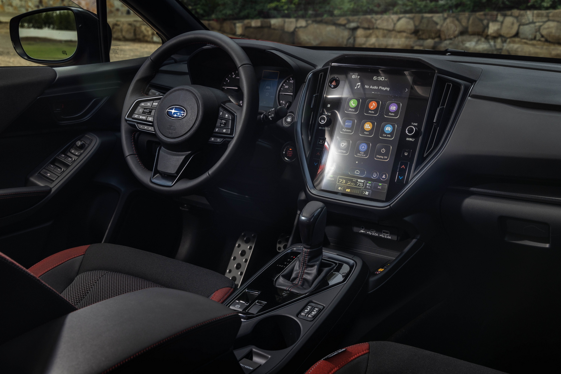
In no world where you're barrelling 3,000+ lbs of mass at tens of miles an hour should you be distracted by some moronic app or subsystem failing to respond in time because it was written by under-experienced software "engineers."
Any software running as a part of a motor vehicle should be federally regulated to not fail response time tests, and if they do, they should be deemed unlawful to be equipped by either the manufacturer or the owner.
It's absolutely ridiculous that this still happens today, and it doesn't have to.
So what? You've got physical buttons? Big whoop. That physical button that takes 500ms to respond is still as dangerous. You've just removed one problem.