| <font size="5" face="Helvetica">Monitor and protect your web app from cyberfraud, account threats, bots and abuse with a single security platform.</font>
Sure but how is this better than setting up the font in CSS? There may be an advantage to not having an external CSS file, but setting up CSS rules inside the HTML file works perfectly well and is much more maintainable than this IMHO.
The short answer: Because anyone can do this using in-line or in-file CSS.
The long answer: Technologies are a blend of humans and machines. Typing HTML code by yourself, especially in 2025, gives another level of meaning and human touch. It's more like modern art in some way.
Hard to disagree on the last part, but hand-coding HTML4 for food in 2025 is not the answer. First, it will look horrible. Second, if will look even more horrible on mobiles, which are first.
Third, if you're really determined to go piedi nudi nel parco in a modern browser, why not abandon HTML4 as well, and the dreaded 1-pixel along with it?
Just escape everything altogether, and you'll be fine. Avoid HTML5, CSS, WOFF, Canvas, and all other dreadfully slow and bug-ridden APIs. You'll be fine, take my word for it. All you need, really, is unobstructed access to target GPU, which will be orders of magnitude faster than all API bs and still do more than HTML4 ever could. For one example, can you figure out how the following page manages to render an HTML page with Garamond Math on it without loading any Garamond Math to begin with and no HTML to write home about? Network tab is a good start:
Easy to update means you only need a text editor and source code to maintain it.
Regarding the effort to write `<font size="5" face="Helvetica">` (I'm just typing this again), it's fairly easy, and taking into account the meaning of the text inside those tags, it is worth spending the time for typing.
Easy as in 'you do not need to shave a yack, just open a text editor'. As opposed to "install node, sass, webpack, vuex, tailwind" or what have you nowadays.
But the same can be achieved by using css. Then there's still nothing to install, and it's still something you can change by just opening a text editor. Plus it would be easy to update in the sense your parent poster meant. And with css you're using the right tools to style your website, so you won't have people complaining the website isn't working well on mobile, although you thought it would be.
I'm all for using simple tools and web standards, but this website with its layout build with tables is a terrible example.
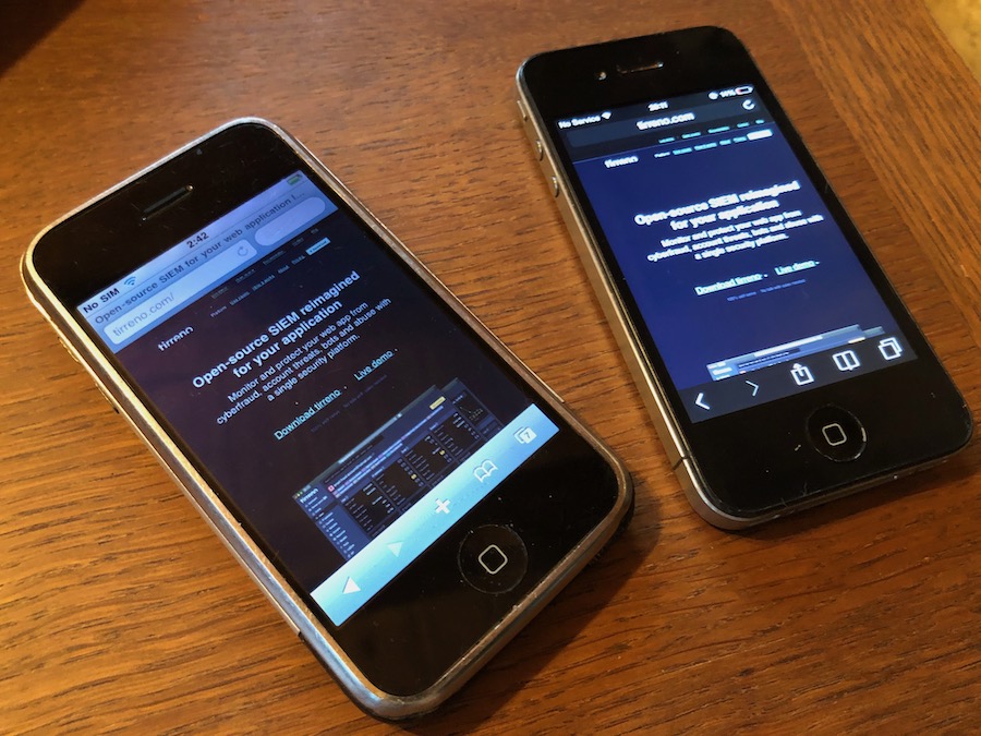
Just for fun, I tried opening the tirreno website on the first iPhone now, and it works as it should.
However, it must be clear that no one expects this website to be taken as an example. Back in the day, there was no other solution than using tables and 1px gif spacing, this is just a reminder of how things were at the beginning.
It’s like seeing neon gas advertising and insisting it should be made with a flat screen display. In this case, it’s our way of bringing back neon to the web.
No, brother - a neon tube requires at least a 4kV transformer, she's not so easy going. And in 2025 there are still absolutely valid use cases for CRT oscilloscopes, lamp amplifiers, LPs and Compact Cassettes, if you're old enough to know what those things are. But arithmometers are only useful to have fun under influence, sorry. Don't be a luddite.
A modern web browser, on the other hand, is the closest the humanity ever got to building a tower of Babylon, which is very easy to see by spending a few hours exploring how the Chromium sausage is made. I'm not aware of any worse codebase out there in the wild, and it is definitely not glowing neon.
On yet another hand, there are good news - it is just a matter of time when DOM API will get properly exposed to WASM VM, and on that sunny day all script kiddies, along with nodejs kiddies, along with endless pythonista will finally and traumatically learn the difference between the definitions of "computer programmer" and "software developer".
The day will come, and computer programming will again be art and full of fun.
You always get back to the basics, they say. But the road is long and full of sticks and stones, just like a false sheperd called 1-pixel gif. That's not yet the art of programming, sorry.
And btw I fully support HN for flagging this post. The quality of writing there is as silly as it is obnoxious.
There is nothing about luddism here. We had a choice: to create a standard modern website, as everyone does these days, or to try something slightly different. The team chose a non-standard approach. To an external observer, such as our banker, it looks absolutely normal. However, if some CTO veteran were to delve into the code and encounter HTML tags that they haven't seen in the last 25 years, they might experience some sentimental or ironic feelings, but in any case, no one gets hurt. Luckily, the <bgsound> tag is no longer supported.
What these web page experiments actually prove is that there are people in the industry who either don’t know or have forgotten what a real HTML page without JS/CSS frameworks looks like. For those, it might be beneficial to discover how things were done at the beginning.
Thanks for mentioning the art. This is something that couldn't be done alone, as it requires both a creator and a spectator. From this perspective, feeling that this HTML web page has an influence on a different audience is exactly what modern art (not to be confused with programming art) is about.
P.S. I am not associated with the original post above.
It's super zoomed out on my phone, it doesn't have a mobile viewport. And if you do want to read text, you have to zoom in more than the width of the full page so you have to constantly scroll left and right.
This is a failure or regression of mobile browsers. We once had automatic line wrapping (Opera Mobile did it best back in its Presto engine days) which provided readable size paragraphs and avoided the need for horizontal scrolling. The onus of adapting the presentation to the medium shifted to the websites, while browsers lost agency.
I'd like to see how that worked. In my mind I'd guess such a feature could have been great for one column layouts, like in this website, but I can't imagine how it would be for the then-traditional layouts of a left sidebar navigation column and a right area for content.
Page starts zoomed out. Each element is limited in width. Double tapping on an element (e.g. a paragraph) zooms in on said element, making it full width. Further zooming in causes the text to reflow to the viewport width. It's difficult to describe, but it used to work fine.
This sets the width to a mininum of 800px, no matter what phone model or browser you use. I'm a little confused how you can can claim this "Works well on any device" when apparently it was not tested on a phone. I, too, closed the tab before I even had a chance to learn about your product.
Update: Not OP, but I'm on a Pixel 8a with Firefox.
This is a software website, and we don't expect many visitors from mobile devices. However, I'll check if this issue can be resolved without using CSS.
I think this is a classic case of familiarity blind spot. It's easy to think of your users as people similar to you, but that's not necessarily the case. Statistically mobile phone users outnumber non-mobile users online nearly two to one, some statistics put the estimate even higher.
This is a misleading reference to statistics without context. It's not a B2C website, and in fact, most of our audience accesses it from Linux devices rather than mobile Firefox.
Anyway, even if someone does visit using mobile Firefox, it only takes one zoom-in/ zoom-out to adjust. So it's not really a webpage code issue, it's more about how Firefox renders pages on mobile devices.
This whole interaction is weird to me. Multiple commentators here have confirmed that your site is broken due to a, let say, somewhat unorthodox technical choice you've made. Rather than fix it, which would've probably taken less time than the thread here, you're trying to convince everyone else that they're holding it wrong. As an aside, it's not surprising that nearly none of your users access your webpage from mobile when it's broken on mobile.
> As an aside, it's not surprising that nearly none of your users access your webpage from mobile when it's broken on mobile.
I doubt their lower mobile visitor numbers are due to the UX on mobile. They may have a lower conversion rate from mobile visitors but it sounds like people don’t visit much on their phones. A given user won’t know it’s broken on mobile before loading the page on mobile.
Additionally, it is a marketing page for a B2B SaaS for web application security. With that context, only if they said anything other than “most of our audience accesses it from Linux devices” I would have reason to think they’re lying. I get the feeling that their business isn’t hurting for mobile users. (When I visited on my phone I figured it’s pointless unless I’m on something with a real keyboard once I saw what’s on offer.)
It is not broken on mobile. There is simply nothing to be broken.
What commenters above are probably suggesting is that there is no adaptive version for mobile, but no one had promised one.
One small, but important correction, it's a B2B on-prem web application, and this is exactly the reason why any devices except those that can run the web server itself are not the target audience.
> Anyway, even if someone does visit using mobile Firefox, it only takes one zoom-in/ zoom-out to adjust. So it's not really a webpage code issue, it's more about how Firefox renders pages on mobile devices.
No, it requires constant zooming and panning to be able read anything. And this has nothing to do with Firefox, Chrome and other browsers behave exactly the same. It is absolutely an issue with your website.
I feel like CSS is unfairly coupled to JS frameworks. It may be reasonable to say that CSS 3 is unnecessarily complex, but clean "semantic" HTML and a basic presentational style sheet is an amazing combination that isn't related to the ball of mud that modern development has become.
The idea to make a website without CSS/JS came to me when I was picking up my mechanical watch from the watchmaker. He used some analog machines to calibrate the movement, and it gave me a sense of trustworthiness that I want to convey through tirreno website.
Thank you. That is a bug and I will investigate. CloudFlare does inject JS into the outgoing HTML for email address obfuscation in the footer. I may need to remove that.
[1] https://www.tirreno.com/