This is a misleading reference to statistics without context. It's not a B2C website, and in fact, most of our audience accesses it from Linux devices rather than mobile Firefox.
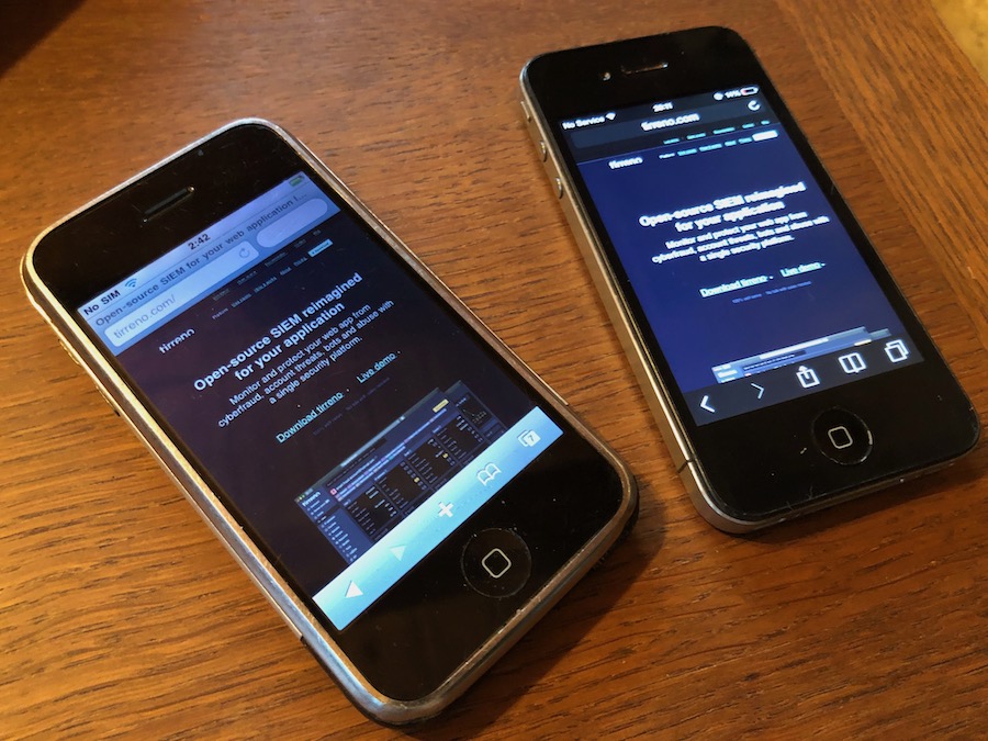
Anyway, even if someone does visit using mobile Firefox, it only takes one zoom-in/ zoom-out to adjust. So it's not really a webpage code issue, it's more about how Firefox renders pages on mobile devices.
This whole interaction is weird to me. Multiple commentators here have confirmed that your site is broken due to a, let say, somewhat unorthodox technical choice you've made. Rather than fix it, which would've probably taken less time than the thread here, you're trying to convince everyone else that they're holding it wrong. As an aside, it's not surprising that nearly none of your users access your webpage from mobile when it's broken on mobile.
> As an aside, it's not surprising that nearly none of your users access your webpage from mobile when it's broken on mobile.
I doubt their lower mobile visitor numbers are due to the UX on mobile. They may have a lower conversion rate from mobile visitors but it sounds like people don’t visit much on their phones. A given user won’t know it’s broken on mobile before loading the page on mobile.
Additionally, it is a marketing page for a B2B SaaS for web application security. With that context, only if they said anything other than “most of our audience accesses it from Linux devices” I would have reason to think they’re lying. I get the feeling that their business isn’t hurting for mobile users. (When I visited on my phone I figured it’s pointless unless I’m on something with a real keyboard once I saw what’s on offer.)
It is not broken on mobile. There is simply nothing to be broken.
What commenters above are probably suggesting is that there is no adaptive version for mobile, but no one had promised one.
One small, but important correction, it's a B2B on-prem web application, and this is exactly the reason why any devices except those that can run the web server itself are not the target audience.
> Anyway, even if someone does visit using mobile Firefox, it only takes one zoom-in/ zoom-out to adjust. So it's not really a webpage code issue, it's more about how Firefox renders pages on mobile devices.
No, it requires constant zooming and panning to be able read anything. And this has nothing to do with Firefox, Chrome and other browsers behave exactly the same. It is absolutely an issue with your website.
Anyway, even if someone does visit using mobile Firefox, it only takes one zoom-in/ zoom-out to adjust. So it's not really a webpage code issue, it's more about how Firefox renders pages on mobile devices.