Hacker Newsnew | past | comments | ask | show | jobs | submitlogin

For fantaſy, eſpecially, I diſagree. When I'm in charge, the long-ſ will be mandatory in any ſtory involving magick, to better ſhew the hiſtorical baſis of the mythology (unleſs, of courſe, a ſkinwalker were to be involved, in which caſe American ſpellings are indeed preferred)


Фор бетер іммерсіон, ол тектс ін сторіес И ред шѵд бе урітен уіþ олд сирілік летерс, регардлес ов þе лангѵадж.


ᚳᚫᚾ᛫ᛁ᛫ᚫᛞᛞ᛫ᚫ᛫ᛒᛁᛏ᛫ᚩᚠ᛫ᚱᚢᚾᛖᛋ᛫ᛏᚩ᛫ᛏᚻᛖ᛫ᛗᛁᛉ?


פור טקסטס סט ין אנשיאנט טיימס, אונלי עברית וילל דו.


Incredible. I sent that to Google translate and it translated fairly well.

(For those who can't read it - the text is English transliterated into Hebrew script, not actually Hebrew. I'm impressed that Google managed to make sense of it)


> уіþ Was the thorn really a part of old Cyrillic? Would make some sense given the shared history, but still.

> И I struggled for a bit with this one, but I don't know of a better way to represent it other then "ai" in Cyrillic I guess.

The "ѵ" is interesting too, never seen that before since you can make do with the sorta B-looking letter instead.


There're several mistakes:

- instead þ could be used ѳ;

- с in тектс is missed, it should be текстс or better теѯтс;

- ѵ is basically Greek upsilon which appeared in English mostly as u [auto] or y [system], therefore шѵд would be better written as шоѵд where /oѵ/ in old Cyrillic pronounsed as /u/ as in Greek, or just шꙋд;

- дж in лангѵадж could be writtend as џ;

And so on.


Thanks, these are good. I took inspiration from this horrible PDF: https://drive.google.com/file/d/14YgpdJ-k5M-GiwRDblvnEtsFvok...


> Was the thorn really a part of old Cyrillic?

No, never was a thing. Early Cyrillic had a bunch of unique letters that are long gone, but it never had "þ" in there.

> The "ѵ" is interesting too

It's from Greek "Y" (upsilon) and it - depending on the place - could've meant either /i/ or /v/ sound (and /u/ when in "оѵ" digraph, so parent comment has it wrong): https://en.wikipedia.org/wiki/Izhitsa


I think you’re on to something


𐡅𐡉 𐡍𐡕 𐡀𐡓𐡌𐡉𐡊


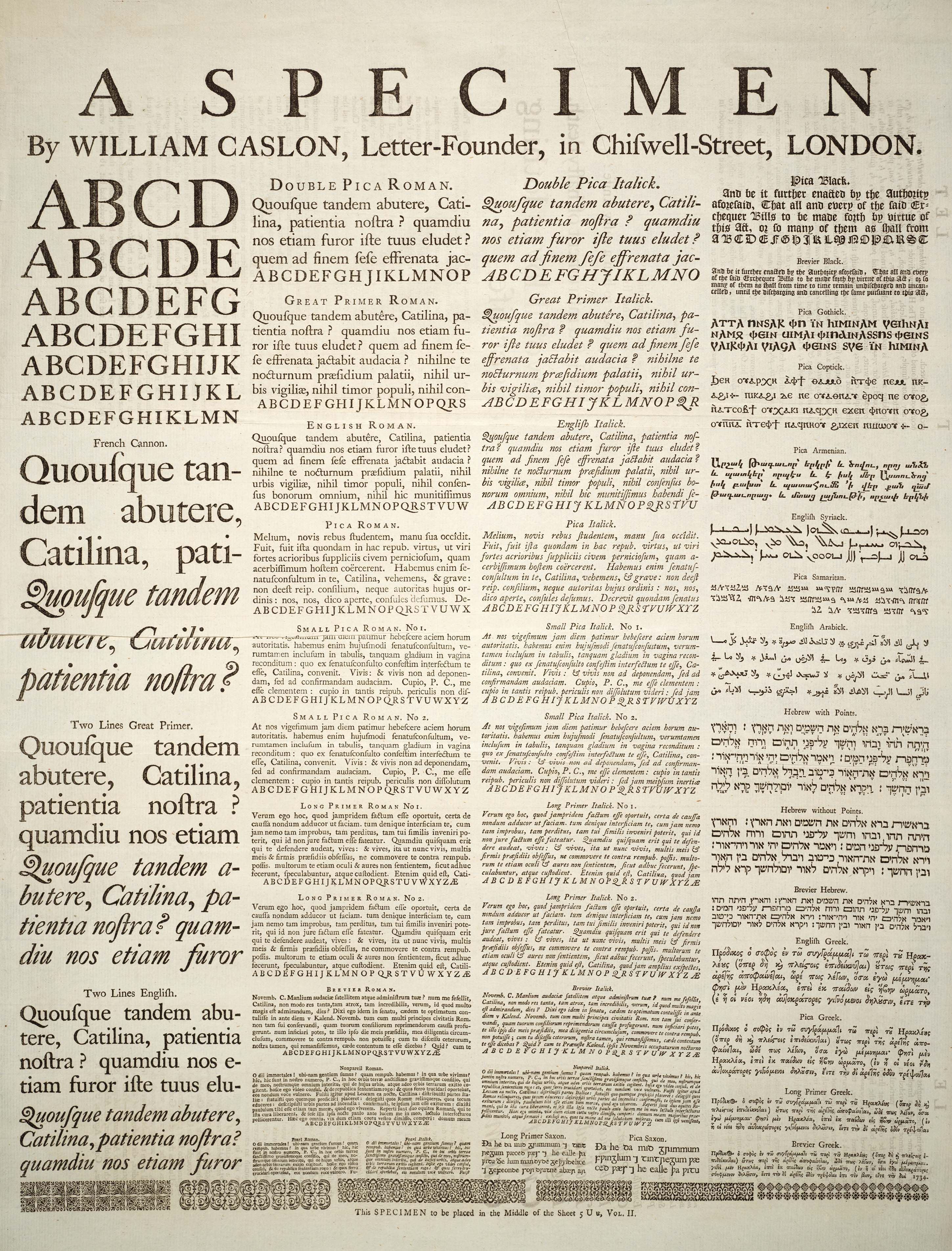
I have to say that the long-s looks quite horrible in Verdana, and probably most other sans-serif font. That makes sense, since most Sans Serif typefaces significantly postdate the abandonment of the long-s.

If you want to see how it should look in context, here's a typical 17th century example: https://www.raptisrarebooks.com/images/86066/paradise-lost-a...

The prints from the 18th century are even nicer with better quality and consistency in general. The Caslon typefaces are pretty exemplary here: https://upload.wikimedia.org/wikipedia/commons/4/45/A_Specim...

Roman typefaces with a long-s are a very 17th-18th century thing. A blackletter (gothic) typeface gets you closer, but all of that is still not very much medieval. What you really want is a meticulously manuscript in Carolingian Miniscule[1] or Uncial script[2], complete with killer rabbits[3] and knights fighting snails[4].

[1] https://en.wikipedia.org/wiki/Carolingian_minuscule

[2] https://en.wikipedia.org/wiki/Uncial_script

[3] https://blogs.bl.uk/digitisedmanuscripts/2021/06/killer-rabb...

[4] https://blogs.bl.uk/digitisedmanuscripts/2013/09/knight-v-sn...


Sadly I still read the s as f so I keep got stumped. "fantafy?"


Reminds me of a Just William story where he copied a letter from a letter-writing guide book, studiously converting all the "f"s into "s"s.


I read someone saying that reading text with the long s is like hearing someone speak with a lisp, and that is SO true. I love it.


Consider applying for YC's Winter 2026 batch! Applications are open till Nov 10

Guidelines | FAQ | Lists | API | Security | Legal | Apply to YC | Contact

Search: