I used to be an infinite canvas fanatic, even building products that leveraged the concept, but ultimately I’ve abandoned it. There are too many issues with having an infinite canvas that make it untenable. This isn’t to say they should never be used, but rather that I believe there are good reasons why they aren’t used more.
1. Ambiguous structure - users cannot easily glean the structure of content from the layout alone. For instance, on an arbitrary canvas, you don’t know if two things are close to each other to indicate a relation, or just for aesthetic reasons. This can be mitigated by ensuring relations are exposed in other ways, but unless everyone is super strict about including an underlying structure, this will always be an issue. Also, without a representation of the underlying structure, an infinite canvas is fundamentally inaccessible.
2. Navigation - finding all possible content on a canvas is hard. This can be mitigated with something like a mini-map, but frankly sticking to one dimension of “infiniteness”, eg scrolling, has shown to be the most effective for the average person to handle.
3. Implicit, but heterogeneous, affordances - when you have an infinite canvas, there are many more actions needed eg. pan, scroll, select, possibly lasso, possibly zoom…all of which need a mouse movement or keybinding or touch gesture, depending on the device and context. These all need to be discovered, or taught, and are often initially hidden from the view. This makes the learning curve far steeper, especially when users are accessing content from many different types of devices.
4. Responsiveness - it’s hard enough to make a paragraph of text easily viewed on multiple screen sizes, let alone a complex layout of objects with relations possibly conveyed spatially. Infinite canvases are difficult to reformat to get a good, legible layout on a screen other than the one the creator used. There are workarounds, but they often lose information unintentionally by repositioning items in ways the author didn't anticipate.
> Also, without a representation of the underlying structure, an infinite canvas is fundamentally inaccessible.
This is really difficult to overcome without some kind of structure. I was really enthusiastic about infinite canvases, but I lost interest when I realized that screen readers would not do well
This is an interesting point, because they are kinda infinite spaces but they also impose a structure on the space, which I would assert is a part of why they are so successful, in contrast to the "infinite structureless blank paper" that the OP is talking about.
The trick is getting the amount of structure just right, not too much to be too restrictive and not so little that users are lost in the way the person you're replying to describes.
Infinite canvases require panning and zooming with the mouse and tracking motion visually. A lot of users probably don't like the cognitive load of that compared to other types of apps.
Excel handles this better because navigating around a large sheet feels more like "snapping" as there's no UI motion as your view zooms in and out. Plus with shortcuts like CTRL + rArrow, which immediately snaps your selected cell to the rightmost end of the current range of cells, the infinite canvas feels downright zippy. Excel sheets also have tabs that signal to the users about how they can split up their data instead of filling up Sheet1 with every scenario. Infinite canvases make you create a new file.
You are usually not dropped in the middle of a spreadsheet with infinite rows/cols in each direction. You start at topleft which makes navigating much less 'exploratory'
If I recall correctly, Lego Mindstorm's GUI-based programming application (along with its various iterations) did something similar too, starting at a "leftmost" side of an infinite canvas.
In 2007 I worked in Office Labs at Microsoft. We explored the idea of creating presentations on an infinite canvas. It was pretty cool. It took inspiration from Seadragon. It was called Plex or PowerPoint Plex.
Unfortunately, all the demo videos were uploaded to Microsoft's YouTube competitor, which is now gone. But here's a video demo of Seadragon to give you an idea of what it was like:
I hated this post up until the last section, then it won me over at the end. None of the infinite canvas interfaces look like anything more than a pile to me. I see no structure at all. If I was forced to use an interface like this for anything crucial, I couldn’t function.
But the last section that shows the same information presented in different formats won me over. This is more of what I’d like to see. Let people who think spacially work spacially if that’s what works for them. Let the people that think however it is that I think work in whatever format the fits in their brain best. Embrace neurodiversity.
I've seen this in the past, but it looks like the "magic paint" feature was added since then, and it really delighted me when I discovered it. It's such an intuitive way to implement multi-select on a canvas.
I was impressed by the way the windows are page-local but the content appears as though it were screen local. I also dug the auto non-overlapping tiles.
I think it needs a more guaranteed high frame rate and some polish for me to judge whether it’s actually better for uses I make up, but it’s really innovative.
I’m thinking the canvas is just given a fixed position and a low z-index and then a “normal” webpage can be made with areas that have a zero opacity element (or no element but then layout is harder).
It feels super impressive but the more I think of it, I think the trick is actually quite simple. I wonder what edge cases I’m not thinking about.
Infinite canvases like Figma give me infinite anxiety. There's no way to easily and sensibly hyperlink to specific areas/contexts within the canvas, and it's really difficult to find things unless you know exactly where to look.
It's like the manifestation of a cluttered desk of papers in the digital world - exactly what we tried to avoid when building new digital interfaces for so many decades.
Edit: there is a way to hyperlink directly to sections in Figma (see comments below), but I've never been a recipient of them :lol:
> There's no way to easily and sensibly hyperlink to specific areas/contexts within the canvas
There are absolutely ways to hyperlink to specific areas and contexts within the canvas. It's one of the core features that's always been part of Figma. For example, click on anything on the canvas and you'll observe the URL change. You can share that URL
> For example, click on anything on the canvas and you'll observe the URL change.
I think this might be the problem. The URL doesn't change as you move around, so folks just copy the URL at the point in time of whatever they're staring at, and end up sharing whatever area was previously focused / clicked on,
The feature is pretty easy to use- at what point do we just accept that some people shouldn't be using the tool? If we always design for the least capable user, we will be unnecessarily handcuffing ourselves.
Now I'm endlessly curious as to why I've never gotten a correctly located link from many designers in several orgs. It is, however, sufficiently buried that I think most designers just copy the browser URL and call it a day.
I honestly can't remember a single time I've gotten a targeted Figma link like this from a designer.
Because people will delete and create new modes as they iterate so those hash links become stale. So while the person who replied to you is technically correct, effectively it is still very unstable.
Similarly, on pages like GitLab you can link to specific line(s) of code in a file...but it often is the head of that branch. The URL will resolve in the future, but its pretty common that the chunk of code has moved.
I wish it was easy to grab a URL for that specific version, with a banner at the top saying it's not the newest version of the code (something I sometimes see with documentation). I don't see why Figma couldn't do this, too.
> Similarly, on pages like GitLab you can link to specific line(s) of code in a file...but it often is the head of that branch. The URL will resolve in the future, but its pretty common that the chunk of code has moved.
On GitHub you can hit the 'y' key[1] and it will add the revision into the URL.
I use a modified version of this paradigm for personal desktop apps that I write for myself to use. In these apps, all the screen elements initially fit within a 1920x1080 area, which is the minimum resolution among all my monitors. To achieve the infinite canvas effect, there could be icons near one or more of the edges. When clicked on, the icon opens a panel in the direction of the nearest edge and the canvas auto-scrolls to it. The panel could, itself, be a canvas, allowing for recursion.
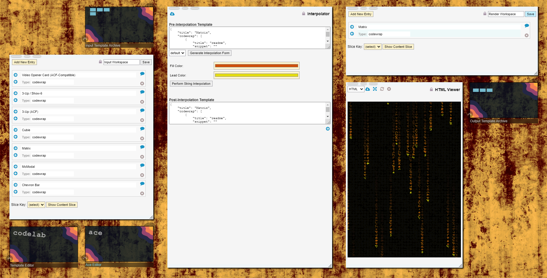
Here is a screenshot of one of such app that I'm currently working on:
Infinite canvases match the way I think. Back in the day, I would use Illustrator over Photoshop for UI work, as it gave me a (near) infinite canvas on which to doodle and explore. Sketch and now Figma continued this approach so I can't be alone here.
Ok, but why? Please excuse my ignorance, it's well earned. I haven't been in the web design space for over 20 years. So, seriously, like, what is this for?
Just so we can? For presenting a specific kind of information?
This appears to be exploration, to see if we can find new useful ways to display and interact with information.
There have been many, many experiments in the past. Design features that work (such as listy designs, tabular designs, 2D designs, non-overlapping designs, etc etc) have stuck around. By "work", I mean that they are useful, practical, easy to understand, easy to implement, non-patented, etc etc.
If we stop experimenting, then we will stop finding new useful design features and UI design will stagnate.
Yes, current UI design is "good enough." But where's the fun in that? Whatever you believe the purpose of life is, experimenting and furthering humanity's knowledge is typically considered a good thing.
I think that this particular experiment is useful, and that there is potential here for more efficient note-taking and knowledge sorting (which could, in the future, potentially benefit everyone). Imagine an author writing plot point ideas into an infinite canvas, then assembling them on the fly. And then they bring those points into a second canvas, where they group them by character. Then they can freely move the plot points between characters, or leave them to the side, not assigned to any character but there, on the "plot points by character" canvas, ready to be dragged on. But then if they're looking at the plot points on the "plot points by time" canvas, and they set a plot point's character to "X", then it will automatically move that plot point into the region of character "X" on the "plot points by character" canvas.
That's just one example. I can imagine more, such as a materials researcher trying to design an industrial process. They could be working through potential chemical products, trying to decide which to use at a particular point of the process. This freeform canvas would let them keep a card for each potential choice right next to the place in the process that it would be used. That proximity of information could be useful.
I've found that Blueprints (a 2D scripting language) in Unreal Engine get really messy, and you're constantly neatening your programs. This particular experiment, with its anti-overlap and automatic grouping features, might lead to good changes in Blueprints in UE that make them neater by nature.
It's so that the topology of the design system can mirror the topology of the information being stored. Top-to-bottom and left-to-right works great for information with a linear, generally one-way directional flow.
But how do you show that certain concepts are similar and related? Wiki informational design says that you should do that by splitting things up into atomic concepts that individually have a linear informational flow and using hyperlinks to connect them. You might group things into common categories.
Links can show a connection, but not how close those connections are or any correlations. The idea of whiteboarding is that you're not limited to segmented linear information flows, and you can represent your thoughts visually.
The "infinite canvas" is to a whiteboard what a wiki is to a filing cabinet of notecards. Or what a plotted graph is to a table of numbers.
I’ve been a UX engineer in the “infinite canvas” space for the last five years. Just getting the organization aligned around something that behaves Figma-like is a huge undertaking, and as some of the comments point out, Figma isn’t really a great experience even once you’ve got the bugs ironed out. I’ve got some ideas about how to improve on this, but they’ll probably have to wait until my current employer goes under. Shouldn’t be too much longer now
The last one reminds me of the Wii lobby. You could have all of your Mii's (avatars) in the lobby and click on "Line em up" to get them into some order, then arrange them manually (by the hair).
I wonder if something like this could be useful if paired with a Tree-like panel for navigation and some selection aware auto-arrange functionality.
Thanks for this. I'm building a card game that needs an infinite canvas. I'm currently using Miro but there's no easy way to "flip" the cards so they are hidden or make certain decks just visible to their owners.
1. Ambiguous structure - users cannot easily glean the structure of content from the layout alone. For instance, on an arbitrary canvas, you don’t know if two things are close to each other to indicate a relation, or just for aesthetic reasons. This can be mitigated by ensuring relations are exposed in other ways, but unless everyone is super strict about including an underlying structure, this will always be an issue. Also, without a representation of the underlying structure, an infinite canvas is fundamentally inaccessible.
2. Navigation - finding all possible content on a canvas is hard. This can be mitigated with something like a mini-map, but frankly sticking to one dimension of “infiniteness”, eg scrolling, has shown to be the most effective for the average person to handle.
3. Implicit, but heterogeneous, affordances - when you have an infinite canvas, there are many more actions needed eg. pan, scroll, select, possibly lasso, possibly zoom…all of which need a mouse movement or keybinding or touch gesture, depending on the device and context. These all need to be discovered, or taught, and are often initially hidden from the view. This makes the learning curve far steeper, especially when users are accessing content from many different types of devices.
4. Responsiveness - it’s hard enough to make a paragraph of text easily viewed on multiple screen sizes, let alone a complex layout of objects with relations possibly conveyed spatially. Infinite canvases are difficult to reformat to get a good, legible layout on a screen other than the one the creator used. There are workarounds, but they often lose information unintentionally by repositioning items in ways the author didn't anticipate.