Gotta say, that last version from blender, the one he hates, kinda seems to trigger some nostalgia for me. It's not as good looking as the drawn stuff, but it totally feels like something I would see in the late 80's or very early 90's in a game.
I felt the same way too - maybe I'm susceptible to it growing up in the 80s and 90s. This kinds of style was common even post 1-bit era (first mac I used was circa '94 vintage early PPC generation - we had a PC-XT clone before that but the style was a lot less common on early DOS).
Yeah I prefer that version too. Definitely hit the nostalgia feels but with some modern .. cleanliness? Eg having it modeled properly then rendered like that gives it a much cleaner and more accurate look than the old hand-drawn pixel art but still nails that old-school vibe perfectly.
I'm reminded a bit of the monochrome art from Cyan's early Hypercard game The Manhole. It used a lot of line art and simple patterns to depict shading -- more cleverly than the Blender output shown in the article.
The Manhole is playable online at the Internet Archive:
But that's an even older style. For black-and-white Mac graphics, I do feel like the final blender output is closer to the old style than the final hand-drawn output, but mostly over one particular issue: every object in the blender image has an outline. A lot of the objects in the hand-drawn image don't; instead, they just bleed right into the empty space around them.
My gut tells me that the shadows of the plates and the pie in the dithered blender output are "too realistic" and should have been drawn differently.
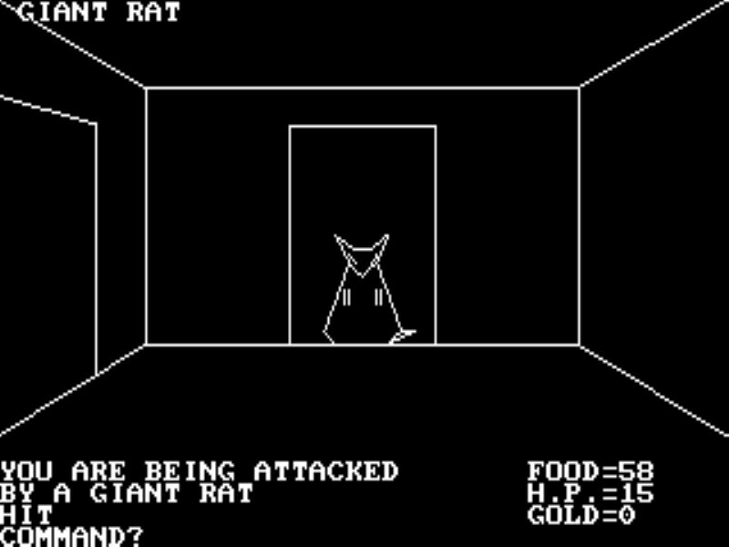
I remember enjoying using Studio-8 (an 8-bit paint program) for the Mac back in the 80's & 90's. I did all pixel art by hand then. From time to time I might fall back to using a scanner to scan in art (and retouching in Studio-8).
Toward the end of my game-writing days I played with creating 3D objects and rendering them — pulling the 2D renders in as sprites. Of course we were well past 1-bit monochrome Macs by that time.
In hindsight I prefer the B&W art in many ways. Every pixel curated.
I miss those paint tools — where you could zoom in at integer scales, click on and off individual pixels. Some modern paint programs still have some of that capability but it seems to often be buried (like you have to figure out how to select a "brush" that is 1 pixel and has no alpha-softening-flow-thing turned on).
This may be a content-light comment, but if the obscure title didn't make you want to read the article - I do recommend reading it: it's short, well written and I can honestly say it's not the kind of stuff I've read about anywhere else.
This is most likely absolutely useless knowledge & at the same time really interesting exploration of how some technical limitations affect the work process. It's a very original-meaning hacker spirit article, the kind I'd expect to find on slashdot circa 1997.
I don't have a good article to link to at the ready, but if you're interested in this, you may be interested in 1-bit music synthesis. (at a normal (48k) sample rate -- I don't mean doing PDM in the Mhz range and then using a LPF) It's extraordinarily limiting, and yet, skilled hackers have been able to make music, even polyphonic music(!)
Kind of an aside, but one of my issues with these games (1bit, other "retro" style games across itch.io) is they function more like art pieces (demos, I guess) than actually fun and interesting games. No shade to those who make these, kudos and have fun, but apart from a few games I can count on one hand (like undertale for example) pull off the retro style and are actually fun.
Like I've yet to play an actually fun pico8 game, apart from the minigame in Celeste, for example, although that's literally celeste...in 8-bit.
I can't recommend Obra Dinn enough. It's a one and done game, but the experience is pristinely polished. There's nothing else like it, and it proves that Lucas Pope means it when he says he uses the limitations of the art style as a way to improve the work.
I play it about once a year, having forgotten a few of the details of the story/gameplay each time, and really wish I could neuralyze myself to play it again for the first time.
Off-topic, but how and why does attempting to directly select text from this post not work (it just drags the whole content as if it were an image)? It appears to be normal HTML behind the scenes, and if you start a drag e.g. between paragraphs it selects text normally (well, almost invisibly, but that's just styling).
::selection is more or less one of the mistakes of the past that I wish browser makers would agree to kill off. I wish Firefox had at least an about:config switch to disable it.
Recently, I started to appreciate art more since it feels like I'm trapped in a utilitarian trap. This one bit art is amazing, but I don't know how I could get involved.
Brandon James Greer[0] has some really good vids on pixel art, including 1-bit. I recommend trying it out for yourself in Aseprite, or if you have an iPad/Apple Pencil, Pixaki is actually really nice.
You can support the artists by buying their existing artwork or commissioning new work.
But you probably meant, "how do I make art?" Art isn't really even a defined thing. Go throw some paint at a wall and read the Art Of Asking Silly Questions by Sunkist ;-)
My impression is that the 3D modeling in the Blender version has many things that are too small and/or detailed for the output resolution, and therefore look quite bad, whereas the hand drawn version prioritizes clean pixels and readable shapes at the expense of "realism":
  - the rims of the stacked drinking cups
  - the rims of the stacked plates
  - the filling of the pie
  - the shadows under the plates, the pie and the mini-billboard
Some objects in the Blender version are also a bit off regardless of the output resolution, for example the huge pipe and the wide forks.
I think more iterations of improvement on the Blender version would have allowed results close to the hand drawn version or even better.
For producing many 1-bit illustrations of this kind for a whole game, mixed techniques are probably the best path: retouching imperfect NPR renderings, assembling drawn and rendered elements in an image editor, using pixel art as a reference for Blender and hand-drawn sketches as a reference for both drawing and 3D models, applying filters to photographs, and so on.
It’s just the artist’s opinion. They were going for something, and the blender-rendered version was not it. When it comes to stylized graphics, there’s no such thing as “better”
The hand-drawn version feels less "mechanical" to me. It's hard to explain, but it's like watching an anime where the artists switch from 2d to 3d animation for complex or repetitive scenes in a way that feels cheap or jarring.
Sometimes I wonder if I could be interesting to have a 1bit desktop. Not necessarily lowres, but 1bit. (Or maybe 4grays). That kind of light, simple desktop (maybe resembling next step maybe more modern) could be pleasing in a way.