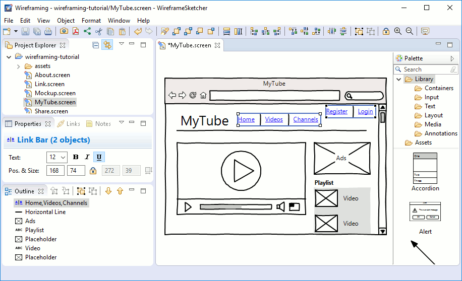
It's amusing that the web crowd redefines standard graphics terms. A "wireframe" in graphics is a 3D model where only the edges are shown. This use of "wireframe" means something else entirely. In publishing, that's usually called a "layout".
In graphics, "rendering" refers to the final steps which generate the actual pixel values to be displayed. The web crowd uses "rendering" to mean creating the DOM to be displayed, which is still a long way from the pixels. Graphics people would call that creating the scene graph. This appears to be a concept created by Google.[1] For scraping purposes, Google runs most pages in a headless browser to build the final DOM. Then they scrape that. Thus, the Javascript gets executed before scraping. Google refers to that as "rendering", even though they don't take the last steps to generate a pixel image.
So it was the 2D equivalent of the 3D graphics model you describe. And of course the wireframe you describe is itself a computer-modeled evolution of a literal wireframe -- a frame made with wires -- of a 3D physical object.
Web design wireframes were intentionally oversimplified so that discussions could focus on the data and flow instead of the final rendering, which was not decided yet (colors, art), and could vary between browsers. The best bikeshedding effort of the tech team holds no candle to that of design and product teams!
But black lines on white paper can be limiting too. They don't show well in client presentations. So colors were an inevitable addition. Varied font sizes and weights are useful to convey hierarchy. Rounded rects are free.
And then, if you've bought into a design language (Material, etc), you might as well use a higher-fidelity representation of the widgets...some of which are so simple that you might as well use the exact widget.
I'm confused. You suggest that templates are what you are offering, but this is a link to an app. Are you offering the wireframe templates themselves? Like, for example, ui8[1].
I will use this as its pretty and useful but just wondering is there a limit on the size of text... if the trend continues, it will be one character per 100vh.
In graphics, "rendering" refers to the final steps which generate the actual pixel values to be displayed. The web crowd uses "rendering" to mean creating the DOM to be displayed, which is still a long way from the pixels. Graphics people would call that creating the scene graph. This appears to be a concept created by Google.[1] For scraping purposes, Google runs most pages in a headless browser to build the final DOM. Then they scrape that. Thus, the Javascript gets executed before scraping. Google refers to that as "rendering", even though they don't take the last steps to generate a pixel image.
[1] https://webmasters.googleblog.com/2014/05/rendering-pages-wi...