yay, postcard apps! this is my space, too. there's something really fun about making an API call and then postcards shoot out the other side.
i like your site and the visual design, very simple and straightforward. at $3.99 it does seem rather expensive compared to other options out there (i have an idea on how much it costs you). also, having some actual pictures of what the cards look like on the website will surely help with conversion.
the first postcard app I built is Three Kind Words (https://threekindwords.com). it’s a small vending machine on the internet where people anonymously send a friend three postcards, one word at a time. the first two cards are unsigned, and the last one reveals who sent them. it’s meant to be a slow, kind surprise in the mail. we've sent over 250 cards so far.
my latest postcard app is Slow-Mo Rainbow (https://slowmorainbow.com). this one lets you send a rainbow in the mail, one postcard at a time. i just launched it last week and am still getting the rough edges worked out, but in the spirit of the thread, i'm sharing it here.
It’s a small vending machine on the internet where people anonymously send a friend three postcards, one word at a time. The first two cards are unsigned, and the last one reveals who sent them. It’s meant to be a slow, kind surprise in the mail.
I shared this on HN a while back, and it gave us a quiet little push. Since then, we’ve sent 246 out of the 300 postcards we set out to deliver this year. Things have slowed down lately, but the whole thing is automated, costs almost nothing to run, and has been a lot of fun to work on!
Just some feedback, I think this would be much more compelling with better choices of messages. It feels like the first two words are setting something up and the third should have some kind of payoff, but a lot of the messages don't work like that. The third word is usually predictable and obvious and something of a letdown "Never give....up".
There's really nothing in that list that is interesting enough to send to anyone in my life. I'd be wanting to send something very specific like "Remember cycling Iceland?" or "Soy chicken success" or something.
I get your concerns about "writing something inappropriate" but you could probably let people choose 3 words from a list of a few hundred pre-vetted words?
thanks for this genuine feedback, it's really helpful insight. i like your idea of pre-vetted words and imagine there is something i could do with an LLM to moderate user generated messages.
Slope | Junior Developer | REMOTE (US) | Full Time | https://slope.io
Slope makes clinical trials boring with products, services, and technology that reduce operational complexity. We support clinical researchers and their patients around the world, with the ultimate goal of getting important drugs and devices to the market faster. As part of our solution we also procure, package, and ship clinical trial supplies to destinations across the United States.
As a junior developer at Slope, your ambition and curiosity are channeled into building a better, more boring way to deliver complex clinical trials in a patient-centric, tech-driven manner.
Join a diverse, highly engaged, and super-ambitious team of humans looking to make a difference on a problem that matters!
Everything is UX. UX starts with underlying data analysis - see Taxonomy and Card Sorting on the linked page. It continues through the development process. It doesn't directly comment on service implementation, but it does help specify what those services need to deliver
I think so. Some examples of places where this has impact but is often overlooked could be when you change car brand. Or if you go from one phone OS to another. The UX features will be slightly different, and there will be a learning curve.
Pulling down to update on feeds/pages/apps is as natural as clicking icons by now.
Co-production is a form of design, no? You design within constraints and it should be happening in tandem with the development of the system so they both feed into one another.
I felt that that the author was more concerned about ownership than short-term productivity or efficiency.
With ownership a different kind of productivity is evoked: knowing how (and why) every part goes together the way it does. This could lead to a flow state when managed effectively.
I do agree that these exercises could lead into the realm of yak shaving, but in this context we're talking about making personal tools vs tools for others to use. I think there's a big distinction between these two approaches.
OP here -- I think you captured a lot of what I wanted to express. A lot of my DIY-ing is definitely about ownership: owning (1) my data completely, including how it's stored and backed up and (2) the future of these tools, so a SaaS provider can't suddenly decide next year that I'm no longer in their target market / most profitable customer segment.
Agree on the distinction between building for myself vs. others. There are a hundred things I'd have done differently, were I building for someone else.
I recommend reaching out to Mr. David Nettleton, who runs a website [1] and has written several books on the subject. He's an oracle of knowledge and has a teachable method of compliance which will save you a lot of time and headache.
I attended one of his in-person seminars back when you could go places and meet people face to face, it was eye-opening.
Also please don't hesitate to reach out directly to me (put an @gmail after my username) and I'd be happy to exchange some emails.
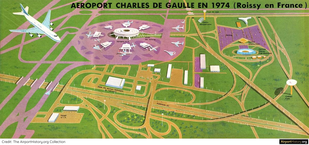
There is a certain quality of the graphic design, colors, typography, and layout of the "vintage" planning & marketing materials shown here that I just can't put my finger on why I like it so much. Perhaps a certain richness from the inks that were available and the type of tools used to produce it.
Whatever it is, it feels authentic and hopeful. I love the sense of optimism that the graphics (and history shared in this article) invokes. Great stuff.
A mixture of change of materials (some of those are clearly paintings done in acrylic that have been photographed then used for colour plates), and change in style - at the moment we're in a backlash against the use of multiple colours, as well as any kind of clashing. This would absolutely be laughed out of the office today: https://www.airporthistory.org/uploads/1/2/1/4/121407428/cdg... - because green and purple are high-contrast colours.
There's something with the non-realistic hand drawing, that puts emphasis on some very specific points. You can't get a similar result with computer aided realistic images.
There is also that the designer seems to really empathize with the message. It's hard to find material nowadays that even has a message, the designer empathizing with it is really rare.
As a child of the 80s, I can definitely say that life in past decades was "brighter" then than it is now, although it's for reasons unrelated to graphic design. What it basically comes down to is, we used to dream and fantasize about possible futures and our contributions to it in a way that was nurtured by society. There was a general feeling that we had grown beyond the profit motive, or at least, that prosperity was increasing faster than effort.
Basic etiquette was better. Well-read people like Carl Sagan were listened to. People could have a modicum of respect in their communities as simple professionals like teachers/architects/doctors/lawyers/etc. Children were allowed to be children. We had movies like The Goonies, which illustrated the ills of society (like unrestrained real estate development) and provided a counterculture message of hope.
I'm in danger of straying into the rise of fear-based dystopia post-2000 so I'll leave it at that. I think that we can get back to the optimism of past decades, but it requires looking past the superficial and understanding that real prosperity is more about opportunity and a feeling that we're all equal and helping to build a better world together.
Whereas in the 80s the fear of civilization-wide extermination through nuclear war was widely present, in films and even pop songs. Y2K was the rare occasion where the sensationalism got the problem fixed, so nobody believes it was ever a risk. Like CFCs.
No, the 90s was a quiet time for everyone west of Yugoslavia and north of the Mediterranean. The "end of history" between the fall of the Berlin Wall and the fall of the World Trade Center.
I sometimes think we don't do futurism any more because we spent so much effort looking forward to the future of 2000, and there's no big date to look forward to quite like it.
When I buy picture books for children, I will not buy anything that was obviously made on a computer. They look so bland and lifeless. (I don't care how it was actually made, it's about the look of the result.)
It's made by humans. With formal, classic training in plastic arts. By hand. Without Adobe tech. Using only pen, ink, charcoal, and paint
Sometimes looking at 1920-30s High Modernist design, it suggests that "new dawn" in human affairs, the sort of confidence people used to have in science triumphing over superstition ;)
Though I know nothing about the materials used, it looks to me like the aesthetic of Chesley Bonestell's space exploration images, and also of '2001' - as can be seen in the "Envisioning 2001: Stanley Kubrick’s Space Odyssey" exhibition, currently at the Museum of the Moving Image in Astoria, NYC.
This. The give and take between conscious focus and unconscious mind wandering has never let me down when working on complex ideas.
Before I had children, I found the "unconscious processing" part more difficult, because my time was simply _my time_ to do with what I pleased... so I would often try to work harder, leading to less productivity and more spinning in circles.
After having children, my time is obviously more structured and I've found the regimen of childcare to be a wonderful diversion from thinking about systems and complexity.
Taking multiple walks a day also helps immensely. The trick is not trying to think about my work when walking, just absorbing the sounds, sights, and smells of the world around.